Battle Royale: Evaluating the Marketing and Branding Efforts of Clinton and Trump
If you’re a fan of the musical Hamilton, you know elections weren’t always this polarizing. It wasn’t until 1800, when young upstart Aaron Burr chose to break with tradition and openly campaign against favored Republican candidate Thomas Jefferson, that the idea of directly attacking an opponent and speaking on your own qualifications became a thing.
Admittedly, things have… intensified… since then. The 2016 election cycle spend blew past the $1 billion mark in April of this year, well before the final candidates in the general had been decided. Now that both the Republican and Democratic conventions are over and done, things are about to kick into high gear, with a high dollar budget to match.
Where do all those dollars go? The most expensive branding and marketing campaigns in the world.
That’s what a campaign is, at the end of the day. It might have started with Aaron Burr talking at social clubs, but campaigns today include millions dumped into advertising, social media strategy, promotional products, and more. And just like any other campaign like this, some of it’s good… and some of it’s awful.
So how are the branding and marketing efforts of the candidates stacking up to date?
Round One: Logo Design
The Clinton camp rolled their logo out at the beginning of her primary campaign, opting for a flat, simple design. The use of an arrow to punctuate the structure of the “H” was reminiscent of the arrow used in the FedEx logo design, and was chosen to represent a march toward progress. It didn’t escape Millennials that the rightward facing logo also aligned with “swipe right” on Tinder.
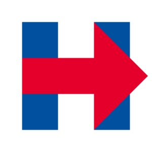
Though some really liked it, others were less than impressed. There were concerns that the most prominent and active element of the logo was red, which is a color primarily associated with Republicans in terms of logo design (to be fair, she’s since rectified this). It also seemed exceedingly basic following the somewhat revolutionary logo designs featured by the Obama campaign in 2008 and 2012. It was so simple, in fact, that applications were developed allowing anyone to turn their picture into a Clinton-esque logo.
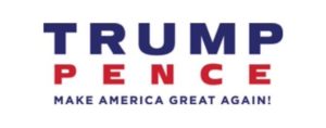
Trump’s logo, on the other hand, has always been… well, boring. Say what you will about Clinton’s weird arrow, but Trump’s initial logo showed absolutely no creativity. Simple and traditional fonts, paired with the most subtle of accents, made it utterly forgettable. No. Seriously. We forgot it existed.
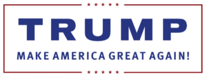
And when he tried to get frisky after picking Pence as his running mate, the campaign totally missed the mark, leading to a whole bunch of NSFW mocking.
They realized their mistake after an onslaught of ridicule and changed course, but the newest logo is just as dull as the original. There also doesn’t seem to be a high quality image file for it anywhere.
The upside? No more gay sex jokes about candidates for whom that kind of thing seems to matter.
Verdict: Clinton, mostly by default.

We just emailed the info to you.
Round Two: Taglines
Every campaign has a catchphrase with which they become associated. President Obama’s was as timeless as it was short, spurred by some beautiful poster designs: hope. This time around, the taglines are also simple, but very different.
The Trump campaign came out swinging in this regard. From the very start, the message was clear: “Make America Great Again.”
Whether or not you agree with the sentiment behind the statement is irrelevant here. The point is that it’s easy to remember and bold. It’s something that can be reiterated in not only signage and promotional products, but repeated by the candidate himself. Not a speech goes by where Trump does not promise to make American great again… whatever that means. Still, it’s ubiquitous in the branding and marketing efforts.
Clinton, on the other hand, has seen her campaign defined by a hashtag: #ImWithHer. It started out as a rallying call, encouraging supporters to make public declarations of allegiance online. That worked. Anyone following the election on Twitter knows that #ImWithHer is a pretty dominant recurring feature in pro-Clinton content. That said, the tagline comes with limitations. Though her surrogates eagerly repeat the phrase, it’s not something that she herself can repeat on stage, limiting its ability to be a thoroughly consistent branding element.
Verdict: Trump
Round Three: Promotional Products
One of the quirkier elements of a political campaign is how promotional products work. Some are free. Some are for sale. All serve a purpose. The design, promotion, and distribution of these products has a huge impact on how effective they are, but there’s no denying that they play a key role in strategy.
Clinton’s approach to promotional products has been unique in that it deliberately hasn’t been centralized. Instead of focusing on one type of product or one message, the offering has been varied, allowing supporters to acquire materials that are more personal than a tagline. These products are designed with specific demographics in mind and are often tied to current talking points. For instance, you can buy a “woman card” of your own to play, or a “Love Trumps Hate” t-shirt.

Trump’s promotional product approach has been largely defined by a signature red hat featuring his tagline.

There have certainly been other products in the mix (see here for some examples), but it’s that dang hat that most people remember. And even when you look at the other available products, there’s a lot more design and message consistency for Trump than there is with Clinton.
Verdict: Slight Edge to Clinton
Round Four: Website design
Candidate websites are notoriously infuriating from a design perspective. You have sites who hit too hard, too fast in terms of lead acquisition. You have boring, unoriginal aesthetics. You have clumsy UX. The list of complaints goes on and on.
Presidential candidates, especially once you get to the general, tend to fare a little better in this category, but there’s always room for improvement. How do Trump and Clinton stack up?
That’s harder to assess than most of these categories, largely because candidates have realized that their sites need not be static. Both the Clinton and Trump websites have already changed dramatically on multiple occasions. That flexibility is probably a good thing from a marketing perspective, and shows a willingness to experiment that you don’t usually see in this space. That said, this trend leaves us evaluating what we’re pretty confident will only be a temporary web design.
The Clinton website, at the moment, actually feels a bit discombobulated. Video is prominently displayed, which is great for initial user engagement. There’s a call to action at the right above the fold, but it’s not particularly compelling or bold. Frankly, there’s little about the current design that’s mentionable. It’s merely sufficient… at best.

But its design also seems pretty acutely crafted to appeal to folks who already like her. You don’t get to a pronounced “issues” section until well below the fold, and even then, it doesn’t look much different from the promotional articles a couple of rows above that. This isn’t necessarily a poor strategic choice, to be fair. After all, Clinton is arguably one of the most thoroughly well-known presidential candidates we’ve ever seen. Even so, it does make for a bit of an awkward homepage in terms of user expectations.
It’s possible that this departure from traditional campaign site design is a klutzy attempt to reach younger, more design sensitive voters. It’s got echoes of Buzzfeed all over it. But the end result is a site that’s far from remarkable, and at times sort of uncomfortable to navigate.
Trump’s website is a bit more traditional. By a bit more, we mean utterly traditional. It is virtually indistinguishable from any other sort of campaign site you’ll see this year or in years past: basic navigation, standard full screen image above the fold with donation ask, subscription option for ongoing information, news and press releases. There’s nothing patently off the mark, but there’s also nothing interesting about it, either. It just… is.

That said, one of the concerns Trump has worked to address in recent months is that he isn’t “presidential” enough. In all fairness, he hasn’t been very consistent in correcting that perception in most arenas. The website, however, aligns with the desired “sophisticated” image. So while the site may not be anything special, that might actually be the point.
Verdict: Trump, though neither deserve much praise here.
Round Five: Mobile Apps
Mobile applications are hot, hot, hot, offering a more engaging way for brands to interact with their customers. When it comes to comparing Clinton and Trump’s efforts in this category, though, there is literally no contest:
Clinton has a mobile app. Trump doesn’t.
Clinton’s mobile app is actually kind of cool. It allows users to set up their own “digital HQ,” and leverages gamification tactics to encourage desired behaviors, from pledging to vote to recruiting friends. Users can complete challenges to earn stars and badges. It also offers interactive features like quizzes that highlight Clinton’s platform and undesirable Trump attributes. All in all, pretty well done.

Search for a Trump app, on the other hand, and this is a sampling of what shows up in your search results for Apple:
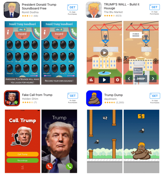
Now, to be fair, there’s a question of how much value a mobile app provides in the context of election season, and whether it’s necessary at all.
Clinton’s app, for instance, is unlikely to be downloaded by anyone other than active supporters and journalists trying to cover it. Then again, the app is designed with this reality in mind. It’s not a form of broad promotion, but targeted engagement, facilitating supporter activity in the campaign with news distribution, event invitations, participation opportunity information, and an option to donate. To that end, it’s another channel for her to motivate the folks willing to help her win.
Trump might not have an app… but he also might not need one. Trump supporter demographics primarily include undereducated, low income, angry voters. He doesn’t need a flashy app to get and keep their attention. Moreover, given that his get out the vote operations have historically been shoddy, and in some cases nonexistent, launching a mobile app is probably not the most productive thing his staff could be focusing on right now.
Verdict: Clinton by a mile. Gotta be in the game to win it.
Round Six: Social Media
It has been argued that social media is what handed President Obama the White House in both 2008 and 2012. There’s something to the theory. Maybe it’s not fair to attribute the impact of social media on the elections entirely to the Obama team; the explosive growth of social media use over that time frame (remember: Facebook was only a few years old during his first campaign) might have made such an impact inevitable.
Still, the effect of social media on the results is undeniable. The surreptitiously recorded clip of Mitt Romney’s now infamous “47%” remarks spread like wildfire across every platform, giving firm and fast legs to a story that might not have even registered in election cycles past. There are those who believe the gaffe might have been what cost him the election, and it only got to that level of influence because of the magnifying impact of social sharing.
The role of social media in this election is a little different. Our social networks have increasingly become echo chambers, with confirmation bias winning the day (even if that means we lose). But just because voter social media posts aren’t necessarily as influential doesn’t mean social media isn’t having an impact.
A big difference this time around is that the candidates are far more active on social media, particularly Twitter… just in strikingly different ways.
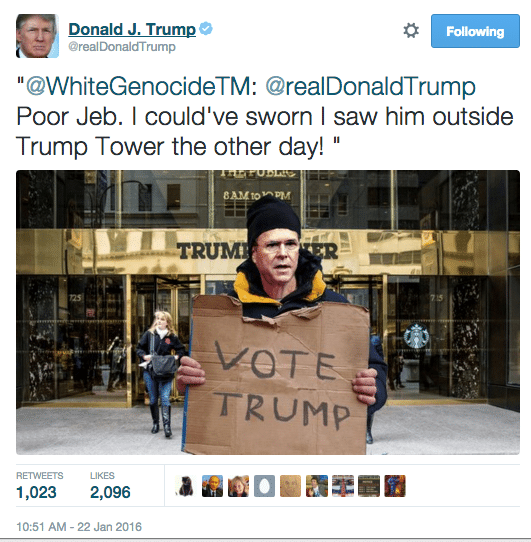
Trump is notorious for manning his own Twitter account — a choice that’s pretty unheard of in most political circles. But that’s always been his style, and with most of his supporters backing him because he “speaks his mind” and isn’t “PC”, what would likely be political suicide for other candidates is actually a boon or him among his base. It’s also led to a lot more press for him, as people mock or question his vernacular (“Sad!” “Loser!”) and spread the use of his nicknames for other candidates (“Lyin’ Ted Cruz” “Crooked Hillary”).
But it’s also brought a lot of negative attention down on his head. Trump isn’t one to look into the source of a lot of the content he retweets, which has caused no small amount of controversy. Time and time again, he and his campaign staff have been blasted for propping up unabashed white supremacists on their timelines, feeding into arguments that Trump and his candidacy are inherently racist.
Though the resulting negative PR from these tweets probably won’t do much to hurt him among current supporters, it does alienate traditional and moderate Republicans he’ll need in his coalition come November.
The Clinton campaign has taken a totally different approach, following in the footsteps of both the Obama campaigns and his administration, as well as adopting some of the snarkier tones embraced by the Democratic party. Her feeds are immaculately curated, with no content going out until it’s been vetted several times over. That’s pretty consistent with her carefully curated image, as well. It’s widely accepted that she’s not always good off the cuff, so it’s safer for her words to be very deliberately chosen. After facing decades of scrutiny, that’s probably a hard-learned lesson.
But that doesn’t mean the feed is dull. From the party itself to progressive organizations like NARAL, the use of humor, sacrasm, and memes has become a way of firing up supporters and engaging younger demographics among liberal leaning folk. The Clinton campaign has leaned into those tactics, partially because of their established efficacy, and partially because it drives Trump nuts, bringing out his more reckless side.

Clinton has also been much more prolific in her use of visual content, from graphics to video. Such content is historically more viewed and engaged with, so this is a smart move on her part. It helps that the design of this collateral has been pretty consistent throughout the campaign. The only lament here is that much of that visual content is still pretty traditional. Outside of the occasional and delightful snark that gets incorporated, much of the content is very obviously campaign material. More visual content that flirts with the peripheral of the campaign and greater inclusion of humor might help in terms of share rates.
But what about the numbers? Trump actually boasts higher follower counts on all major social platforms except Linkedin and Google+, but those networks are arguably the weakest platforms for user engagement and message exposure. Clinton has more traction on YouTube, and though the value of rich media such as YouTube is high, the site doesn’t have as many consistently active users with durable focus. Across the board, Trump sees higher engagement rates among his followers, and slightly higher positive mention rates. He also, though, sees higher negative mention rates.
These numbers need context, though. Trump supporters tend to be — how shall we put it? — a bit more rabid in their enthusiasm. Clinton’s numbers might also have been depressed as a result of a prolonged primary battle with Bernie Sanders. And generally speaking, it’s pretty difficult to get an accurate read on mentions and sentiment, which is especially true in a world where hashtags sometimes are substituted for names (#HillYes) and taglines can replace direct mentions ([insert supportive comment here] #makeamericagreatagain). Sarcasm is difficult for programs to parse, as well. It’s just not as simple as the metrics might suggest.
Verdict: Clinton. She’s got stronger game and is less of a liability to herself than Trump.
Round Seven: Speech and PR
When comparing Clinton and Trump’s PR strategies and execution, there, again, really is no comparison. That’s partly by design.
As we discussed above, Trump is known for bucking the idea of scripted talking points. Sure, he has some he’ll hit over and over again (building the wall, for instance), but one of the issues that’s plagued his campaign is inconsistent positioning and outright falsehoods. There have been plenty of examples here, ranging from statements about his relationship with Putin to a bizarre quibble involving the NFL and the general election debate schedule. Perhaps most damning has been the ongoing storm surrounding purported donations to veterans’ charities, especially against the backdrop of a damaging public standoff with the parents of a fallen soldier who spoke at the DNC. Not helping matters is the fact that, when caught in a lie, Trump tends to double down instead of course correcting.
This doesn’t seem to matter among those who support him. Trump has rather effectively leveraged the criticism of “gotcha” journalism popularized by Sarah Palin in 2008. But again, this narrowly tailored strategy (if you can call it that) is probably not helping things among those moderate voters he so desperately needs. From establishment political leaders to traditional voters, growing apathy and distaste could prove to be devastating at the polls.
Clinton’s style is the polar opposite of Trump’s. Her speeches and public statements are hyper-stylized, and her campaign scheduling is designed to minimize the possibility of unpredictable engagements. To some end, it makes sense. Testy moments with Black Lives Matter activists during the primary season, for example, caused some backlash. But it’s not just about voter interactions. She shuts everyone out. Notably, she hasn’t held a press conference in over 240 days, much to the chagrin of reporters trying to hold her accountable.
There’s a significant downside to this defensive posturing. Clinton, like Trump, faces record likability deficits, which has largely been attributed to the perception that she’s too scripted. Much like Trump’s abrasive style might not hurt him among existing supporters, the idea that Clinton isn’t a great communicator probably doesn’t impact her with her current fan base, which tends to be more focused on her wonkish ways. But among undecided voters, a more authentic voice could do wonders for her poll numbers, especially with recent (if tepid) attempts to engage disaffected Republican moderates.
Verdict: Clinton, once more because her style is less of a liability than Trump’s.
Final Score

When everything is tallied, Clinton comes out ahead, winning 5 of the 7 categories discussed. It’s closer than that tally reveals, though — and arguably much closer than it should be.
But does it matter?
Trump’s primary campaign, in historical context, should have been over before it began in earnest. In any other election cycle, claiming that all undocumented immigrants from Mexico are rapists and drug dealers would have immediately sunk a candidacy. His comments on women during those early debates should have done him in, as well. And the penis jokes? Seriously?
But there’s not a single journalist, academic, or politico watching this election who doesn’t agree that it has proven to be a totally different animal than elections gone by. So while Clinton is ahead in terms of her branding and marketing strategies, that might not mean as much as it might have four, eight, or even twenty years ago.
Further complicating matters is that there’s a growing contingent of voters looking for a third party candidate — many more than were contemplating such a vote in 2008 and 2012. Historically, such trends can muck up even the best branding and marketing strategies during a campaign; remember Ross Perot?
Still, it’s sort of fun to sit back and look at the decisions being made from a branding and marketing perspective. And to be fair, there’s probably a lot that can be learned by watching everything unfold. Your company might not be contemplating a billion dollar marketing strategy, but by paying attention to what works and what doesn’t in this election, you might just get some ideas for your own branding and marketing efforts.

Design Done Better
The easiest way to get affordable, high-quality custom logos, print design, web design and naming for your business.
Learn How to Grow Your Business With Beautiful Design