
Two percent is the average conversion rate for ecommerce sites. While every site is different—and you’ll benefit far more by focusing on your conversion rate—that’s where most sites are today.
But what if a 2% conversion rate isn’t enough to stay profitable?
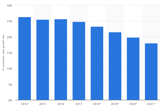
Right now, many ecommerce companies can still grow with an average conversion rate. This is largely thanks to the ecommerce industry growing by about 23% year over year.
But that growth may be slowing. By 2021, the ecommerce growth rate is projected to drop by as much as 5–6%, down to about 17%.
To nurture growth in the years to come, you’ll have to find ways to boost your conversion rate—regardless of where it is now.
One area of opportunity is ecommerce landing pages. Top landing pages can see double-digit conversion rates for pre-sale opt-ins. Why? Because landing pages deliver a more tailored, conversion-focused experience for users.
This post:
- Explains key differences between ecommerce landing pages and product pages.
- Highlights elements of successful ecommerce landing pages.
- Offers two case studies to show how ecommerce companies are using landing pages.
Ecommerce landing pages vs. product pages
Product pages and landing pages have the same goal: converting the user into a customer. The difference is how they approach each visitor.
A landing page is an individualized funnel with a single goal: converting incoming traffic (typically coming from emails, paid ads, or social media campaigns) into a qualified lead or sale. The conversion is what’s important here, not the completeness of information.
A product page nudges the user in the same direction, but it also informs all visitors—from any potential traffic source—about the product, similar products, policies, etc.
Ultimately, landing pages cut to the chase. As Tim Ash, author of Landing Page Optimization, wrote:
If the visitor can’t find something easily, it does not exist. If you emphasize too many items, all of them lose importance. Any delay increases frustration.
Consider an example of a landing page from Airbnb:
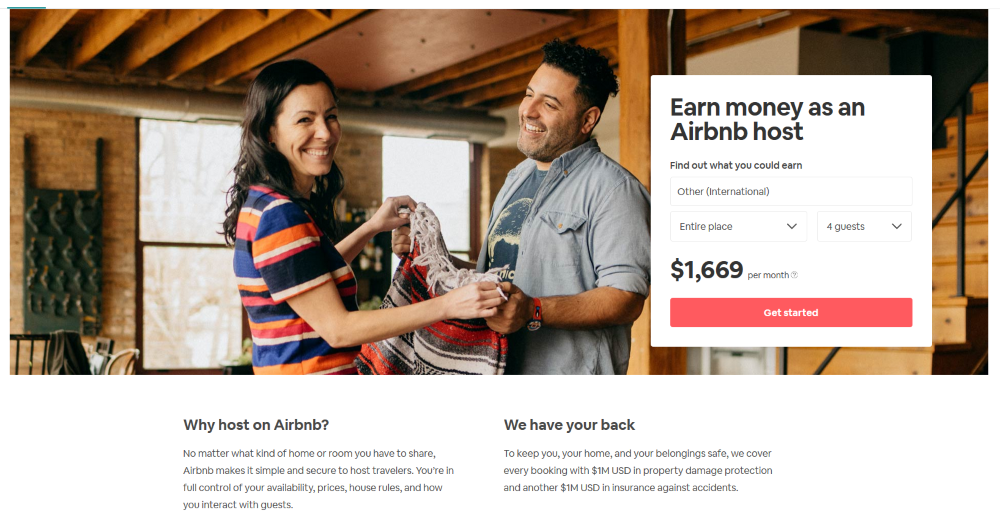
The goal of this landing page is to get people who are interested in hosting on Airbnb to click “Get started.” Everything is built around that, including:
- Customized information. Notice the “$1,669 per month” calculation? This is a tool specific to Airbnb. It uses standard prices based on a user’s IP address and generates an estimate of what they might fetch as a host. Customized information like this is a hallmark of single-purpose landing pages.
- Simplicity. With a simple white pull-out box that makes the “Get Started” button even more obvious, this page doesn’t want you to stay very long. It wants you to keep moving through the sales funnel.
- Emotional connection. This is one key distinction between landing pages and product pages: the emphasis on emotion. From the section “We have your back” to the crisp visual of a couple happily hosting on Airbnb, there’s a clear effort to project the emotion a visitor will feel if they click on the call to action (CTA).
In contrast, take an Amazon product page for a stand mixer. Here’s what you’ll see:
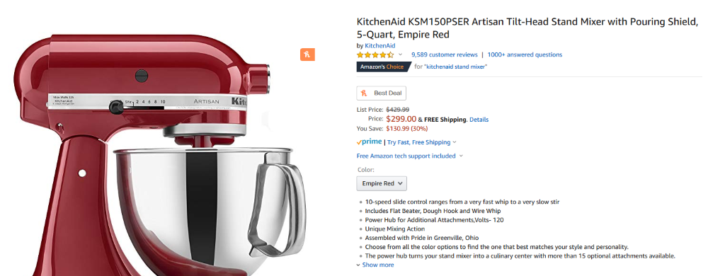
- Prominent features listings. Notice how the product photograph—however striking—doesn’t take up much real estate? That’s because a product page is largely defined by the information it provides. Amazon emphasizes details like customer reviews, color, product description, and price. Each key answer is “above the fold,” whereas on a landing page, further details might be pushed down.
- Proof. From social proof (thousands of customer reviews, “Amazon’s Choice,” 1,000+ answered questions) to visual proof with information-focused product imagery, the product page is a digital version of picking up a box in the store.
- Options. A product page is also a place where customers can select from a few options: shipping details, product features like color or size, and usually similar product recommendations.
Personalized sales content is not the focus of a product page. Instead, product pages usually deliver one-size-fits-all information, options, and alternative navigation routes.
This can feel overwhelming for the shopper and increase cognitive load, potentially leading to decision paralysis—and no action at all. Clear, simple landing pages can create a distraction-free path to purchase.
Even with tailored landing pages, however, plenty of users will land first on your product pages. Here are some keys to optimizing them.
Optimizing ecommerce product pages
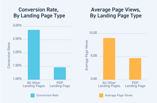
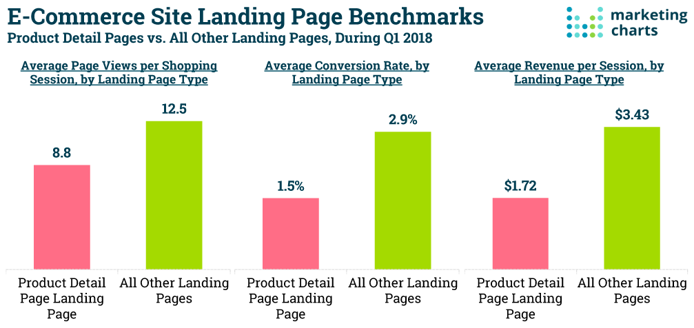
Compared to optimized landing pages, product detail pages (PDP) can reduce purchase likelihood by 50%:
So, yes, landing pages often convert better. But even with landing pages, people coming to your site from sources like organic search will still hit your product pages first.
With that in mind, make sure your product pages are optimized, too. This will help make your landing page, which they may encounter later in the sales funnel, more successful. CXL has written about ecommerce product pages and related elements many times before:
Product page design and UX
- What Nike.com (and Others) Can Teach You About Building Persuasive Product Pages
- 10 Product Recommendation Techniques to Improve UX and Conversions
- How to Optimize Out of Stock Product Pages
- Why Ecommerce Product Filtering Is Broken (and How to Fix It)
- Product Bundling Strategy: How to Get It Right
- 5 Critical Factors for Optimizing Luxury Ecommerce Sites
Product page copywriting
- The Complete Guide to Writing Product Descriptions That Convert
- Using Message-Mining to Pinpoint a High-Converting Value Proposition for Your Product
As the (non-exhaustive) list above suggests, covering product page optimization in full is outside the scope of this post. But, at the very least, consider the following strategies that can help reduce distractions, tailor content, and make it easier to target past site visitors:
- Navigational tools. Minimize them. Navigation that makes sense for your homepage may distract on a product page.
- Traffic source. Tailor on-page offers so they’re relevant to the channel the visitor is coming from (like Google Ads, social ads, etc.)
- Tracking. An advertising pixel such as a Facebook pixel can help improve sponsored marketing to track conversions and indicate the most effective ads to target customers.
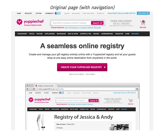
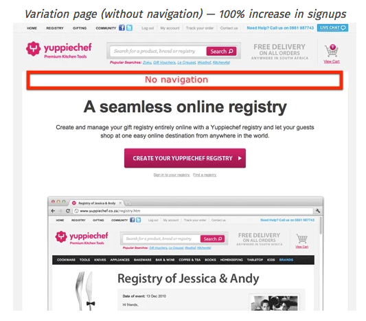
Subtle changes to product pages (such as removing a navigation bar) can have a big impact. Yuppiechef, for example, removed the navigation bar from a registration page and increased conversions from 3 to 6%.
Optimizing product pages improves their ability to make sales and serve as a (somewhat generic) landing page. Since about 96% of visitors aren’t ready to buy when they arrive on a product page, enhancing it to serve new visitors can help you make sales, even if those sales don’t occur during the initial visit.
How do you improve conversions for past visitors? Ecommerce landing pages offer an answer.
Optimizing ecommerce landing pages
The concept behind ecommerce landing pages is simple: They convert traffic into sales. We see the impact of that narrow focus reflected in conversion rates:
A tailored landing page comes with a number of potential advantages:
- Limited distractions. Remember how removing navigation links improved conversions by 100%? Landing pages with limited distractions tend to perform better, even though only 16% of landing pages don’t have navigation bars.
- A single CTA. Landing pages with multiple offers generate 266% fewer leads than single-offer pages. Limiting the choices on a landing page directs the focus exactly where you want it to go.
- Tighter targeting. The more landing pages you create, the more tightly targeted your landing pages can be. That’s why businesses with over 40 landing pages tend to convert as many as 12 times the opportunities of businesses running 10–15 pages.
- Rapid adjustments. Landing pages enable quick iterations and real-time changes, like when a sale is happening.
If highly optimized landing pages represent an opportunity, who’s realizing it?
Case studies: ecommerce merchants experimenting with landing pages
Several ecommerce site builders like Shogun, Zipify, and PageStudio allow Shopify store owners to create and launch specialty landing pages for online products or events. Two case studies show the potential.
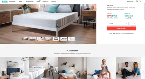
Leesa: Tailored landing pages for a small product line
Mattress company Leesa saw a 35% increase in conversion rates and 25% increase in average order value when they introduced optimized landing pages. What worked so well for them?
They followed several landing page best practices while also incorporating elements like:
- A countdown timer. The on-page countdown timer helped create a sense of urgency and scarcity for each visitor, which nudged them closer to taking action and completing the purchase (as they knew the deal ended soon):
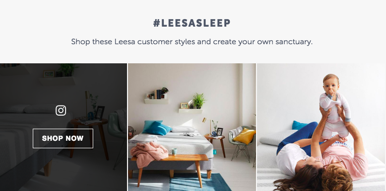
- Social proof. A good idea for any sales-oriented page, including testimonials and reviews from happy customers lent the “wisdom of the crowd” and helped eliminate uncertainty about the purchase:
- Optimization for social ad traffic. Because Facebook and Instagram ads allow for targeting based on demographics, psychographics, past purchases, and site visits, Leesa optimized its landing pages for specific demographics. On-page images, copy, and messaging were carefully curated, spotlighting images of families and parents when relevant, for example:
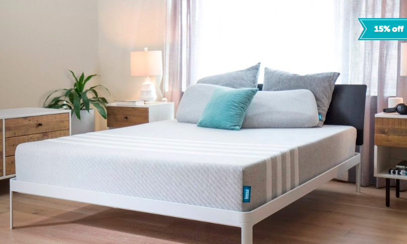
- High-quality hero image: A clean, professional image of the product in use provided relevant visual context and helped customers envision themselves incorporating the product into their lives. Again, the focus on imagery helps distinguish a landing page from a product page:
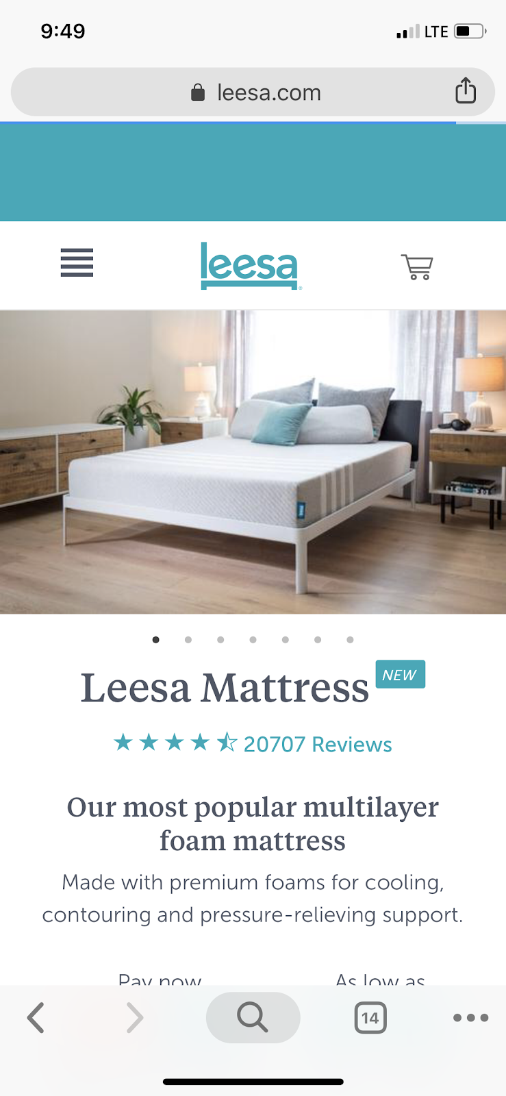
- Simple, large CTA button: Because the CTA was simple and large, it was easy to find, captured a visitor’s attention, and made the conversion path clear.
- Mobile optimization. By using a landing page that was easy to navigate and view on mobile, Leesa accommodated its mobile shopper demographic and captured more sales:


Nick Raushenbush, co-founder of Shogun, noted that, among other things, Leesa succeeded “by eliminating any remaining uncertainty with their free shipping and returns policy.”
Landing pages are appealing for merchants with a small selection of product offerings (like Leesa) because fewer landing pages are needed.
Online retailers with wider product offerings can group or batch products on landing pages to eliminate distractions around the sales funnel.
Let’s look at an example.
Blenders Eyewear: Batch products on landing pages
In another use-case, featuring Blenders Eyewear, we can see how landing pages work within a long-term sales strategy rather than a one-off sales event.
Why did Blenders decide to try out landing pages? Chase Fisher, CEO of Blenders Eyewear, explained that landing pages tied in nicely with their storytelling and customer experience efforts in cross-channel experiences:
We started using social and email marketing as a way of driving people to specialty landing pages to “see more” of the content we were posting. We use landing pages as a way of visual merchandising our products, educating our customers, or telling a story.
Blenders uses multiple landing pages (usually between three and five) that run at the same time. They segment customers to show only the versions that are most relevant to them.
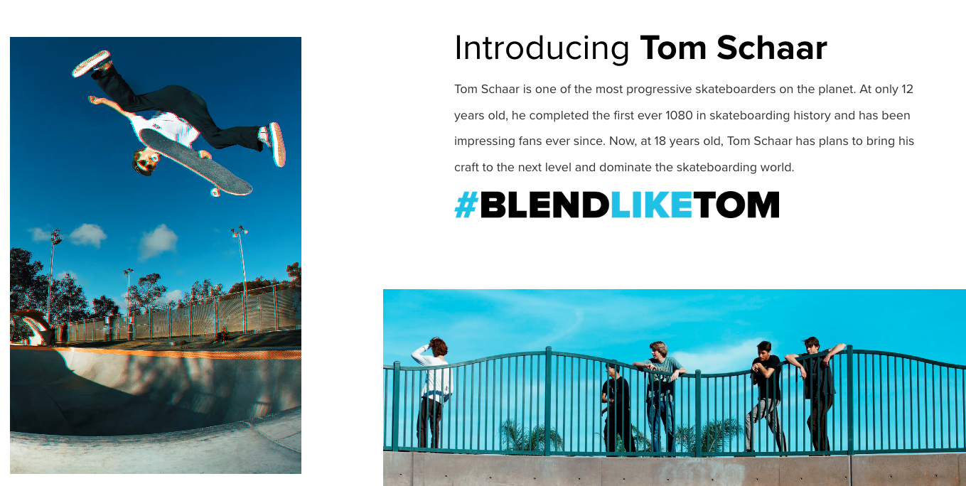
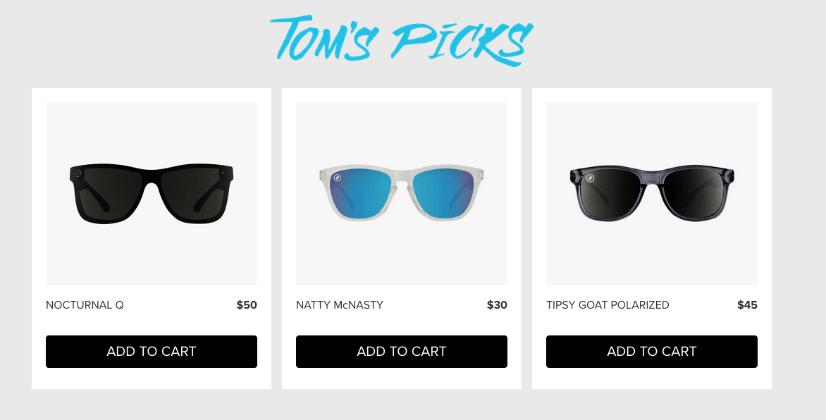
One example is their landing page promoting a partnership with athlete and skateboarder Tom Schaar, which resonates with a young, skateboarding-interested audience:
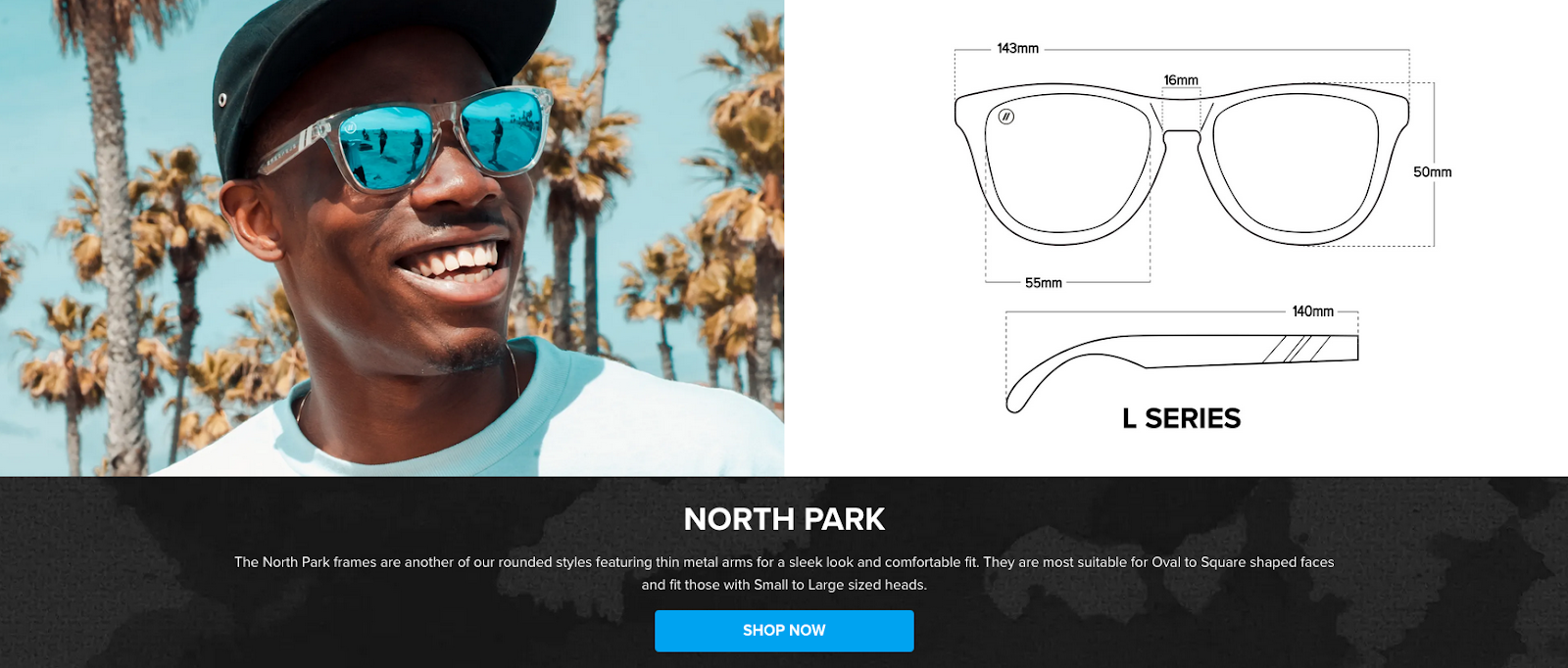
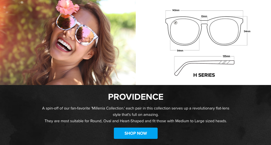
They also have a landing page that paid campaigns and support teams rely on to persuade bottom-of-funnel customers. The Blenders Eyewear Fit Guide landing page is an alternative to the company’s traditional product pages. (In their main navigation, Blenders links to a simpler, text-heavy Fit Guide.)
Blenders drives traffic to the page with PPC ads and has also integrated the page into support tickets. Support team members refer users to the landing page to help with the exchange process or guide them through fit-related questions.
The landing page resolves a host of potential objections:
- Helps shoppers find a style they’re confident with;
- Educates them on the differences between frames and sizing;
- Spells out specifics around measurements.
Blenders has seen this landing page outperform a standard product page time and again—driving a higher conversion rate (3.13%) and producing more sales for the brand (1,319 orders per month).
Taking Ecommerce Landing Pages a Step Further
This approach doesn’t have to stop here, however. Just as it makes sense to drive traffic to landing pages instead of product pages, that same logic extends to the entire funnel.
Plenty of important things happen after the visitor converts on a landing page—opportunities to continue the conversation (and potentially increase average order value) on the checkout page, via upsells, and on the thank-you page.
“Marketers need full control of the entire funnel, from the time a shopper clicks on an ad, all the way through to the thank you page,” said Jordan Gal, Founder of CartHook. “This means the marketing team needs to be able to tailor each individual funnel. Marketers should never make compromises to their strategy just to accommodate the limitations of the store theme or platform.”
Marketers can build fully customizable funnels, all while pushing order data into the same Shopify store. The marketing team can then create an infinite number of funnels that consist of landing pages, checkout pages, upsell offers, and thank you pages.
So, what does this look like in action?
How natural stacks uses landing pages for split-testing
Natural Stacks is an ecommerce company focused on brain health in the natural health niche. Their products often require more education (across several touchpoints) before the first conversion is made.
Because they have so many custom formulas to talk about, they need the flexibility to test and iterate quickly on new messaging and landing page approaches to match traffic sources (e.g. social ads, email marketing, PPC campaigns, etc.).
Taking the comprehensive ecommerce funnel approach outlined above, they pair ClickFunnels and CartHook to build a landing page that integrates with their online checkout experience, all while importing the data back into Shopify, which acts as the CRM. From there, orders are sent to Shipstation.
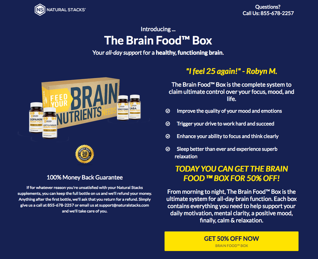
Here’s that approach on TryBrainFood.com, one of the brand’s landing pages that promotes the Brain Food product line:
Using the funnel strategy described above to sell the Shopify SKU and embedded Improvely links on the Clickfunnels buttons, they can split test each funnel, gathering rich data on performance.
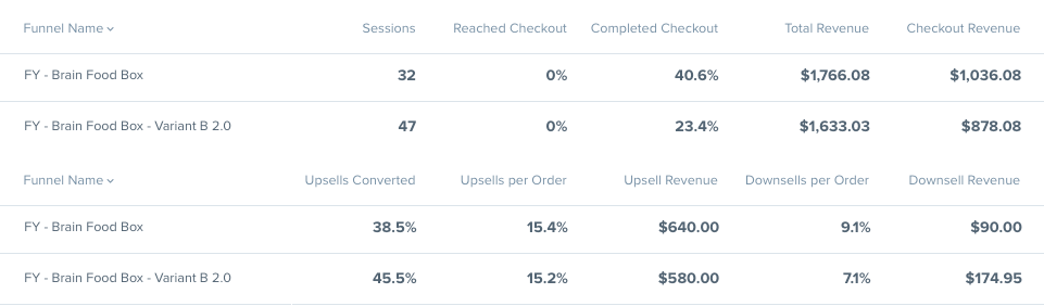
This information paints a clear picture of which upsell or downsell funnel converts better and generates more revenue. With this, they can also more accurately measure the performance of different marketing channels (like sponsorships on podcast and radio shows) to see which work best.
Conclusion
Ecommerce landing pages are still a fairly new tactic. Product pages remain the norm. However, product pages are usually one-size-fits-all pages that can be visually distracting and informationally overwhelming.
Ecommerce landing pages streamline the user experience, focusing users on the next step in the funnel with highly customized content. Companies with a small product line can quickly generate multiple versions of a page to serve various audiences and channels.
Even for companies with larger product lines, the ability to batch products or create an alternative product page—one that addresses the concerns of bottom-of-funnel users—can increase conversions.
Related Posts
-

In today's review I'm reviewing 2 different ecommerce product pages. Watch this 5-minute review: Pages…
-
If you're selling in a competitive market, you must live & die by the little things…
-
It took us six rounds of tests until we landed on a variation that was…
-
We talk a lot about creating high converting landing pages, getting traffic that converts, and…


I read your blog. After reading your blog, I earn a lot of changes your blog is better, I will also ask your contacts to read your blog.