Why Beautiful Design Isn’t Always Best For Small Businesses and Startups

There’s always beauty in good design, but good design isn’t always beautiful.
How can this be true?
The answer is simple.
Good looks aren’t everything, as Steve Jobs liked to remind people:
Most people make the mistake of thinking design is what it looks like. People think it’s this veneer – that the designers are handed this box and told, “Make it look good!” That’s not what we think design is. It’s not just what it looks like and feels like. Design is how it works.
You can have a good design that isn’t beautiful, but you can’t have a good design that isn’t functional.
You don’t have to look further than a site like Craigslist, with its infamously austere look, for proof that unattractive websites can be popular and functionally easy to use.
What is it that draws people to use sites that are otherwise considered to be a little less than easy on the eyes?
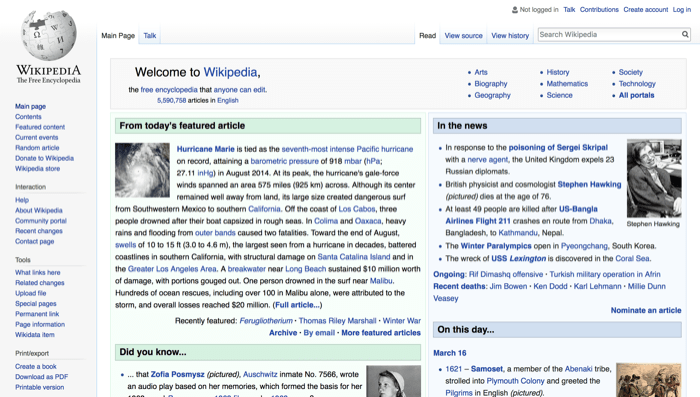
Wikipedia is a great example of a site that is generally considered to be unattractive but hugely popular because of its usefulness and unique content
Just because something is beautiful doesn’t make it successful. In fact, we just explored this paradox in 7 Epic Product Fails and the Valuable Lessons They Can Teach Your Small Business.
The power of being useful
Offer compelling content
More than anything, sites with great content can overcome even the worst visual design.
You don’t have to look further than institutions like Wikipedia or IMDB for examples of sites that make up for their lack of aesthetic appeal with compelling content.

Web veteran The Drudge Report is a prime example of a popular yet unattractive website.
Basecamp founder Jason Fried once called the Drudge Report “one of the best-designed sites on the web.”
At first, Fried’s statement seems odd and misplaced. But it makes perfect sense, as Fried explains:
To clarify, my definition of design goes beyond aesthetic qualities and into areas of maintenance, cost, profitability, speed, and purpose. However, I still think that the Drudge Report is an aesthetic masterpiece even though I also consider it ugly. Can good design also be ugly? I think Drudge proves it can.
Fried pointed to several qualities that make The Drudge Report noteworthy, including that:
- It has stayed consistent through many trends,
- Its design was unique (and thus made it stand out in comparison to the bigger news sites), and
- It provided content no other site offered.
The important lesson for small businesses and startups is to build a foundation of meaningful, relevant content, user experience, and usability, including mobile app usability testing, before worrying about making things pretty.
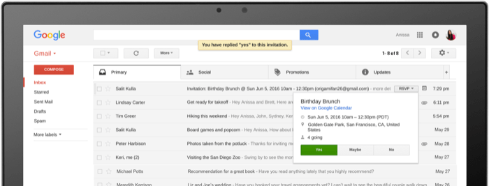
Gmail’s functionality has more than made up for its not being considered a beautiful design.
Be unique
Sites that offer something unique can overcome less than appealing designs.
Two sites that exemplify this concept of function over form are Gmail and eBay.
Both sites have long been considered unattractive and have been the subject of many unsolicited redesigns.
Even so, both have been popular for decades, outlasting many other more aesthetically pleasing competitors.
Essential Branding Toolkit for Entrepreneurs
Build a stronger brand with our free guides. Get actionable insights to define your brand’s unique voice, understand your market, and stand out to customers. The guides are concise, actionable, practical, and tailored for the busy entrepreneur.
- The Ultimate Branding Checklist
- Crafting Your Unique Value Proposition
- Build Your Brand Pillars Worksheet
- Market Research Kit
For Gmail, the power of its search, its generous allotment of storage, and how quick and efficient it makes working with email are all unique features that make it stand out amongst countless email competitors.
Regarding online sales and e-commerce, eBay may have the first-mover advantage, but it’s also the power of its auction tools and the site’s many buyers and sellers that make it one of the top 50 most popular sites on the web.
The important lesson for small businesses and startups: aims to provide a unique experience or features that can’t be found anywhere else.
A second important lesson for small businesses and startups is remembering this across all your visual design efforts. For example, strive for uniqueness when it comes to your brand. Make sure your company’s name and logo stand out from your competition. Avoid generic design at all costs because generic design will only damage your business.

MySpace is a site that was notorious for having a terribly designed site that was still very popular due to its social reach.
Facilitate social connections
If MySpace did anything (besides providing the business world with a fascinating train wreck), it proved that people would tolerate a garish, aggressively user-hostile design to be amongst friends.
Creating and maintaining a site based on a social network is challenging and probably not something most businesses would consider taking on.
The concept that makes social networks successful can be used effectively by businesses looking to make their sites more compelling.
Many tools are available to small businesses who want to make their sites more social and communicative.
Chat widgets provided by services like Drift, Intercom, and Zendesk make it easy to connect your customers directly with staff.
Another option is to give your customers a more conversational experience by integrating chatbots into your site.
The important lesson for small businesses and startups is to make your site more sticky and enable connections for your customers through direct interactions with your staff or other customers or via chatbots.
The power of user experience and usability
As we’ve shown, making your site (or product) useful is crucial to its success.
Visual design remains important, but a plain-looking site can still be functional and useful.
Simply put: design has to make the site, product, or service easy to use.
Remember the Steve Jobs quote we mentioned earlier? Good design is about how something looks AND how it works.
A visually stunning site with poor user experience, usability, and little relevance or utility, is probably doomed to be left in the dustbins of the web.
Steven Bradley, the author of several design books, including Design Fundamentals: Elements, Attributes, & Principals, translated Maslow’s hierarchy of needs into a hierarchy of needs for the design.

The most important needs are functionality, reliability, and usability. You’ll notice that all of the examples we’ve offered in this article meet those needs.
There are many factors that create a good user experience. These factors include:
- Have a clear, consistent navigation,
- Provide an uncluttered, goal-focused layout,
- Make it fast,
- Be responsive to a site visitor’s actions,
- Do not be aggressive – no popups, unexpected videos autoplaying, irrelevant notifications, or invasive advertising,
- Work properly – no broken links, weird layout issues, etc. and
- Be readable.
The important lesson for small businesses and startups: Invest as much effort, if not more, into user experience and usability as you invest in making designs pretty.
Build consistent and sensible navigation
The primary goal of a site or app is to provide people with access to the content and features they need to solve a particular problem or provide information.
We provide access to these crucial things through navigation, which is made up of links, buttons, menus, and alternative methods like search.
Many elements make site and app navigation usable, but there are some best practices that most designers agree are important to follow.
One of the most effective navigation design practices is to be consistent.
Every time someone uses a new site or app, they must learn how to use it.
Where is the navigation? Where will I get if I click this button? How do I get back to here if I follow this link?
You can help people find their way by providing them with navigation that uses techniques seen elsewhere.
This allows people to leverage knowledge learned from using other sites and apps so they’re not starting from scratch. Some of these techniques include:
- Make the main navigation easy to find and place it in the same location on every screen.
- Inform people of where they are at all times by highlighting the current screen in the navigation, displaying appropriate page titles, and using “you are here” elements like breadcrumb navigation (read about “wayfinding” to learn more).
- Show only relevant and related navigation items whenever possible to reduce clutter.
- When required, make the search easy to access and find.
Provide a focused layout
The goal of a screen or page is to guide people to the information and features they need.
Make sure you optimize your layouts for these goals and remove anything that either gets in the way of these goals or is irrelevant.
To paraphrase Strunk and White’s Elements of Style: “omit needless elements.”
Make it fast and be responsive
Slow websites and apps can be the death of even the best products.
One of the longest-lived best practices for successful digital products is to make them fast and responsive.
Don’t make your customers wait after clicking a link or tapping a button.
When you need to make them wait (for example, displaying a long list of products or fetching inventory information), give them some indication that things are happening. It can be as simple as displaying a spinner or another “loading” image.
As Google pointed out:
Slow loading sites frustrate users and negatively impact publishers. In our new study, “The Need for Mobile Speed”, we found that 53% of mobile site visits are abandoned if pages take longer than 3 seconds to load.
Google isn’t just spouting advice on how speed impacts your site users; as of January 2018, they’re also penalizing slow sites in their search results.
This means you have double the incentive to make sure your site and app perform quickly.
Don’t be aggressive
As mentioned, people use your site and app to perform an action or find information.
Tossing blockers in their paths like pop-up windows, intrusive advertising, or unwanted notifications can hurt their goodwill and patience.
Don’t let your site be one of the bad guys!
Make sure your site or app works
The only thing that negatively impacts people’s confidence in a site more than poor grammar or spelling is a site that doesn’t work.
Links or buttons that lead to nowhere, layouts that display strangely, or apps that spontaneously crash can greatly impact how your business is perceived.
Before you launch a new site or app, you should go through thorough testing to make sure everything works as expected.
There are numerous online services that check for broken links and some that will even check the content, speed, and other crucial tests.
Google’s Webmaster Tools does all of this for free, as do Nibbler, Sitechecker Pro, and Dead Link Checker.
Make your site or app easy to read
You can have all of the compelling content in the world, but if it’s hard to read, it’s not doing you any favors.
Make sure your information is easy to read, so it has the best chance of being read.
This is even more important in other forms of visual design, such as logos and packaging design.
Modern trends in logo design all point to making the logo both good-looking and functionally easy to read and remember.
Similarly, modern packaging design trends go beyond beauty in engaging prospective customers.
When creating (or improving) websites and apps, there are several changes you can make to improve the readability of your text. Some quick fixes include:
- Make sure the text size is large enough. A common recommendation is to ensure the text is no smaller than 16 pixels. Not sure what 16 pixels look like? Most web browsers default to that size, so you should be okay if you’re not making your text smaller than the defaults.
- Use white space to give your text visual breathing room. Adding space around each of the lines (called “line height” or “leading” in typographical terms) helps to separate the lines and increases the readability.
- Add margins and padding to the text itself. You don’t need to (nor should you) fill the entire screen width with text. Adding spacing on the top, bottom, and left and right of the text makes reading less stressful as it’s easier to focus.
- Use enough contrast between your text and the background it appears on top of. Too little contrast between the two makes the text harder to pick out from the background. The best possible choice is to have black text on a white background.
The bottom line: strong user experience and usability can compensate for even the most basic design. Make both a priority for your site or app.
Wrapping up
One of the first lessons a good creative learns is that website and app design is not always art, and creatives are not always artists.
Designers are more like artisans, crafting things that are designed to be used.
The reality is that users will tolerate poor visual design if the content or benefit of the site is strong enough.
That doesn’t mean you should ignore how your site looks.
After all, numerous studies show that attractive designs are easier to use.
First impressions are very important, as we discussed when we looked at the effects of good design on business:
Three studies found that a mere 50 milliseconds were all people needed to form an opinion about a website. Google performed similar testing and found an even slimmer margin: a speedy 17 to 50 milliseconds were all people needed to decide how they felt about a website.
If you decide to rebrand your business or update your site or app to improve its aesthetics, crowdspring’s creatives can help you navigate this process.
Just remember what we said when we started this discussion: there’s always beauty in good design, but good design isn’t always beautiful.

Design Done Better
The easiest way to get affordable, high-quality custom logos, print design, web design and naming for your business.
Learn How to Grow Your Business With Beautiful Design