13 Proven Ways To Optimize Small Business Website Conversions

Americans are in love with the Internet.
Recently, the Pew Research Center revealed that 8-in-10 Americans shop online.
And 9-in-10 Americans are online in some form.
Today’s youth doesn’t know a world without the internet, and even senior citizens are adopting technology faster than ever. (Pew research shows that 67% of seniors are active online, and 42% own smartphones.)
Faced with numbers like these, there’s no question that your small business needs a website.
Even if you already have a website, is it optimized to convert people browsing into customers?
Your customers and prospects want to access your business on their timeline at their convenience.
And that’s the brilliance of a website. It’s your online brand ambassador day or night.
But it’s not enough for your website to just hang out on the great wide web, gathering pixel dust.
People may be in love with the Internet, but they’re also more savvy consumers than ever before.
It needs to be optimized to convert to get the most from your website.
Conversion optimization means getting your visitors to take actions you want them to take. Wikipedia explains:
In internet marketing, conversion optimization, or conversion rate optimization (CRO) is a system for increasing the percentage of visitors to a website that convert into customers, or more generally, take any desired action on a webpage. It is commonly referred to as CRO.
Your conversion rate is a simple formula:

You define your goal(s) and then simply track visitors.
The average conversion rate for websites that sell products and services is 1%-2%. But some websites do a phenomenal job converting visitors; their conversion rates can easily be 2x or 3x (or more!).
Why should you care about conversion rate optimization?
The answer is simple. Improving your conversion rate is the easiest way to increase revenues and profits for your business.
Here are 13 proven ways to optimize your website to convert website visitors into customers:
- Put Your Home Page to Work
- Remove the Visual “Noise”
- Limit Navigation Options
- Create a Clear Flow of Action
- Make it Easy to Read
- Stay True to Your Visual Brand
- Only Ask for ONE Thing
- Head Off Concerns
- Optimize Your Load Speeds
- Optimize for Mobile
- Design for Your Audience
- Present a Clear Unique Value Proposition
- Test, Test, Test!
Let’s review each of these tactics so that you can implement them on your site.
But before we do that, here are a few words about website design pricing. Some business owners worry that the cost of website design can be prohibitively high.
Many design companies and agencies indeed charge thousands of dollars for their services. But this isn’t universally true (crowdspring’s website design projects start at just $899, including all fees).
And, importantly, conversion rate optimization will help you to make money. Most of the time, you have to spend some money to make more money.
Decrease Friction
Most people don’t like to work hard.
Let’s be honest; for some of us, encountering even a little resistance can derail our best intentions.
There is a vital business lesson in that nearly universal truth. If you want people to do anything, you must make it easy.
In other words, you’ve got to reduce the friction.
Conversion expert Jeremy Smith defines friction this way:
Friction is any variable (on or off a website), that negatively affects or distracts from the user’s experience on your site…anything that slows a user down— a sticking point or something that rubs them the wrong way— is friction and can block a potential conversion.
So, if you want someone to respond to your call to action, you have to make it easy.
These web design tips will help remove friction and make it easy for future subscribers, clients, or customers to complete your call to action.
We just emailed the info to you.
1. Put Your Home Page to Work
Your home page is arguably the most important page on your website. Most of the visitors to your website start there. So, ensure you’re using that valuable digital real estate.
We recently looked at how you can evaluate whether it’s time to update your small business website. As we wrote there:
With so much to gain, your website should be working for you, not against. The stakes are too high to risk losing business due to weak website design or poor user experience. So don’t leave it to chance.
Your homepage should not only identify and introduce your business; it should also include an articulated call to action.
By placing your CTA on your homepage, you remove the friction of searching for or navigating to another page. This makes it very easy for motivated customers to accomplish what they’ve come to your site to do.
It also increases the chance that you may also capture the attention of less motivated viewers and encourage them to act before they have a chance to lose interest and wander off. This increases the likelihood that these customers may convert as well.
We recommend you read Grow Your Small Business With These 7 Website Design Best Practices and 10 Important Web Design Best Practices and Tips for Small Business Websites to learn more about putting your home page to work.
2. Remove the Visual “Noise”

Image courtesy of Pandora
A visually busy web page is an unsuccessful web page.
If your website has buttons people can click, flashing ads, and verbose copy, your audience doesn’t know where to look. As a result, the viewer might miss your website’s most important conversion element – the call to action.
Jayson DeMers, founder and CEO of AudienceBloom, and Forbes’ contributor points out:
Sometimes, companies will offer a call-to-action in a sea of other readable, interactive material. For example, you might have an email signup form next to a banner ad that one of your sponsors pays for, or have your call-to-action at the end of a blog post, where there are also links to related content articles. When you divide a user’s attention this way, you’re splitting their chances of completing the conversion into a fraction of what it was previously.
So, clear out the visual clutter.
Eliminate unnecessary graphic design elements. Streamline your copy. Embrace negative (white) space in your website design.
Pandora’s homepage does an admirable job of clearing out the visual noise. Their call to action floats over a serene field of blue negative space. And as a result, your eye is drawn almost effortlessly to their CTA.
Follow Pandora’s lead and include only the elements (such as your company logo) that are most important to help your viewers see and interact with your call to action.
3. Limit Navigation Options
Ideally, you want to motivate a customer to remain on the page where your call to action is long enough to engage with it. One way to accomplish this is to limit the number of places a viewer can click.
Only include essential navigation options on your main menu. (For landing pages, you may consider eliminating navigation menus.)
Even if you have a complex website with many pages and lots of information, you can share the rest of your site with the customer at another time – after they’ve converted.
4. Create a Clear Flow of Action

Image courtesy of Slack
Where would you rather stroll down the hall of mirrors at Versailles or through a hoarder’s apartment crammed with 1970s fashion, dirty cookware, and stacks of National Geographic back issues?
One offers a clear and attractive path of progression.
The other… not so much.
Design your website to create a clear, logical path to follow. Use visuals and text to direct the viewer’s eye to the next information or step in the process.
Slack’s website provides a great example. The grey dots on the left side of the screen allow you to click through an explanation of how Slack works and Slack’s benefits. The final dot brings you back to the call to action above.
It should be effortless for a prospective lead to complete your call to action. If viewers can easily follow the path you’ve laid out for them, they will be more inclined to do so.
5. Make It Easy To Read
Font choice and line spacings are important elements of your website design – and an important factor to consider when reducing viewer friction.
If your audience can’t easily read the copy on your website, they probably won’t waste their time trying.
They’ll click elsewhere.
So, carefully consider your font choices for aesthetic value and ease of reading. To learn more about what makes a typeface easily legible, check out this article from Allan Haley of Fonts.com.
And don’t forget the line spacing.
Line spacing is the vertical space between two lines of text. Text that is closely crunched or spaced too widely is harder to read. According to Practical Typography, the optimal line spacing is 120% – 145% of the text point size.
Decrease Mental Friction
Friction can come in many forms.
We’ve already addressed several things you can do to decrease the practical friction that might prevent leads from converting. But don’t underestimate the negative impact of mental friction.
If your website design creates confusion, and inspires frustration or anxiety, it probably results in lost leads.
6. Stay True to Your Visual Brand

Image courtesy of Apple
Your business should have an easily recognizable visual brand. (If you don’t already have a visual brand with a logo, brand colors, common design elements, etc… You need to get one.)
That visual brand should inform your website’s appearance.
Feature your logo prominently.
Use brand-specific colors, fonts, and design elements.
This visual consistency is vital to:
- ensure that customers recognize your business and…
- reassure customers that they’ve found the right website.
Recognition and reassurance make customers feel comfortable that they’re going to get the ebook they were promised instead of a nasty computer virus.
The example above from Apple demonstrates its visual brand perfectly. The minimalist design of a single image and sparse copy on a white background is classic Apple. The familiarity of design confirms to visitors that they’ve found the right place.
7. Only Ask for ONE Thing
Have you ever been paralyzed by choices?
My soon-to-be-husband asked for help choosing my engagement ring a few years ago. I recall standing in the jewelry store, staring at sparkly things and feeling completely paralyzed. How would I ever choose?
Admittedly, that was a great problem to have at the time. But… Similarly, asking prospective clients and customers to make too many decisions can intimidate and chase off otherwise promising leads.
Decision-making causes mental friction.
Psychologist, professor, and best-selling author Barry Schwartz posits in his book, The Paradox of Choice: Why More is Less, that offering too many choices can lead to confusion and distress.
…as the number of choices keeps growing, negative aspects of having a multitude of options begin to appear. As the number of choices grows further, the negatives escalate until we become overloaded. At this point, choice no longer liberates, but debilitates.
So, remove the mental friction caused by presenting too many choices. Focus your call to action on the single most valuable request you can make.
What is your business’s most valuable call to action?
That’s the one to feature.
8. Head Off Concerns

Image courtesy of Freshbooks
Despite the consistent growth of e-commerce, internet users are still wary of sharing their personal or financial information online – and they should be.
A reliable, trustworthy business like yours runs not every website.
So, remove the friction of anxiety by reassuring those concerns before they have a chance to take root in your viewer’s mind.
Security seals or “trust badges” can let prospective customers know your website can be trusted. CXL Institute conducted a study to determine which trust badges generated the most trust. Check out the results here.
You can also ease your prospective leads’ minds by reassuring them of your consumer information privacy rules. They’ll be more willing to share their coveted email address if they know you won’t sell it to a third party.
Finally, if you know of an industry-specific concern that might give your audience pause, speak to that as well.
For instance, crowdspring offers a 100% money-back guarantee if you don’t find a design you love.
Problem. Solved.
Freshbooks’ website (pictured above) reassures customers in several ways. They list the reputable press organizations that have featured their service and include a link to their security safeguards beneath their call to action field. They also claim that 97% of small business owners recommend their services.
What assurances can you provide for your visitors to ease their minds?
Get Your Technical Ducks in a Row

If your website doesn’t function well, it will question your business’s competency.
It will also scare potential clients or customers away.
Make sure your website is bug-free and does what it is supposed to by using bug tracking tools to prioritize bugs and improve the user experience, which will help you optimize your conversion rate.
Once you’ve captured that low-hanging fruit, aim for some of these more advanced technical goals to improve your conversion rate even further.
9. Optimize Your Load Speeds
Internet users are an impatient lot. As we mentioned previously:
A positive user experience starts with a fast webpage load time. In fact, slow load times may prevent your user from having much experience at all because they’ve already clicked away.
Kissmetrics’ Infographic “How Loading Time Affects Your Bottom Line” shows that 25% of users will have left your site after only 4 seconds.
That’s one-fourth of your prospective leads gone in just four seconds…
Take a look at Kinsta’s Beginner’s Guide to Web Speed Optimization to learn how you can improve your website’s speed and raise your conversion rate.
We use and like a service from dotcom-monitor to monitor our site speed and performance and identify possible problems. It’s affordable and nicely customizable.
10. Optimize for Mobile

Americans use smartphones to access the web more than they use computers.
This has been true since 2014.
If your website isn’t optimized for mobile,, you’ll lose those mobile web users – and fast.
You could design two websites – one for mobile and one for desktop. Many businesses do this.
But this approach means you have two parallel websites to maintain and update. In other words – twice the work.
The alternative is to invest in a responsive design for your website. Responsive designs can adapt to whatever screen size they appear on to provide a seamless user experience.
A poor mobile experience provides a kind of friction. Optimizing your website for mobile access will smooth the way for your visitors, increasing conversions.
Be Specific
As we said in a previous article,
Not all customers are alike. And spending time, money and manpower trying to reach all of them effectively is not only foolhardy but impossible. Each consumer demographic has its own unique needs and preferences.
Wise small businesses focus on reaching their specific, unique audience. And you’re a wise small business owner, right?
You’ll increase conversions if your website targets your unique customer niche.
11. Design for Your Audience
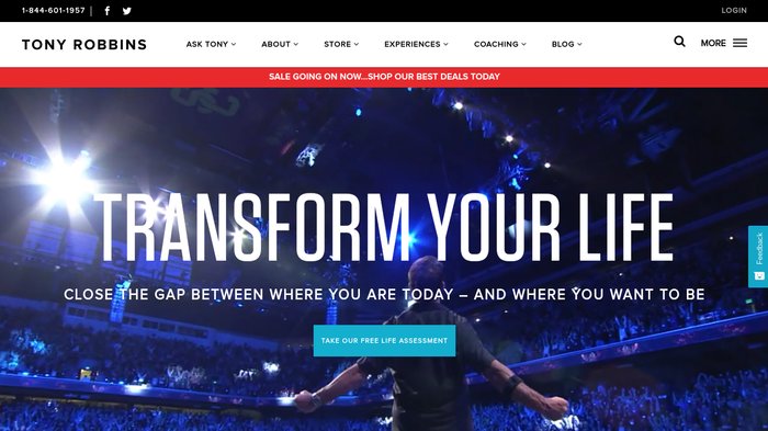
Image courtesy of Tony Robbins
Who is your ideal customer?
You should immediately know the answer to this question. If you don’t, then start there.
Tony Robbins’ ideal customer wants to transform their life. His website is designed to build excitement – from the oversized text inviting you to “Transform Your Life” to the rockstar-esque video that scrolls in the background behind that text. Robbins’ website presents energy and a clear message of self-improvement to his visitors.
Like Robbins’ website, every aspect of your website (and your brand) should be designed with your target audience in mind.
What colors appeal to your demographic?
What voice or tone should your copy take to reach your target audience most effectively? Witty and casual? Formal?
You want your website visitors to feel like you’re talking to them. This will help them to imagine that your product or service is perfect for them.
Your company’s brand identity should complement your target audience.
12. Present a Clear Unique Value Proposition

Image courtesy of Airbnb
And, of course, don’t forget to show your viewers your unique value proposition. As Jayson DeMers reflects:
If you don’t know what your UVP is, now’s the time to figure it out—what’s the bottom-line value that you’re offering your users that they won’t be able to get elsewhere?
What specific service or product are you offering in exchange for your prospect’s hard-earned cash or personal contact information?
Airbnb does a fantastic job articulating its unique value proposition on its website homepage. “Book unique homes and experiences all over the world.”
This single line of copy clearly shows what benefits users gain from doing business on Airbnb.
As we discussed in our previous article, Grow Your Business With This Excellent Advice from 7 Exceptional Small Business Coaches:
In business and in life it’s always good to remember that it’s not about you. Show your customers what you can do for them and you’ll earn their buy-in. Focus on the benefit your product or service offers – once that point is made your customers can learn about the features themselves.
If your audience can’t see the benefit of completing your call to action, they won’t complete it. And your conversion rate will suffer.
So clearly outline your unique value proposition and make your call to action specific.
13. Test, Test, Test!
Finally, if you want to design a website that converts well, you must test it.
Test the overall layout. Test colors. Test headlines. Test copy. Test calls to action.
Not all at once… You’ll want to be able to isolate which variable created what impact.
This is the value of A/B testing.
A/B (or split) testing allows you to compare a new variable to your control (or original) web design. Whichever version performs the best should be adopted.
Then that becomes your new control. And then you begin the process again to test a new variable.
You can A/B test many things, including:
- Headlines
- Placement of buttons (calls to action)
- Page layout
- Colors
- Design elements and graphics
- Copy (written content on the page)
Testing is the only way to quantify which elements of your web design are serving you well and which are not. It allows you to chart your growth and make conscious choices about how to improve your web design.
Kissmetrics’ Beginner’s Guide to A/B Testing is a great resource if you’re new to testing.
The Art and Science of Conversion
Conversion is an art – and a science.
And what converts well today may lose its impact over time, forcing you to modify your tactics and try new things.
To recap, these are 13 proven tips for optimizing your website to convert browsers to customers:
- Put Your Home Page to Work
- Remove the Visual “Noise”
- Limit Navigation Options
- Create a Clear Flow of Action
- Make it Easy to Read
- Stay True to Your Visual Brand
- Only Ask for ONE Thing
- Head Off Concerns
- Optimize Your Load Speeds
- Optimize for Mobile
- Design for Your Audience
- Present a Clear Unique Value Proposition
- Test, Test, Test!
Your website should never be static. Plan for change as an inevitable part of your website’s lifespan.
Continue to seek out new ways to reduce friction, optimize technical performance, and share your business’s value in your audience’s language… and you’ll find that your website delivers stronger conversions.

Design Done Better
The easiest way to get affordable, high-quality custom logos, print design, web design and naming for your business.
Learn How to Grow Your Business With Beautiful Design