Logo Design Trends 2020: Your Definitive Guide to Navigate The Biggest and Hottest Trends
![]()
{{CODE2000000}}
The art and craft of logo design constantly evolve.
Good designers and smart entrepreneurs collaborate to elevate the art of logo design by creating more perfectly brand-appropriate, memorable logos.
Inexperienced designers and entrepreneurs follow logo fads for the sake of appearing relevant and trendy.
As logo design and branding experts, we keep our fingers on the pulse. And, we love to share what each new year will bring.
>>If you’re interested in current logo trends, look at logo design trends for 2022.
Whether you’re a business owner, marketer, or designer, you should understand these trends because a logo is the visual centerpiece of a company’s brand identity.
Social media optimized logos, simplistic letter play, swooshy people, pixellated designs, and bright colors were popular logo design trends in 2018. When we looked at logo design trends in 2019, we saw a renewed focus on responsive logo design, simple typography, and a renewed popularity of vintage styles.
What will be trendy and hot in 2020?
We’ve studied the recent designs from the top logo designers on crowdspring to find the trends that you should pay attention to in 2020.
8 logo design trends and styles in 2020
Before we jump into specific 2020 logo design trends, let’s briefly review why every entrepreneur, marketer, and designer should care that their logo is strong and compelling.
Whether you’re looking for a logo design for a new business or considering a rebrand, your logo design should feel fresh and relevant for a long time, and not dated a year from now.
What makes a good logo?
As we explained in The Small Business Guide to Creating a Perfect Logo:
At its most basic, a logo is a small, symbolic piece of artwork that represents a business… When you set aside all the design trends and fancy fonts, at its core, a logo must:
1- Embody your brand.
2- Be instantly recognizable.
3- Be versatile.
4- Be timeless.
Everything else is optional.
In fact, I’ll go one step further. Every design choice in your logo should exist only to serve and strengthen the four items listed above. And, if you meet these four requirements, many other commonly cited logo must-haves, like simplicity and memorability, naturally follow.
So, if the best logos are timeless, then are logo trends even worth considering?
Yes.
Design choices that start as trends may push the boundaries of logo design as a whole (like these iconic logos) and find new ways to create memorable, aesthetically pleasing, effective logos.
Trends invite us to think innovatively and may introduce a visual concept that will serve your business well. But, the true test of any logo design trend is whether or not it successfully communicates your brand.
As we previously discussed,
…even if a trend does offer some inherent aesthetic value, if it doesn’t support and reflect your brand, it’s a poor choice for your logo.
When it comes to branding and innovative logo design, a good modern logo design must reflect your brand, and be memorable, unique, and timeless.
You should avoid trendy logos that get in the way of accomplishing those design goals.
The lesson here isn’t that trends are bad.
The lesson is that you should always weigh any logo design decision through the lens of your brand.
One of these trends may be a perfect way to communicate your brand.
Now, some business owners worry that the cost of logo design can be prohibitively high.
It’s true that many design companies and agencies charge thousands to tens of thousands of dollars for their services. But this isn’t universally true (crowdspring’s custom logo design projects start at just $299, including all fees).
So now that you know that a unique logo design can be affordable, read on to find out about the latest trends in logo design.
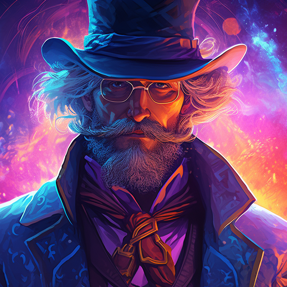
1. Playful minimalism

Ultra-chic minimalist logos have enjoyed a surge of popularity over the past few years.
And in a beautiful evolution, it seems designers have grown tired of taking minimalism so seriously. The modern, whimsical minimalist designs above keep the less-is-more aesthetic and execute it with a sense of warmth and humor.
All minimalism reduces its subject to just the visual essence. This makes minimalist logos very adaptable to a wide variety of backgrounds and mediums – making them very functional.
This new breed of logos enjoys all of those practical benefits while also eschewing the coldness of traditional minimalist designs. They’re more accessible – and in our opinion, more fun.
In 2020, we expect to see more logo designers exploring new ways to playfully interpret the minimalist style to suit unique brands.
Pro tip: This trend is fun, but if your brand isn’t playful, creative, warm, or quaint (these attributes aren’t appropriate for every brand)… then it’s not the right trend for you.
2. Strong typography

In logo design, font choices are just as important as the icons you use in the logo.
In fact, some logos (known as logotypes) are made up entirely of letters with no icon at all.
And recently, designers have grown bolder. Note the wide variety of in-your-face font choices that appear in the logos above.
But not any font will do. You can’t just plop your business name under your logo mark in a serif or sans serif font like Helvetica or Times New Roman and call it a day. Often, you must get creative with the type treatments to personalize the design.
The beauty of this trend is its flexibility. There are so many strong fonts available to choose from – there’s bound to be a striking option that suits your unique brand.
We anticipate that designers will continue to push the envelope with creative typography in 2020.
Pro tip: When working with a designer to get a logo, remember that typography isn’t just letters, Make sure the overall look of your custom logo design supports your brand.
3. Swooshes

We’ll be honest – this next trend is not one of our favorites. But, we seem to be in the minority because these swooshy logos are everywhere and show no sign of waning in the new year.
Curved lines can be used to communicate movement. But, adding a random curved line or ellipse to a logo has become so commonplace that it’s now landed squarely into the “overdone” category.
Part of the problem is that these swooshes often don’t have anything to do with the brand or product represented by the logo.
But, because swooshes are so popular, they’ve become part of the visual language of what a “logo” looks like. So, they just get added everywhere.
If you’re considering adding a swoosh to your logo, you’ve got plenty of company. But, know that that will make it harder for your brand to visually stand out.
Pro tip: Make sure that swoosh is linked to your brand in a meaningful way before you commit to this trend. Otherwise, it’s not worth it.
4. Line art
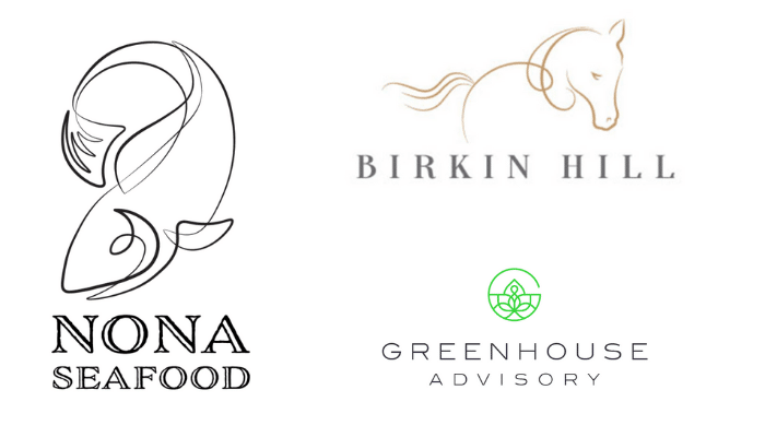
Line art is a remarkably versatile, timeless form. These traits automatically make line art a strong option for a logo.
From repurposing retro pin-striping technique to create a memorable fish, to clean geometric line drawings, to suggestive gesture logos (like the horse above), we’ve seen designers ramping up their creativity and reinterpreting what a line art logo can be.
We think this is only the beginning.
In any age, art finds a balance.
Art Nouveau was a reaction against the rigidity of the Industrial Revolution. Shortly after, Art Deco’s geometry kicked Art Nouveau’s asymmetrical curves to the curb.
Line art’s simplicity is a natural response to the vibrantly colored gradient logos that have taken over our computer monitors for so long. For this reason, we believe line art will continue to gain in popularity in 2020.
This trend is refreshing, elegant, and flexible. It’s also beautiful.
Line art logos can be rendered on virtually any background. And, with the nearly endless array of styles in which they can be executed, you’re sure to find one to match your brand’s tone.
Pro tip: Request lighter and heavier line weight versions of your logo in your final files. The heavier line weight version will be easier to see on busier backgrounds.
5. Broken box

Geometric logos have always been and will always be popular.
However, there’s a particular style of geometric logo that has exploded in popularity and this trend shows no sign of stopping. The “broken box” logo is everywhere… and, it’s underwhelming.
In the endless goal to have a “clean, simple” logo, it is possible to go too far. Placing an interrupted box around your text just doesn’t say very much about your business. It’s too simple. Especially when so many others have already done it.
Are you trying to communicate that your business is “outside of the box?” Then this tired visual cliche is the wrong way to say it. Are you aiming for understated elegance? Then get in line with everyone else who stuck their initials in a box and called it a logo.
Minimalism and geometric designs are both very popular. This is both.
And, does the broken box logo look professional? Yes.
But, the fact is that your business will never visually stand out if you follow this trend.
Pro tip: If you have your heart set on this style of logo, be sure to find ways to incorporate your brand identity into the design.
6. Negative space
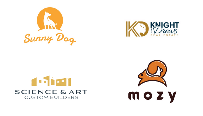
Designers continue to embrace the challenge of purposeful negative space in logo design – and we expect to see this continue into 2020.
It only makes sense – a logo must cram so much meaning into such a small area. You naturally want to make every single aspect of the design pull its weight in communicating your brand.
Negative space designs can be executed in a wide variety of artistic styles. And, they are adaptable to a wide range of backgrounds, since negative space allows the background to peek through and become part of the design.
Not to mention, people enjoy the clever surprise of discovering, say… a second tiny squirrel peering out at them. A logo that makes you smile, or with a hidden secret, is likely to be more memorable.
Pro tip: Logos with meaningful negative space imagery (like the arrow in the FedEx logo) can make quite an impact. Is there a meaningful message your brand can communicate through negative space?
7. Geometric framing

As we’ve mentioned before, geometric logos are endlessly popular.
But, this exciting geometric logo trend is a bit more subtle, and a lot more unique, than many geometric logos. The trend we’re describing is geometric shapes as framing devices.
Rather than relying solely on a geometric shape to communicate your brand – a big ask – these logos use geometric elements to frame other brand-specific imagery.
And, unlike the aforementioned “broken box” concept, this trend is flexible enough to deliver a wide variety of unique logos. So, you can have the classic, grounding influence of a geometric shape without sacrificing meaning or visual differentiation.
There are so many ways to execute this trend, as you can see above. We’re excited to see how designers continue to innovate and interpret this trend in 2020.
Pro tip: There are many ways to visually define and interact with a geometric shape. Consider what a literal frame versus a suggested frame (Twin Trees vs John Strutt above) says about your brand. Should your brand-specific elements remain inside the geometric shape or break out of it? Ground any visual choice you make back to your brand.
8. Connect the dots

One of the most unique trends we’ll see in 2020 is the connect-the-dots phenomenon.
These logos combine a series of dots and lines to build an overall design. This trend is interpreted in a variety of ways – playing with line and dot weight, experimenting with composition, and choosing between solid and hollow dots.
But, because logos in this style are all made up of the same essential building blocks (and often paired with clean sans-serif typography) they take on a somewhat homogenous look.
This logo design trend is very popular in the tech, medical and HR industries. The dots and lines are often used to symbolize data moving between two points or connections between people.
This trend – while immensely popular as we enter 2020 – seems destined to burn itself out and become dated quickly in the following years. We’ll have to wait and see.
Pro tip: If your business centers around connection, networks or communication, challenge your designer to think of a number of creative ways to express those themes before defaulting to this trend simply because it’s popular.
What’s next?
Do any of these trends strike a chord with your brand?
If yes, great!
If not, that’s okay, too. Some brands just transcend trends.
When starting a new business or rebranding, it’s natural to want to prove yourself. And, it can be tempting to follow a popular trend simply because it makes your logo looks like other logos – giving it credibility of a sort.
But favoring trends over your true brand identity will only hurt your business in the long run. So, always put your brand first.
We’re happy to help you find a logo design that embodies your brand identity– let us know if you’d like a free design consultation with our team.
Check out Logo Design Trends 2021: Your Essential Guide to Navigate The Biggest and Hottest Trends if you’re looking for logo design trends and styles for 2021.
Want a closer look at all design trends for 2020?
2020 Logo design trends2020 Web design trends
2020 Product design trends

Design Done Better
The easiest way to get affordable, high-quality custom logos, print design, web design and naming for your business.
Learn How to Grow Your Business With Beautiful Design