4 Psychology-Based Design Tips For Eye-Catching Packaging Design
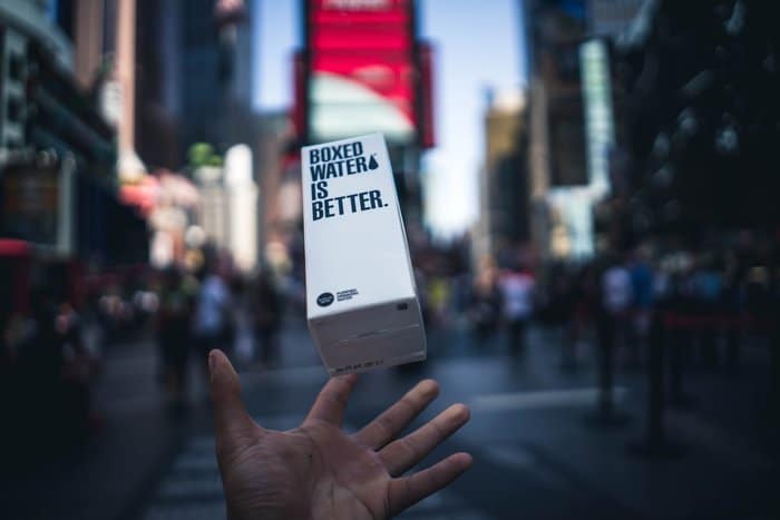
With thousands of products on store shelves, eye-catching packaging design is the only on-the-spot tool you have to encourage sales.
Your packaging design should speak, loud and clear, for your product when you can’t be there to do it yourself.
And, let’s be honest, it would be creepy if you were actually there.
Creepy, but cool, as this Dollar Shave Club commercial shows…
But, what makes certain package designs catch the eye, while consumers pass other products by?
Psychology.
People subconsciously respond to visual stimuli. In fact, this is one of the core principles of marketing psychology.
Knowing how to get people to respond favorably to your packaging design will help you sell more products.
Megan Sullivan, in her article “The Psychology of Product Packaging,” points out:
We all want to believe that consumers make decisions on products and services strictly based on merit, with the best one winning. In spite of that hope, psychologists and retailers agree that in many cases this just isn’t true. Quality aside, sometimes the flashier, prettier or sexier product wins the day.
So what does this mean for retailers and product manufacturers? What it means is that creating a terrific product is only part of the formula for sales success. Packaging it perfectly, complete with eye-catching graphics and colors, is just as important to your financial success.
Personal confession time… I don’t drink (alcohol). But, I know that many adults drink. So, when I need a host or hostess gift, I go to the liquor store. Then I pick out a bottle of wine with the most amazing, enticing, funny or odd label I can find. My purchase decisions are based 100% on the packaging.

We just emailed the info to you.
And, I know that I’m not the only consumer who makes their decisions based on packaging when purchasing a product they’re unfamiliar with.
If your business offers a physical product, you can’t afford to short-shrift your packaging design.
Don’t believe me?
Packaging design influences our behavior even when we have no intention of buying anything.
Packaging design affects our subconscious mind.

Image courtesy of L.Cheryl
A 2013 study reported that,
The appeal of product packaging has the potential to trigger impulsive buying even for consumers with no intention to make a purchase.
That’s pretty darn compelling. The study revealed three more pieces of impressive evidence in support of the power of packaging design:
- Attractive packaging triggered more intense activity in areas of the brain associated with impulsivity than neutral packaging.
- Unattractive and attractive packaging lead to less activity in areas of the brain responsible for reflective thought than neutral packaging.
- Attractive packaging triggered reward responses in the brain whereas unattractive packaging triggered areas associated with negative emotion.
In other words, attractive packaging design motivates people to make impulsive choices, bypasses reflective thought and leaves the purchaser with a feeling of having been rewarded. That’s a powerful impact.
In this article, we’ve compiled four psychology-based design tips for improving product packaging design. Smart choices in color, shape, texture, and typography can make all the difference.
Let’s get started with the first tip.
1. Color evokes emotion in packaging design

Color should serve three primary functions in your packaging design:
Color Should Capture the Shopper’s Attention
Color can be extremely effective at grabbing our focus. Certain color wavelengths have been shown to attract human attention. This study reported that red, yellow, green, and pink are the four most eye-catching colors. Using these colors on your packaging will physiologically increase the likelihood that someone will look at your package.
 But that doesn’t mean all packages should be red, yellow, or green. If all packages used the same colors, no one product would ever stand out (based on color alone).
That’s where the isolation effect comes in.
The isolation effect is a psychological phenomenon that you may recall from this Sesame Street Song:
One of these things is not like the others.
One of these things just doesn’t belong.
Can you tell which thing is not like the others before I finish my song?
Things that are visually different from their counterparts tend to stand out and capture our attention.
You can use this principle to your advantage. If all your competitors use blue packaging, consider using yellow or orange to isolate your package and steal the focus.
Color Should Create Appropriate Emotional Associations
Certain emotions have been assigned certain meanings in our culture.
In the United States, red is associated with love, passion, anger, and action.
Blue is associated with tranquility, trust, stability, and also sadness.
Yellow is associated with happiness, and green is associated with money.
As we wrote in an earlier article:
In a widely-cited study called “The Impact of Color on Marketing,” research found that people make a subconscious judgment about products within the first 90 seconds of seeing it. The majority of these people evaluate these products on color alone: almost 85% of consumers cite color as the main reason they buy a certain product, and 80% of people believe color increases brand recognition.
You can learn more about color by reading “How 21 Brands Use Color to Influence People.”
The important thing to remember is to choose colors that inspire the sort of associations you want customers to make with your product.
Choose relaxing blues or lavenders if you’re selling a line of soothing face masks.
Are you selling camping gear for glamping sites? Woodsy greens and browns may be the way to go.
How about kitchen appliances? Crisp shades of silver or white suggest cleanliness and will make inspire confidence that your product is safe for use with food.
Color Should Reinforce Brand Identity
If you have a logo – and you should – then there are already certain colors associated with your brand. Your logo should be featured prominently on your packaging so that loyal customers can recognize a brand they trust and new customers can get to know your brand.
 The colors that you choose for your packaging design should take their cue from that logo. They should live well together whether you choose to use similar or contrasting colors.
If you already have a style guide, then congratulations! You’re already ahead of the game. Your style guide should tell you everything you need to know about using color in your packaging design.
Think you can get a perfect score?
2. Structure and Shape Influence Emotions in Packaging Design
Shape has the potential to be the single most unique identifier for your product packaging.
Think about it – the customer is scanning a shelf full of traditional bottles…
But your syrup stands alone in its bottle shaped like a woman who could be their grandma. The shape is distinct, unique, and instantly recognizable.
It also reminds them of how much they love their grandmother’s pancakes. Annnd, they’re sold!
Shape has been shown to have the power to conjure emotional responses.
Pure shapes and lines, without any context at all, can literally inspire awe, fear, contentment or excitement. So associating a shape with a contextual message (like “Gee, this bottle lady looks like she could make some tasty pancakes!”) has the potential to create even more powerful emotional reactions.
While there is no one perfect shape for all packages, there are general psychological guidelines to keep in mind.
There’s a strong body of evidence, including this study, showing that people tend to find curves more appealing than straight lines. A team of scientists at the University of California, Irvine found that:
As predicted, participants were more likely to judge spaces as beautiful if they were curvilinear than rectilinear. Neuroanatomically, when contemplating beauty, curvilinear contour activated the anterior cingulate cortex exclusively, a region strongly responsive to the reward properties and emotional salience of objects.
Conversely, this study by Moshe Bar and Maital Neta shows that people tend to show a bias against pointed shapes. They provide evidence to suggest that sharp, angular lines are perceived as threatening.
So, don’t be afraid to think beyond traditional packaging shapes. But make sure that “different” isn’t your only criteria. Aim for a package design that is different, product-appropriate, and brand-relevant. But, also keep in mind the basic psychology of shapes.
3. Texture and Touch Impact Reactions In Packaging Design

Packages aren’t just meant to be looked at – they’re meant to be touched.
In a perfect world, everyone who sees your package design will be motivated to pick it up and take it home. For that reason, you must take touch into account when planning your package design.
You want to create positive tactile experiences for consumers.
Textures that are pleasant to touch, like smooth matte, silky high-gloss, or soft and fluffy will motivate consumers to keep their hands on your product.
Lawrence Williams and Joshua Ackerman of the Harvard Business Review point out that:
Physically holding products can create a sense of psychological ownership, driving must-have purchase decisions.
Choosing a texture for your packaging that is pleasant to touch will encourage customers to hang on to it just a bit longer. This, in turn, will extend that feeling of psychological ownership and motivate the customer to purchase the item.
For example, I may or may not have impulsively purchased a stuffed bunny at Target just because it felt so soft when I picked it up. (I did.) And, my husband and I may or may not fight over who gets to hold it because it is so soft and snuggly. (We do.)
Touch is a powerful force. Use it to your advantage.
Packaging Textures Can Influence How People Perceive Your Product
In addition to creating a pleasant tactile experience for consumers, the way a package feels can make implications about the product itself.
Williams and Ackerman describe a study that found that water served in a sturdy cup was perceived to be better than water of the same quality served in a flimsy cup.
The product was the same. The perception was different due solely to the packaging method. Shoddy packaging made participants worry that the product inside was shoddy, too.
Choose a packaging texture that reflects what the consumer will find inside. Is your product luxurious? Choose packaging material that feels luxurious. Is your product earthy and natural? A raw, earthy texture may be the right choice.
Plan to give consumers an enjoyable tactile experience that appropriately reflects your product and brand.
4. Typography Evokes Emotional Reactions in Packaging Design

Don’t overlook the importance of font choice in your packaging design. After all, fonts are the delivery system for the literal message on your package. The font should support the message you are trying to communicate.
Mikael Cho, Founder/CEO of unsplash, writes in his article “The science behind fonts (and how they make you feel)”:
Because fonts are designed by humans, there is usually some meaning attached to them. You don’t want to choose a font that is easily associated with something in our culture that’s markedly different than the vibe you’re trying to give off.
For instance, one study showed that ornate script fonts implied that a task would take longer than the exact same task explained in a clean, simple font. This may be due to the fact that elaborate script fonts are reminiscent of the handwriting styles seen in earlier centuries.
You may not want to communicate that your product is oldey-timey and quaint.
Then again, maybe you do.
The important thing to keep in mind is to choose a font that sends the message you intend to send.
Here are some guidelines:
- Fancy Script Fonts – prestige, elegance, and maturity
- Hand Script Fonts – casual, playful, rebellious, and youthful
- Serif Print Fonts – stability, class, and older age
- Sans-Serif Print Fonts – modernity, directness, simplicity
- Headline Fonts – attention-grabbing, intense, truthful
- Decorative Fonts – unique, whimsical, fun
Knowing what a font is communicating independently of the words themselves is vital to making the right font choice. Make sure the unspoken language of your typography reflects the personality of your brand and product.
It’s All About Your Customer
Packaging design can do so much for your product and brand when optimized properly. Letting your customer’s inherent psychological and cultural biases guide your choices will vastly increase the chances that your package will be the one to catch their eye.
Here’s a quick recap:
Color
- Capture attention with vibrant eye-catching shades or unique color choices.
- Create positive emotional associations through smart color choices.
- Choose colors that represent your brand.
Shape
- Don’t be afraid to set your product apart with a unique package shape.
- Soft curves are viewed as friendlier and more attractive than sharp, angular lines.
Touch
- Choose pleasant textures that will make consumers want to hold on longer.
- Select package textures that reflect the product inside.
Typography
- Choose fonts for the meaning they convey, not just because they look cool.
- Select fonts that are easy to read and that convey the essence of your product and brand.

Design Done Better
The easiest way to get affordable, high-quality custom logos, print design, web design and naming for your business.
Learn How to Grow Your Business With Beautiful Design