The 18 Most Iconic and Influential Logos Of All Time: Decade by Decade

Logo design has come a long way since the start of the 20th century.
It’s grown as an art and as a business science.
Logo design has also grown more challenging as the marketplace expands and communication has amplified globally.
Once upon a time, it didn’t matter if a local small business accidentally shared a logo with another business 100 miles away. The odds were good that the audiences for each business would never overlap.
But that’s no longer the case.
The internet has obliterated distance and language barriers. Today, it’s imperative that each company has a unique brand identity, including a unique business name and logo to distinguish them from their competition.
As we wrote in our comprehensive guide on how to start a business:
A strong brand identity is the most effective way your new business can gain a competitive edge in an increasingly crowded marketplace. A brand represents how people know you (or your business), and how they perceive your reputation or the reputation of your company.
In today’s noisy world, a strong brand is more important than it has ever been.
Now, many business owners worry that the cost of logo design can be prohibitively high.
Many design companies and agencies indeed charge thousands to tens of thousands of dollars for their services. But this isn’t universally true (crowdspring’s custom logo design projects start at just $299, including all fees).
A modest investment in a unique logo can go a long way.
Having said that, in our modern marketplace, it’s easy for the public to look at certain logos and dismiss them as “derivative,” much like viewers watching the Marx Brothers for the first time and saying, “I’ve seen all of this before!”
Of course, they have – but they’ve seen it before because the Marx Brothers invented it.
And, just as the Marx Brothers made an indelible imprint on modern comedy, certain logos have made their mark on the world of brand design.
These logos have stood the test of time, seared themselves into the public consciousness, and influenced countless other logos that came after them. And, it helps to know where you’ve been to plan where you’re going.
So, let’s get started. What can you learn from the most influential logos of the 20th century?
1900 – 1909
Eastman Kodak logo (1907)

The original Eastman Kodak logo isn’t the most impressively designed. But, it is one of the earliest examples of the now-standard, classic monogram-in-a-circle logo style.
This logo was first revealed in 1907. But, it was replaced in 1935 with a very different design. Kodak’s logo has gone through several evolutions since 1907. And, today, Kodak is known for its iconic red and yellow abstract “K” logo.
But, their original monogram logo within a circle is almost prescient in its modernity. The three sans-serif initials of the Eastman Kodak Company overlap to create an abstract monogram that wouldn’t look out of place today.
Look around the next time you leave your house. I bet you’ll see more than a few logos in this style.
Ford Motor Company logo (1907)
Image courtesy of List Car Brands
The Ford Motor Company’s first logo, which debuted in 1903, featured a beautiful art nouveau border framing their company name in a serif block typography. The art nouveau features were modern and on-trend for the time.
In 1907 Ford rebranded and revealed their second logo. It’s the origin of the logo we all know and recognize today. And, it has a fun, brand-specific origin story.
The script we’ve all come to associate with Ford is actually a streamlined version of Ford’s own signature. While the company’s logo has been modernized in the decades since the distinctive Ford script has remained virtually the same.
Today, you can find signature-based logos all over the marketplace. Kellogg’s and The Walt Disney Company come immediately to mind. But Ford came first.
The signature-inspired logo continues to serve businesses well since it’s unlikely that your signature would look exactly like another’s. But, be sure to give plenty of thought to the remaining design that supports the signature if you choose to go this route.
Mercedes-Benz logo (1909)
Image courtesy of Car Brand Names
The Mercedes-Benz logo is simple, memorable, and instantly recognizable. It was one of the few logos that I could identify even as a child. And, this timeless design made its first appearance in 1909.
The logo features a three-pointed star inside of a circle. The star was inspired by a similar star that founder Gottlieb Daimler drew over his home on a postcard he sent to his wife. In the message, he explained that the star would shine over his business and bring prosperity.
Eventually, the three-pointed star represents land, sea, and air – the three arms of Mercedes’ business.
Today, clean and minimalist geometric logos like this one continue to be immensely popular. Lexus, Nissan, Chrysler, Delta, Converse… The Mercedes logo legacy lives on.
But, prepare to spend some time looking for a simple, clean geometric logo design that another business hasn’t already claimed. Make sure this logo style is really the best choice for your brand before investing the time and effort to create a truly unique logo in such a crowded genre.
1910-1919
BMW logo (1917)
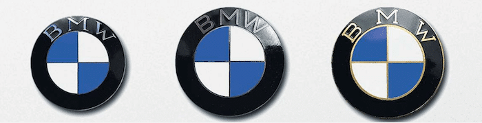
Image courtesy of BMW
In 1917 BMW (Bayerische Motoren Werke) was founded. The young business’s logo was registered by Franz Josef Popp that same year.
The logo features a black ring surrounding a checkered pattern in blue and white – the Bavarian Free State colors. BMW’s initials adorn the top of the black ring.
It was illegal to use Bavaria’s national colors for commercial purposes. Over the years, the logo was emblazoned on all of BMW’s company products – even if it wasn’t used in advertising until over 10 years later, in 1929.
To this day, only minor changes have been made to the logo – tweaks to the typeface and slight adjustments to proportions. The BMW logo’s bold color blocking and geometric shapes have inspired several other logos. You can see its visual influence in the Target bullseye, the Window’s logo, and the London Underground logo, among many others.
You can use color-blocking creatively in your logo design in any number of ways.
UPS logo (1916)
Image courtesy of Logo Realm
Consumers worldwide eagerly await the arrival of the brown vans with the shield on the side. United Parcel Service delivers packages across the globe and is one of the top delivery services today.
In addition to providing superior parcel delivery service, they also act as a logo role model. As you can see above, the UPS logo has evolved a great deal from 1916 to today. But, can you spot the one element that has stayed the same?
The UPS logo has always featured a shield. And in the years since, businesses desiring to instill trust, reliability, and security often choose shield-based logos as well.
This design trope has become so common that you’ll have to work hard to create a unique take that hasn’t been done before. Rely on your brand to guide the design.
1920 – 1929
Chanel logo (1925)
Image courtesy of Wikipedia
The iconic Chanel logo is one of the best-known logos today. It appears on bags, jewelry, shoes, and belts… and, of course, on Chanel garments themselves. It’s a lofty status symbol that the haves love to flaunt while the have-nots peer on with envy.
Founder Coco Chanel designed the two interlocking Cs logo in 1925. It was inspired by the decorative windows at the Chateau de Cremat in Nice.
The logo is one of the earliest examples – and certainly the most famous – of “letterplay.” Letterplay logos seek to arrange a business’s initials in visually creative ways to create a memorable and iconic original composition.
Unlike a traditional monogram, the letters are used purely as artistic elements. They can be flipped, rotated, overlapped, or merged to create a finished product that can stand independently of the letters.
Letterplay logos are everywhere today and one of the most commonly requested logo styles that we see on crowdspring. For this reason, it’s vital to tread carefully when designing a letterplay logo. The odds are good that it may already exist, whether you know it or not.
Columbia logo (1928)

Columbia’s Grecian torchbearer logo is both visually striking and steeped in history.
Columbia was a codename used to represent the United States in secret publications of the British parliament debates in the 18th century.
This portrayal of Columbia closely resembles the caryatids (columns carved to resemble Grecian women) that support the southern porch of the Acropolis. And, she is draped in an American flag while holding a torch aloft in her right hand.
Her neoclassical influence is clear – an influence that continues to be popular today. Logos referencing columns, caryatids (like Columbia), and arches are commonplace. These neoclassical elements still conjure feelings of timelessness and classic elegance.
Want to embrace the neoclassical vibe in your logo? Don’t expect the neoclassic elements to do all the work. Make particular design choices that will clearly communicate your brand.
1930 – 1939
Volkswagon logo (1937)
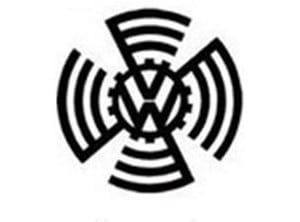 Did you know that the Volkswagon logo we know today began its life surrounded by a swastika? The business was actually the brainchild of Adolf Hitler, who wanted an accessible vehicle for Germany’s people. Thus, Volkswagon was born.
In keeping with its roots, the original logo included a curved, stylized representation of a swastika. However, the nationalist ideology associated with Volkswagon’s brand did not serve the business well. After World War II, the company floundered – no one wanted to buy it.
The British army took control of the VW factory. Under their control, the swastika “wings” were removed, and the colors were inverted to make the logo look less like the Nazi flag. Eventually, Volkswagon returned to the German government’s care since no one could be persuaded to purchase it.
Despite Volkswagon’s roots, the company hit its real stride as a symbol of peace and rebirth in post-war Germany. Today, the original VW logo stands as a cautionary tale for businesses everywhere. Include overt political messaging in your brand at your own risk.
1940 – 1949
Rosie the Riveter logo (1942)

Image courtesy of Wikipedia
Rosie the Riveter is a bit of an anomaly on this list. She not really a logo, per se. But, Rosie was one of the most effective branding mascots in history. And, she’s had a tremendous influence on logos to follow. So, we’re gonna give her a pass and include her anyway.
Rosie was the face of the American working woman during World War II. She was the face of an incredibly successful campaign that endeavored to motivate women to enter the working world for what was probably the first time in their lives. Pittsburgh artist J. Howard Miller created the original campaign poster in 1942.
Today, you can see Rosie’s echoes in many mascot-style logos, from Frosted Flakes’ Tony the Tiger to Mr. Clean. Back up, boys – Rosie was here first.
1950 – 1959
Frigidaire logo (1955)

Image courtesy of Under Consideration
Frigidaire has been a trusted brand in refrigeration for the past 100 years. But, their most unique and memorable logo didn’t appear until 1955. To this day, it acts as a visual time machine that can transport viewers back to that era.
But why does this simple script logo have that power?
In 1955, the nation’s fascination with space travel was heating up. As Denise Ngo of Popular Science explains:
Although modern historians consider Sputnik’s launch in 1957 as the start of the Space Age, its aesthetic can be traced back to at least a decade earlier, when rocket ships, spaceflight and nuclear energy entered the public consciousness.
This awareness impacted every arena of design. That includes typefaces and logos. So, “futuristic” script typefaces like the one used in the Frigidaire logo were rampant in 1950’s advertising and brand design.
This streamlined typeface logo implies speed, grace, and efficiency. And, it serves as a visual representation of the optimistic space-age zeitgeist of the 1950s.
Today, these retro script fonts are experiencing a resurgence in popularity – perhaps in response to the clean minimalism of the sans-serif fonts that dominate modern design. But, they’ve got a lot of personalities. So, if you’re considering a mid-century, script-style font for your logo, make sure it matches your brand.
NASA logo (1959)

NASA insignia (left) and NASA seal (right)
When you think of famous logos, you may not immediately think of NASA. NASA’s first logo (fondly called the “meatball logo”) features an element that has become one of the most ubiquitous logo design shapes.
The original NASA insignia (in use from 1959 – 1975) features a round blue planet (or “meatball”). It also features stars, a red V-shaped vector representing aeronautics, and a slender white ellipse meant to indicate space travel. The official NASA seal (a sort of dress-up logo for special events) features these same elements.
Who would have guessed that the white ellipse featured on the NASA logo would become one of the most popular shapes in logo design?
Maybe ellipses took the logo design world by storm because they communicate movement; or because they’re an interesting twist on the classic circle. But, I posit that it’s both of those things and more.
As we’ve already mentioned, space travel captured the world’s imagination in the middle of the 20th century. The ellipse became linked with the “cool factor” of space travel through its inclusion in NASA’s logo.
Today, the connection between the ellipse and space travel has weakened. But, apparently, the cool factor remains. And, the modern logo-verse is chock full of logos surrounded by or featuring ellipses.
Personally, we suggest that you think twice before making an ellipse, a primary design feature of your logo. They’ve become a bit overdone. So, make sure an ellipse is really the best fit for your logo before you commit.
1960 – 1969
IBM logo (1966)
Image courtesy of PaulRand.design
IBM is an example of a company that has truly reinvented itself to keep up with the times.
From its first incarnation as the International Time Recording Company (1889), IBM has discarded old technology and adopted the new. For a complete history of the business, click here.
The IBM logo has followed suit and changed many times over the years. But, in 1966, famed logo designer Paul Rand landed on the design that would become famous. IBM’s iconic logo consists of bold block letters made up of 13 (1966) or 8 (1972) blue stripes.
IBM’s website explains that the horizontal stripes indicate “speed and dynamism.” Those stripes opened up a whole new world of creative possibilities in logo design for the design world.
While initials will probably always be popular content for business logos, thanks to Paul Rand’s IBM logo, designers will continue to re-imagine boldly creative and meaningful ways to visually modify those letters to communicate better the brand they represent.
1970 – 1979
Nike logo (1971)
Image courtesy of Wikipedia
Carolyn Davidson originally designed the famous Nike “Swoosh” in 1971.
Only a student at the time, Davidson was paid a mere $35 for the design. But, Nike founder Phil Knight never forgot her contribution. Davidson continued to work with Nike and was awarded shares of the company when it went public in 1983.
Davidson’s famous design was inspired by the brand’s namesake “Nike” (Greek goddess of victory). Nike was known for her wings, which allowed her to fly over battlefields safely. Davidson visually combined a check-mark with a wing to create a unique abstract shape that communicates speed and agility.
The Swoosh looks great on the side of a shoe.
To this day, the Swoosh is held up as an ideal example of an abstract logo that manages to communicate the brand’s identity perfectly. Logo designers the world over seek to create the next signature abstract logo design.
If you opt for an abstract design, remember that your marketing and branding must support the logo to instill some meaning into an unfamiliar icon.
Apple logo (1977)

Apple logo by Rob Janoff courtesy of Fine Print Art
The very first Apple logo represents a very different brand than the Apple that we know today.
Original Apple logo courtesy of Think Marketing Magazine
Apple’s original logo – which featured Sir Isaac Newton about to be beaned on the head by an apple – resembled a print engraving. It looked old-fashioned, fussy, and looked more like an antique shop logo than a technology logo. It was only in use for a year.
Co-founder Steve Jobs quickly saw that the original logo’s old-fashioned vibe was a poor fit, and Apple’s visual brand changed course. Graphic designer Rob Janoff was hired to create a new modern logo to reflect Job’s vision for Apple better.
Apple unveiled Janoff’s new rainbow-striped apple logo in 1977 – just before the Apple II debut (the world’s first PC with a color display). The sleek, colorful design resonated with the public, and the logo became an instant hit.
So what is the Apple logo’s legacy? It underlines the importance of choosing a logo that properly reflects your products and your brand.
A sleek minimalist logo was a perfect fit for a boundary-breaking technology company. But, more than that, the logo visually reinforced the business’s brand name (Apple) and served as a reminder of the very thing that set Apple ahead of their competition at the time (color PCs).
The Apple logo was so well aligned with its brand that it raised the bar for logo designers everywhere.
1980 – 1989
MTV logo (1981)

Image courtesy of Pinterest
The MTV logo made its debut in 1981. The “M” was yellow with blue shading, and the “TV” was red. MTV was determined to show that they were a new kind of business and a new kind of experience.
So, in keeping with the hip reputation and visual celebration that MTV wanted to project, they continually changed their logo’s colors and patterns. The shape remained consistent to ensure it was easy to identify, but the MTV logo became a kaleidoscope of changing patterns and color.
MTV’s television medium allowed them to saturate viewers with their logo to ensure recognition. It also allowed them to easily make visual changes to establish those changes as a signature of their logo.
This chameleonic approach was a pioneering branding statement. It led the way for the Google Doodle and countless other logos that adapt to unique concepts.
Remember that it’s important to establish your logo and build customer recognition before you start riffing on the design. Otherwise, consumers may not be able to identify you.
World Wildlife Fund (1986)

Image courtesy of dewebsite.org
The World Wildlife Fund’s panda logo is the only non-profit logo to appear on this list. But, it’s by no means a token inclusion. The WWF panda is a well-known and influential example of a negative space logo.
The panda featured in the WWF’s logo was inspired by Chi Chi – a giant panda living at the London Zoo in 1961 when the non-profit was founded. While the logo has remained very similar to the original, it has been updated over the years.
The most significant change occurred in 1986 when the panda transitioned from a traditional black and white line drawing to a more abstract panda defined by negative space.
The creative use of negative space helped to propel the logo into a more sophisticated and modern look. And it inspired other logo designers to follow suit.
1990 – 1999
Windows logo (1993)
Windows 3.1 logo courtesy of Wikimedia
Microsoft’s Windows launched in 1985. But, it wasn’t until the 90s that the tech giant really started to take off.
In 1992 Windows 3.1 launched. And, the now-familiar Window’s logo made its first appearance.
The iconic logo is a colorful representation of a window. In fact, they may have been inspired by Apple’s successful logo that featured a similarly literal logo mark featuring lots of colors.
Over the years, the Window’s logo has gone through several evolutions. But, the most significant aspect of the logo – the window structure itself – has always remained.
Today, logo designers have embraced the 4 quadrant layout and use it in myriad creative ways to represent different business aspects. It’s become a style of logo in and of itself. But remember that it’s crucial to put a new spin on a concept to stand out – and avoid IP infringement!
FedEx logo (1994)
Image courtesy of Wikipedia
Once you’ve seen the arrow in the FedEx logo, it’s impossible to unsee the arrow in the FedEx logo.
If you don’t know what I’m talking about, take a peek at the white space between the “E” and the “x” above. Go ahead – I’ll wait…
That little arrow reveals a hidden depth that elevates this otherwise straightforward typeface logo.
FedEx transports packages. An arrow suggesting movement is a perfect accompaniment to their brand name.
This incarnation of the Federal Express logo debuted in 1994. This technique of creating layers of visual meaning has encouraged logo designers to be more creative in how they communicate in logos. Today’s logo designers are still inspired to hide clever and meaningful shapes that deliver a deeper meaning for the overall design.
FIN
We made it! That’s 100 years of epic logo designs.
I hope you’ve discovered some inspiration for your business’s logo. Or, at the very least, a deeper appreciation of the art and impact of logo design in our world.
Remember that if you choose to embrace any of the logo styles represented here for your own business, it’s essential that you put your own unique, brand-specific spin on them.
It’s never enough to cleverly replicate a logo style or create a brand identity based on a logo design trend. A logo – no matter how attractive – is a failure if it doesn’t properly communicate the business it represents.

Design Done Better
The easiest way to get affordable, high-quality custom logos, print design, web design and naming for your business.
Learn How to Grow Your Business With Beautiful Design