6 Compelling 2018 Book Cover Design Trends Every Author Should Know

Contrary to the belief that ebooks are taking over the world, print and the written word are most decidedly not dead yet.
In fact, in 2016 ebook sales fell for the second year in a row as printed book sales increased. A Publishers Association report succinctly captured the reason for this trend: “Readers take a pleasure in a physical book that does not translate well on to digital.”

There’s something special about reading a physical book that ebook readers and tablets haven’t been able to capture, and this yen for a tangible experience has been a boon for authors and book cover designers.
>> If you’re interested in current book cover design trends, read 10 Top Book Cover Design Trends for 2022.
As with anything related to books, however, the emergence of Amazon – and indie booksellers, too – cannot be ignored. Print may be where many books are read, but the purchasing of books (both print and ebooks) is most often done online. This, along with the mega-retailer’s huge influence on books as a whole, has had a major influence on book design trends.
As we wrote previously:
A typical reader will do a search on Amazon and will look at a handful of books. Sure, content and reviews are important, but the book cover is the first thing a potential reader sees and the cover can either make or break that initial impression. This is not surprising. Great images create an emotional reaction in people. Because images are processed by our brains 60,000 faster than words, a great cover is critical to making an amazing first impression. A poorly designed cover not only fails to create the emotional reaction you want to create in your readers but also implies that the contents of the book are also sub-par.
It’s very clear that having a wonderful story is important, but even the best story isn’t likely to be read without an equally wonderful cover design.
We’ve previously offered actionable tips for effective book cover design – 10 Smart Tips to Help Authors Create an Amazing Book Cover Design.
But with the continued dominance of Amazon and other web-based booksellers, authors and book cover designers have had to update their strategies to get noticed.
Book designers now optimize their cover designs for smaller screens. Knowing that books are sold with their title and author clearly visible on a bookstore’s website has given designers more freedom to be creative. As a result, authors and designers are less concerned with displaying the title and author information as prominently in their designs.
Eye-catching, bold, and even surreal designs are becoming increasingly common among well-designed book covers.
The designers on crowdspring (over 210,000 from nearly every country on earth) are at the forefront of these trends and have helped many authors use the latest designs to create beautiful book covers.
If you’re an author publishing your next book or an aspiring author writing your first book, here are six compelling book cover design trends you’ll see in your local bookstore and online next year.
1. Messy typography
 Typography is an important element in effective book cover design.
Most book covers have a title, an author’s name, a subtitle or some other promotional text as primary elements. The book cover must, at a minimum, display some or all of this information in a clear, engaging way.
This doesn’t mean authors and designers are left with few creative options.
For example, because most books today are sold online, authors and designers can be more adventurous and experiment with typography.
Creative typography can work great, but experiments with typography can backfire. Some experiments push type to the extreme, to the point that the typography makes the title unreadable or confusing.
That said, book covers are often most effective when they complement or augment the story or subject material contained within. Consumers still judge books by the cover, and a cover that doesn’t communicate what a book is about (or the book’s genre) may ultimately fail.
If you want to try artful type design for your book, make sure it fits with your book’s subject and gives the potential reader an inkling what to expect. Being edgy for the same of edginess could backfire if it means readers are left with no idea what your book is about.

2. Everything centered

by espacioM
 A counterpoint to messy text is the continuing trend for books to have large, bold type centered on their covers.
This is usually a visually pleasing way of presenting your book’s title. Depending what font is used and how it is laid out, this can be a very effective approach.
Consider how the cover’s text works with any imagery you’ve chosen for your book cover.
The book’s cover encapsulates the story or subject and should communicate a lot to the viewer. If you’re going to choose a straightforward type of design, choose an image or imagery that helps the viewer connect with the book and what it’s about.

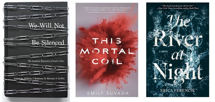
3. Text on photos

by mbeabknights2013
A trend that continues to grow in popularity is incorporating text with a photo.
This gives the cover completeness and integrity that can be a compelling combination. It also can provide the viewer with a hint to the book’s plot, an insight on a character, or some other crucial story element.
Book covers are often like the opening credits to a TV show, where visual clues and the overall aesthetic prepare the viewer for what’s to come. Like opening credit sequences, the combination of type and image on a book’s cover can effectively set the stage.
It’s important that whatever expectation your cover creates be met and matched with the book’s content.
A book cover that makes the viewer think they’re in store for an exciting action-thriller or a sordid romance shouldn’t turn around and be the opposite or something totally unexpected.

4. Minimalism
by Seaside
 A strong book cover talks to potential readers.
It tells them what genre the book is, what the story or main theme is, and leaves them with a sense of what lies in store for them between the covers.
As we talked about in our previous look at current web design trends:
There are very few instances where choosing a clean, concise design is a wrong decision. Clean design moves site content to the forefront and helps focus your audience’s attention on what your site says.
Simple cover designs make the key parts plainly clear. Making it easy to read the title and author can be a good thing, especially if the author is well-known.
The difference between book covers and websites is that book covers often compete against each other in a layout, whereas websites are experienced one at a time. Simplicity sometimes can backfire if the title or author isn’t well-known, or if minimalism is common with other books in the same genre.
This said, simplicity is always a popular trend in any design field, and book covers are no exception. There are some stunning designs that are as beautiful as they are sparse, and many of next year’s crop of covers will undoubtedly follow the path to clarity.
5. Obscured type

by Ann_RS
To paraphrase Newton’s Law: for every design trend, there is an opposing trend.
Just as book designers are turning to clean, simple designs, they are also experimenting with the obscure: with typography or elements that are covered or hidden in some way.
This trend works well with books that deal with mystery or truths uncovered, or books that go to places or ideas that haven’t been explored before.
A cover that uses obscurity as a theme literally gives the viewer the sense that they’re not seeing the full picture.
As with other design trends, consider if this aesthetic makes sense for your book.
Hiding or covering part of your cover might be the wrong approach if your book’s goal is to educate or shine a light on a topic.

6. Handwritten text

by dadan
A book’s cover is the clearest expression of the book’s brand. Yes, even books have brands, and the font choice and how type is laid out on the cover can have a powerful impact on both the brand and the viewer.
One growing trend is to use handwritten fonts. Handwritten type gives books a unique feel, and depending on the quality of the type they can seem more personal or intimate.
You’ll find plenty of cookbooks using handwritten type – it emphasizes the connection and warmth you get when sharing a recipe with a friend or family nature.
Handwritten text can feel threatening or frightening, as well, which can work well for suspenseful genres. It all depends on how the type is written and the context it’s presented in.
Childish-looking written text might work well on a parenting book, but it could also add a disturbing touch to a mystery or horror novel.
If you’re going to try handwritten text for your cover, make sure the quality of the writing is consistent with the feel of your book. You want to give your book a unique look, not an amateurish one, and some manually written text could backfire on you it’s poorly written or low-quality.


Good book covers capture a book’s soul. They give the viewer a taste of what’s to come and establish the book’s genre, style, or theme.
They also create or help build the book’s and author’s brand. That’s a lot of responsibility for a single image!
For larger publishers, a lot of research goes into the marketing of book genres and subjects.
Books, like any other media, have their own demographics and target audiences, and publishers work hard to figure out what works best for those groups.
Once they find a winning formula, they often run with it, which is why you see so many books from a particular niche with similar looking covers.
Your best option when designing a cover for your book is to work with an experienced book cover designer. A good designer understands how books similar to yours are marketed, and how current design trends could help (or hinder) the success of your cover design.
Here at crowdspring, we have thousands of designers who can take a trend and make it something original – and entirely in keeping with your your own vision for an exciting cover for your next bestseller.

Design Done Better
The easiest way to get affordable, high-quality custom logos, print design, web design and naming for your business.
Learn How to Grow Your Business With Beautiful Design