
Every company dreams about creating high-performing teams. For us at OWOX, that dream centered on our analytics department, which included 12 specialists—junior analysts, mid-level analysts, senior analysts, and QA specialists.
Collectively, our analysts were responsible for consulting clients on data analysis and improving our marketing analytics tool. While our company focuses on analytics, our challenge was not unique—many in-house marketing departments and agencies struggle to measure and improve the efficiency of their teams.
In theory, our analytics department would work seamlessly to make the whole business profitable. In real life, it often struggled for constant improvement—new people, new business goals, and new technologies disrupted steady progress.
How could we get our analytics team to spend more time doing the things they were best at, as well as those that were most valuable to the company? Here’s the start-to-finish process we implemented to benchmark team performance and then use that data to increase efficiency.
Table of contents
Our baseline: Mapping the ideal analyst workload
What is the most effective mix of responsibilities for each analyst position under perfect conditions? Our first step was to diagram the ideal division of work for our analytics team:
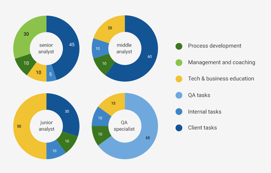
So, for example, in our company, we expected senior analysts to spend:
- 45% of their time on tasks from clients;
- 30% of their time on management and coaching;
- 10% of their time on tech and business education;
- 10% of their time on process development;
- 5% of their time on internal tasks.
This ideal task distribution, as we later learned, was far from reality. That gap resulted from eight key challenges faced by our team.
8 ways our analytics team was struggling
A dream team can’t be gathered at once; it can only be grown. Analysts in our analytics department expect to grow professionally and be given a lot of challenging tasks.
To deliver on that promise of professional growth, we had to confront eight key problems facing our team:
1. Inefficient task distribution for each position
At some point, everybody gets sucked into a routine and doesn’t ask if the current way is the only way to do their work efficiently:
- Our senior analysts had no time to teach and coach new employees, but they also had no time for managerial tasks because they were overloaded with client work.
- Our mid-level analysts didn’t have enough time for R&D and improving their skills.
- Our junior analysts were just studying all the time. We hadn’t passed them tasks so that they could dive into real work experience.
Each of these realizations became clear after we visualized the gap between expectations and reality (detailed in the next section).
2. No measurement of efficiency for each team member
We all knew that the ideal workload above was just a model. But how far from this model were we? We didn’t know how much time a particular employee spent in meetings, worked on client tasks, or was busy with R&D.
We also didn’t know how efficiently each analyst performed a task compared to the rest of the team.
3. Incorrect task time estimates
We couldn’t estimate precisely the time needed for each task, so we sometimes upset our clients when we needed more time to finish things.
4. Repeating mistakes
Whenever a junior analyst had to solve a complicated task for the first time, they made the same predictable mistakes. Those mistakes, in turn, had to be identified and corrected by their mentor, a senior analyst, before the tasks could enter production.
Even if they didn’t make any mistakes, it took them longer to complete the task than a middle or senior analyst.
5. Unintentional negligence
Sometimes, client emails would get lost, and we exceeded the response time promised in our service-level agreement (SLA). (According to our SLA, our first response to a client email has to be within four hours.)
6. Speculative upsells
We knew how much time we spent on each task for the client. But this data wasn’t aligned with the billing information from our CRM and finance team, so our upselling was based only on gut feeling.
Sometimes it worked; sometimes it failed. We wanted to know for sure when we should try to upsell and when we shouldn’t.
7. Generic personal development plans
We had the same personal development plan for every analyst, regardless of strengths and weaknesses. But development plans can’t be universal and effective at the same time.
For our analysts, personalization of development plans was key to faster growth.
8. Lack of knowledge transfer
Our senior analysts were swamped with work and had no time to pass their skills and knowledge to their junior colleagues. The juniors grew slowly and made lots of mistakes, while seniors had nobody to pass tasks and responsibilities to.
It was clear we had plenty of room to improve, so we decided to bring all the necessary data together to measure the efficiency of our analysts. Let’s look through these steps in detail.
How we measured the performance of our analytics team
This process started by defining the problems and questions outlined above. To answer them, we knew that we would need to capture before-and-after metrics. (Top of mind were the words of Peter Drucker: “You can’t manage what you can’t measure.”)
Here are the four steps we took to gather the necessary data and create a real-time dashboard for our analytics team.
1. Identify the sources of the data.
Since most of our questions connected to analyst workloads, we gathered data from the tools they were using:
- Google Calendar. This data helped us understand how much time was spent on internal meetings and client calls.
- Targetprocess. Data from our task-management system helped us understand the workload and how each of the analysts managed their tasks.
- Gmail. Email counts and response statuses gave us information about analysts, projects, and overall correspondence with clients and the internal team. It was significant for monitoring SLA obligations.
2. Pull the necessary data and define its structure.
We gathered all data from those sources into Google BigQuery using Google Apps Script. To translate data into insights, we created a view with the fields we needed.
Here’s a table showing the fields we pulled into the view:
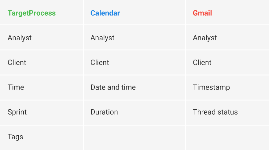
Our key fields were analyst, date, and project name. These fields were necessary to merge all the data together with correct dependencies. Once the data was ready, we could move on to the dashboard.
3. Prototype the dashboard.
Don’t try to make a dashboard with all the metrics you can imagine. Focus on the essential metrics that will answer your questions—build an MVP, not a behemoth.
Typically, best practices of dashboard prototyping are to:
- Define the essential metrics that will answer your questions.
- Ensure that KPI calculation logic is extremely transparent and approved by the team.
- Prototype on paper (or with the help of prototyping tools) to check the logic.
4. Build the dashboard
We used Google Data Studio because it’s handy, is a free enterprise-level tool, and integrates easily with other Google products.
In Data Studio, you can find templates designed for specific aims and summaries, and you can filter data by project, analyst, date, and job type. To keep the operational data current, we updated it on a daily basis, at midnight, using Apps Script.
Let’s look closer at some pages of our dashboard.
Department workload page
We visually divided this page into several thematic parts:
- Project;
- Task distribution by role;
- Time spent by task type.
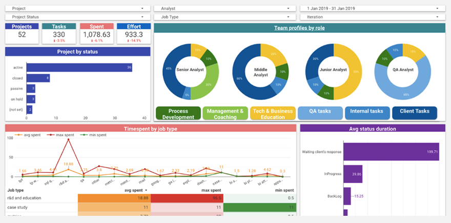
With this dashboard, we could see how many projects we had at a given time in our analytics department. We could also see the status of these projects—active, on hold, in progress, etc.
Task distribution by role helped us understand the current workload of analysts at a glance. We could also see the average, maximum, and minimum time for each type of task (education, case studies, metrics, etc.) across the team.
Analyst workload page
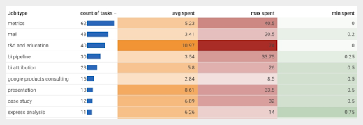
This page told us what was happening inside the analytics team—time spent by analyst, by task, and by the whole team:
- Time spent on tasks and meetings;
- Percentage of emails answered according to the SLA;
- Percentage of time spent on each task by a given analyst;
- Time that a given analyst spent on tasks compared to the team average.
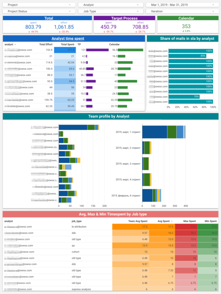
This was useful to understand how much time tasks usually took and whether a specialist could perform a task more efficiently than a junior-level analyst.
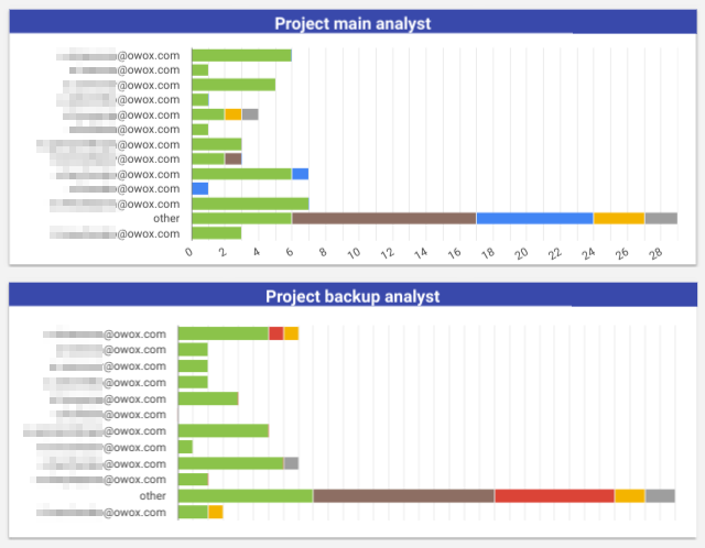
Project workload page
This page analyzed the efforts of the whole team and individual analysts at the same time. Metrics included:
- Tasks across all projects or filtered by project;
- Time spent on meetings and tasks;
- Share of emails answered according to the SLA;
- Statistics for an individual project (with the help of filters);
- Average, minimum, and maximum time for each type of task in a project.
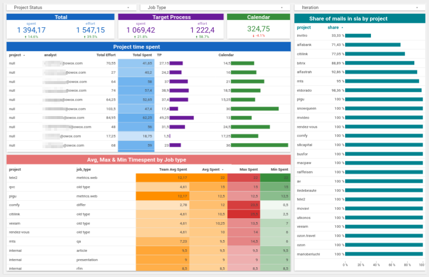
It also included the analyst and backup analyst for each project, as well as the number of projects managed by a given analyst:
We can’t show you all of our dashboards and reports because some contain sensitive data. But with this dashboard in place, we:
- Realized that the workload of an analyst is far from what we expected and that average values can hide our growth zones.
- Proved that most of our analysts (~85%) answered emails on time.
- Mapped the typical tasks that we ran into, how long it usually takes to accomplish them, and how the time for each particular task can vary.
- Found weaknesses and strengths for each analyst to customize their personal development plan.
- Found areas for automation.
The number of dashboards isn’t as important as seeing the changes we made using them. The latter translated our measurements into strategies for team improvements.
Acting on our data to improve the analytics team
Let’s have a closer look at how we used the dashboard to begin to solve some of the problems we mentioned above.
Improving task distribution for each team member
When we compared the real task distribution with the ideal task distribution, we were, shall we say, disappointed. It was far from perfect.
Our senior analysts worked on client tasks 1.5 times more than planned, and our junior analysts were studying almost all the time without practicing their skills.
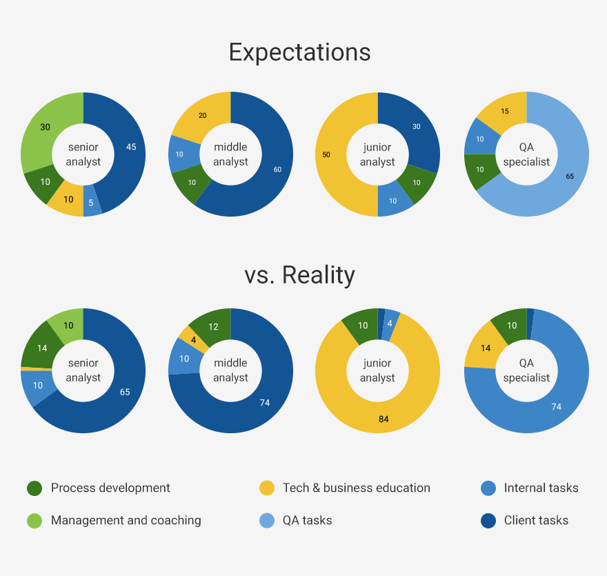
We started to improve the situation with a long process of task redistribution. And after some time, we saw improvement:
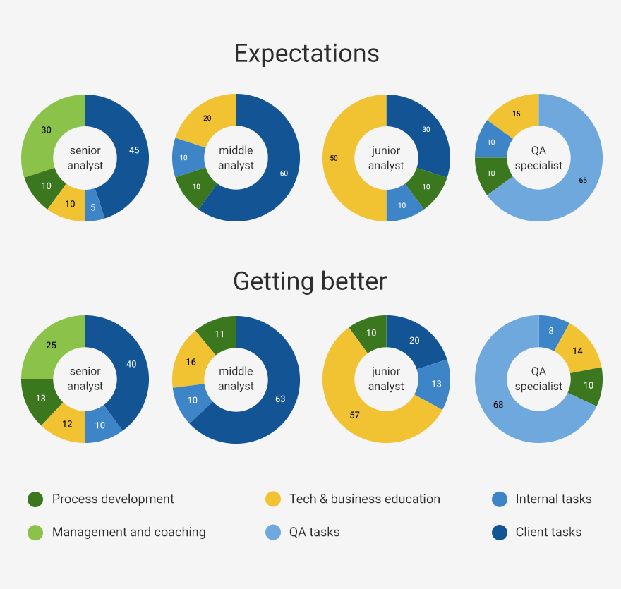
While everything looked better in the dashboard, we still had room to grow.
By aligning everything to the average values, we were trapped in a typical stats problem: treating the average as the real-world scenario. The average is a mathematical entity, not a reflection of real life. In real life, there’s nothing more blinding than focusing on the average.
When we drilled down to a particular role or analyst, the data looked quite different. Here, for example, we have data for Anastasiia, a senior analyst. On the left is the ideal, in the middle is the average, and on the right is her personal division:
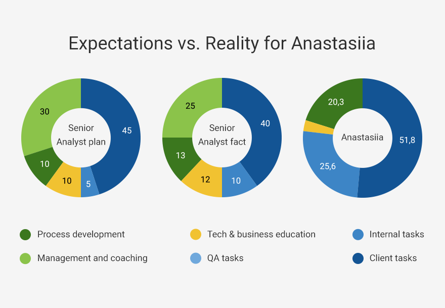
The picture changed dramatically from the senior analyst average and the reality for Anastasiia. The time spent on client tasks was much higher than it should’ve been, and almost no time was spent coaching new employees.
That could be for multiple reasons:
- Anastasiia is overloaded with client tasks. In this case, we need to take some of her tasks and pass them to another analyst.
- Anastasiia didn’t fill out the task management system properly. If this is the case, we need to draw her attention to its importance.
- Anastasiia might not be a fan of her managerial role. We need to talk and figure it out.
We redistributed some of Anastasiia’s tasks and discussed the bottlenecks that were eating the biggest part of her time. As a result, her workload became more balanced.
If we had only looked at the average stats for the department, we never would’ve solved the problem.
Automation and knowledge transfer to minimize mistakes
We had lots of atypical work in our department. That’s why it was hard to predict how long it would take to complete it (and which mistakes would appear).
We started improving our task estimation process by classifying and clustering tasks using tags in our task management system, such as R&D, Case Study, Metrics, Dashboards, and Free (for tasks we didn’t charge for).
When analysts created a new task, they had to define its type using tags. Tagging helped us measure which jobs we ran into most often and decrease repeated mistakes by automating typical reports.
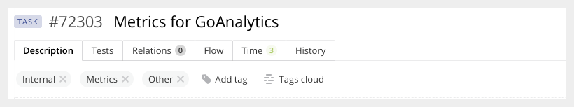
Below, you can see a dashboard showing the minimum, maximum, and average time spent on different types of jobs, as well as their frequency:
This helped us estimate the time required for typical tasks and became a basis for estimating unusual tasks. An average is a useful estimate for a new client, and outliers helped us understand how much time extra features may take.
We also looked closely at the most frequent tasks and those that had the maximum time spent. To eliminate mistakes in these tasks, our first step was to write detailed guides on how to perform each task.
For example, to create a report on cohort analysis, the guide included
- Initial data;
- Business objectives;
- Limitations;
- Patterns;
- Self-checks;
- What to pay attention to.
These guides helped pass along knowledge and avoid typical mistakes. But we also had to deal with unintentional mistakes.
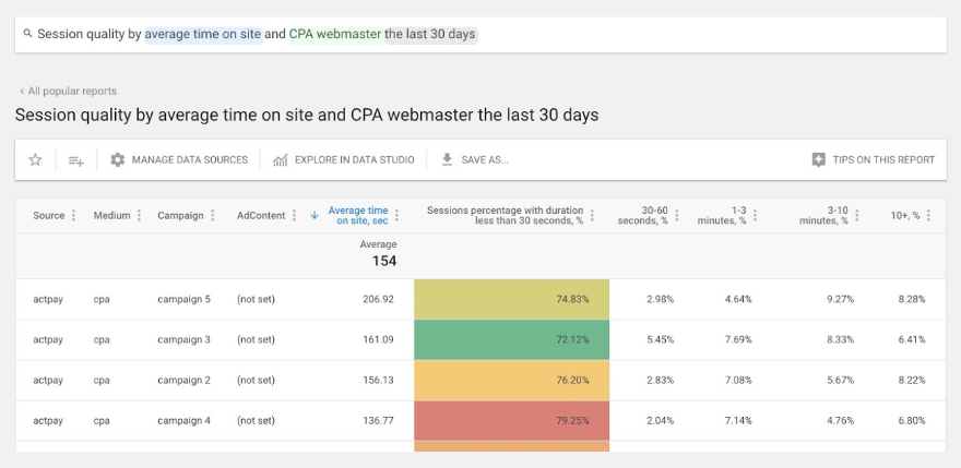
Automation can help prevent recurring, minor errors. We built (and sell) our own tool to automate reports, like the example below for CPAs:
We got rid of hundreds of unintentional mistakes and the never-ending burden of fixing those mistakes; boosted our performance and total efficiency; and saved loads of time for creative tasks.
Decreasing unintentional negligence
Client tasks take approximately half our analysts’ time. Even so, sometimes something goes wrong, and answers to important emails from clients are delayed beyond the four-hour commitment in our SLA.
This dashboard helped us monitor analyst adherence to our SLA commitments:
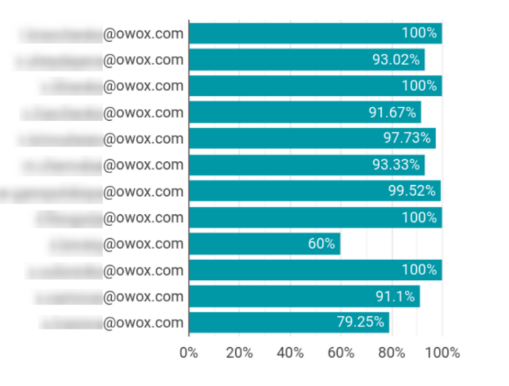
When we recognized that the percentage of responses within four hours wasn’t perfect, we created notifications in Slack to serve as reminders.
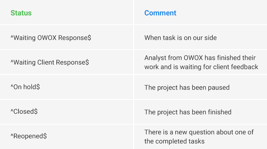
To activate a reminder, an analyst sent a status (described below) to a separate email account without copying the client. Here’s the list of statuses we developed for the system of reminders:
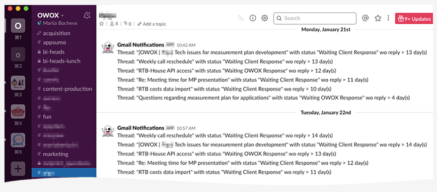
Our analysts got notifications in Slack if the SLA time for a response was almost over, or if they had promised to write an email “tomorrow”:
Personal development plans
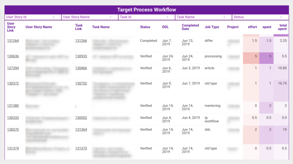
When an analyst created a task in Targetprocess, they estimated the time needed based on their previous experience (“effort”). Once they’d finished the task, they entered how much time was actually spent.
Comparing these two values helps us find growth zones and define the difficulty of execution:
For example, suppose an analyst spent much more time than average on a task with the Firebase tag. If that’s caused by low technical knowledge, we’ll add Firebase to their personal development plan.
By analyzing analysts’ efficiency on the individual level—while focusing on the educational opportunity—we solved our problem of tarring all analysts with the same brush for development plans.
Now, each specialist had an exceptionally relevant step-by-step guide for self-improvement to help our specialists grow faster.
Conclusion
We still have some questions to dig into in our department. Launching analytics for a real-life team is an iterative process.
Where will we go next? Fortunately, we have strong analytical instruments in our hands to help not only our clients but also ourselves. As you look at your situation, here are key takeaways:
- The sooner, the better. Collecting, merging, and preparing data is about 75% of your efforts. Make sure that you trust the quality of the data you’re collecting.
- Start with an MVP dashboard. Focus on critical KPIs. Pick no more than 10 metrics.
- Define what you’re going to do if a metric changes dramatically at 5 p.m. on Friday. You should have a plan if a metric rises or falls unexpectedly. If you have no idea why you should have such a plan for a certain metric, think over whether you need to track it at all.
- An average is just an average. Look at the extremes. Challenge the average when it comes to managing and developing people.
- Use transparent and easily explained algorithms. Make sure your team understands the logic behind the algorithms and is okay with it, especially if KPIs influence compensation.
- It’s easier to automate tracking than to make people log time. But you shouldn’t make it look like you’re spying on the people working for you. Discuss all your tools and steps for improvement with the team.
Related Posts
-

Do you get several messages a day from customers asking for a discount or coupon…
-

As technology continues to make data-driven marketing easier to implement and control, one thing remains…
-
This post is not a dry feature-by-feature comparison, nor does it include a winner-take-all verdict.…
-
Are you taking time to think, just think? Dedicated time for thinking is the key…