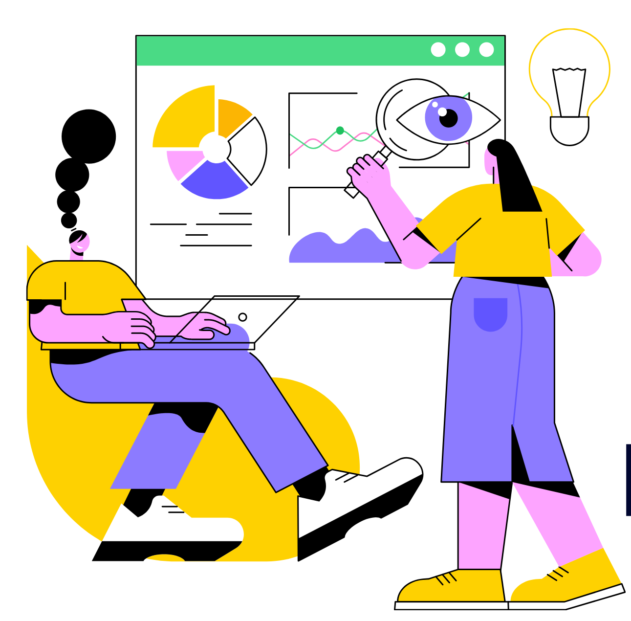
The Psychology of Design: Why Your Business Must Understand How Design Influences Customer Behavior

Design can be an incredibly powerful tool when you understand how psychology influence’s people’s behavior.
Science has proven that people respond differently to shapes, colors, patterns, and other design elements. Just like in marketing psychology, you can use the psychology of design to create stronger designs.
The good news is that you don’t need a degree in psychology to leverage good design practices in your own business or when you’re creating designs for someone else. You can apply basic psychological principles when formulating your next logo design, website design, print design, or any other design project.
We took a close look at five psychological theories that can help you improve the effectiveness of the designs you use to market and grow your business.

Mental Models
The next time you walk up to a swinging door, take another, close look. What kind of door is it? How does it open? Do you think you should push or pull to open it?
The system your brain uses to figure out what to do is called a mental model. It’s the way you think something could work.
Your brain is continuously taking in information about the world and making sense of what it perceives. In the case of the door, our brain assesses many elements, including:
- Whether the door uses a bar or push/pull plates,
- What text labels are present,
- Our previous experience using doors like this one, and
- If we’ve never used one, maybe the memory of seeing someone else use one
Once we have this information in mind, we apply our mental model of how doors should work based on what we’ve learned to (hopefully correctly) try and open it.
Mental models are a powerful design tool because they leverage existing knowledge to help people make decisions about how to use something. Apple used mental models extensively when they introduced the iPhone in 2007. They relied on people’s mental models of real objects like phone books, telephones, and clocks to make the iPhone’s revolutionary interface more intuitive. It’s one reason why the early iPhone interfaces looked just like the non-digital objects they were seeking to replace. For example, the “phone book” had a visual look that reminded you of a phone book.
What happens when someone’s mental model doesn’t match how something ends up working? In the case of our door, we {BANG} push when we should have pulled or vice versa. There is a mental model mismatch between how we think something should work and how it actually works. This mismatch can be highly frustrating, and if your products or designs suffer from a mental model mismatch, it could mean the difference between an engaged customer and one who does business with your competitor.
Doors that frustrate expectations of how they should work are often called “Norman doors.” The Norman referenced here is seminal designer Don Norman, who wrote about doors, phones, and the design of everything things in his book called, appropriately enough, The Design of Everyday Things.
Vox and the excellent design podcast 99% Invisible looked at bad door design in this entertaining video, which also features an interview with Don Norman:
Correctly used, mental models can reduce errors, lower the learning curve, and make using a new product or app a more pleasant experience. Make sure when you design something you match the correct mental model with how it works. Your customers may not notice it when everything works as they think it should, but they definitely will when it doesn’t.
Gestalt Principles
The word gestalt may be German for shape, but it’s also connected with a fundamental set of principles that are critical to the effectiveness of design. When we look at the world, our minds strive to make sense of what we see. The Gestalt Principles describe the different ways that our minds perceive that order. One of its core concepts is they describe when and how our minds see different visual elements as being part of a greater whole. As such, they have become invaluable tools for designers.
There are ten primary Gestalt principles:

1. Simplicity
Simplicity refers to the idea that the first time we see something, our minds try to see it in its simplest form.
In the above image, simplicity means we immediately see the head of the person rather than the tiny individual photos, which happen to be the heads of Chinese people.
2. Figure-ground
 Figure-ground describes how our minds try to find what part of an image is the figure (or subject) and which part is the ground (or background).
In the image to the right, what you see as the figure and as the ground depends on how your mind perceives it. For some, the hand is the figure, and the shape of a woman’s face and body is the ground.
 When used in a design, figure-ground can be a handy tool to create visual tension, excitement, and interest. In the example on the right and slightly above this paragraph, notice how your mind flips which is the figure and which is the ground depending on whether you’re looking at the woman or the man’s face.
3. Proximity
The Gestalt principle of proximity says that we perceive objects that are close to each other as being part of a group. This principle is used throughout design and is a powerful way to help create visual order.
There are countless examples of proximity at work in design, from icons that have labels to e-commerce sites with products placed close to their prices.

In the example above, the Facebook home page uses proximity to divide the layout into two sections – why you should sign up, and then the sign-up form itself. The “why” section uses proximity to visually connect the reason (“see photos and updates”) with its icon.

We just emailed the info to you.
4. Similarity
The principle of similarity is just as it sounds: objects that are similar are seen together as a group. The above example, from CNN.com, shows this principle in action. Notice how the headlines to the left and the images with headlines in the middle look like two separate groups. This separation is both because of proximity but more importantly because they look similar.

5. Common fate
Common fate may sound like something dire, but it refers to how we perceive items in motion. Things moving in the same direction appear to belong to the same group. A good example of this is watching how flocks of birds fly together. The birds flying in the same direction look like they are in the same group, and ones flying in a different direction do not.

6. Symmetry
When we look at something, our minds crave examples of symmetry. Symmetry creates a sense of harmony and order which are things we naturally desire. In general, we have a bias toward symmetrical things. We find people with symmetrical faces and bodies more beautiful. The same bias exists in design. Symmetrical designs feel more harmonious and easier to take in.
7. Continuity
Continuity is all about alignment and direction. We see items that are arranged in a line to continue beyond where the items end. This is one of the most important principles of design. By placing items in a row, designers can coax the viewer’s eye along the row and beyond, which is a powerful way to draw attention. The viewer’s eye continues in the same direction until it sees another object.

A simple example is a line with an arrow at the end. Our eyes follow the line beyond where the arrow ends until they get to the circle.
8. Closure
 Closure is a fun principle because it plays with the idea that our minds want to complete what we see. Many logos use this principle to create dynamic imagery out of very little. When you look at the shapes to the right you probably don’t see six objects at first, but a ball instead.
A famous example of closure in effect is the FedEx logo, which uses the space between the E and the X to create an arrow. Once you’ve had it pointed out (pardon the pun), you can never un-see it.
![]()
Closure is effective because it uses the viewer’s mind to fill in the gaps, which often makes the design more striking and memorable.
9. Common region
Common region is the principle that items located within the same area are perceived to be together. We’ve seen many previous examples that use common region to help visually group related items, such as the Facebook homepage, CNN headlines, and the photo of birds flying in formation.
Common region is very similar to the principle of proximity except it can be applied to larger groups of items.
10. Element connectedness
Element connectedness states that items connected by a visual element (such as a box or line) are considered to be a group. Navigation sections are a good example of this in effect – many navigation areas use a box or set of lines to separate the navigation from the rest of the layout visually.
The Psychology of Color
As we wrote previously:
In a widely-cited study called “The Impact of Color on Marketing,” research found that people make a subconscious judgment about products within the first 90 seconds of seeing it. The majority of these people evaluate these products on color alone: almost 85% of consumers cite color as the main reason they buy a particular product, and 80% believe color increases brand recognition.
We associate colors with specific feelings or ideas, and designers have to be careful to use colors in keeping with how they register emotionally.
Here’s the basic rundown:
Red: a powerful color that harnesses intensity, power, and action. Red demands your attention and increases your heart rate, and encourages people to take risks. When designers use red, they use it with the understanding that it makes a hard hitting impact – its fiery hue won’t soothe customers.

Yellow: associated with vigor and lively enthusiasm, yellow has been shown to encourage mental activity and can even generate muscle energy. Designs that use yellow aim to grab your attention and ramp up your energy levels.

Blue: a calming hue shown to be so powerful an association that it can lower blood pressure. It soothes and reassures, engendering trust, security, order, and tranquility. If your design features a lot of blue, the psychology behind it is betting on you feeling secure in the reliable, trustworthy color choice.

Purple: a color both commanding and opulent, lavish while maintaining its regal narrative. It is also evocative of the fantastic, suggesting wisdom, creativity, and imagination.

Orange: this exuberant color is vibrant, and its energy suits companies interested in appealing to a loud, strong business niche.

Green: associated with well-being, growth, and nature, green is a popular choice when dealing with environmental issues, natural or organic product companies, and banks.

Black: a color that is timeless and sophisticated. When people see black, they feel they are indulging in an exclusive, high-end experience. It’s also a powerful way to elicit feelings of careful consideration and authority because black is a sober, dignified color.

The Psychology of Shapes
As with color, people associate different shapes with varying emotions and qualities. Our subconscious matches specific characteristics with certain shapes, making it necessary to choose the right shape/association for your business.
Shapes help to define or reinforce our perception of the brand. When you’re choosing a shape for your logo, you want to consider the feelings different shapes elicit. Circles often are associated with friendship, collaboration, and idealistic visions. Squares and other line based shapes can emphasize the impression that a company has structure, balance, and stability.
Circles imply positivity and relationships. Round logos convey a sense of community, unity, and perfection.

Designs that feature curves suggest motion, pleasure, and rhythm. These logos are used to emphasize a company’s ability to satisfy consumer’s need for gratification.

When you see squares used in a design, it imbues it with a sense of stability, strength, and professionalism. The sharp edges and well-defined outline of a square promote an efficiency and sense of security in the brand employing it.

Triangle designs suggest power, purpose, and energy. The sharp lines and peaks convey aspiration and prestige to viewers, and companies that use triangles capitalize on that to elicit these qualities in consumers’ responses.

The Von Restorff Effect

Wikipedia defines the Von Restorfff Effect as “the “isolation effect”. “When multiple homogeneous stimuli are presented, the stimulus that differs from the rest is more likely to be remembered.”
In other words, to be remembered you have to stand out.
This effect can make a particular area of an advertisement or logo stand out, drawing viewers to look at that spot. Color, shape, and position further emphasize this focus point by creating a juxtaposition between design features.
Any time you break a design “habit,” you create an element of surprise and contrast that increases the memorability of that particular design feature.
Creating a memorable design isn’t as hard as you think. If your small business wants to refresh your design, or if you need a brand new one, look no further than crowdSPRING. We have the world’s best creative team. Our team of hundreds of thousands of designers can help you use great tips like these to get you a design that is psychologically proven to work for your business.

Design Done Better
The easiest way to get affordable, high-quality custom logos, print design, web design and naming for your business.
Learn How to Grow Your Business With Beautiful Design