
When I started blogging, my intention was NOT to make it my main income source.
My blog was a place I could share ideas and maybe make a little side income from at best, at worst it would be a short lived experiment.
You see, I didn’t view blogging as a good business model.
As far as I could tell, blogs didn’t make much money, and the few people who did make reasonable income from them worked incredibly hard to sustain it.
Because a blog is so reliant on fresh content, I saw blogging as the opposite of the kind of business I sought.
It was a trap, the worst kind of business model in my eyes, because you could never stop working, unless you wanted your income to stop too.
Blogging As An Email List Growth Vehicle
 My opinion of blogging changed the day I added an email list optin box to my blog.
That was all the way back in 2006.
That first day I had about 10 people sign up to my email list. The next day it happened again, and then again the day after.
Day after day, month after month, year after year, people continued to find my blog and join my email list.
Today as I type this, more than a decade since I started using my blog to grow my email list, not a day has gone by without my blog diligently working to grow my list.
The consistency is incredible, and best of all, it’s free.
What’s truly amazing, is over the years I have significantly reduced how much content I publish on my blog.
To put it simply, over time how hard I worked blogging decreased as my income increased.
My blog didn’t become a trap, instead it became a freedom vehicle.
Thanks to my blog and all the email subscribers it has brought to my world, I hit $2 million in sales of my own products.
None of this would have been possible if I didn’t realize that blogging, when combined with email marketing, creates one of the best freedom business models available online today.
How To Turn Your Blog Into An Email List Growth Machine That Runs On Autopilot
I’d like to teach you how to turn your blog into a tool to grow your email list.
The most important first step you can take is to optimize how you invite people to join your email list on your blog.
It’s vital you do this as step one. There is no point publishing content or going out there to drum up traffic to your blog, if people show up and then leave without subscribing to your email list.
So, how can you maximize how many people subscribe to your email list from your blog?
It’s relatively simple in concept, just use several of the ten email optin form placements in your blog design to invite people to subscribe to your email list that I cover later in this article.
Obviously you have to have something to offer people in return for subscribing, which is often called a ‘Lead Magnet’ or ‘Freebie Giveaway’. In this article I’m not going to focus on the what as much as the how (not WHAT you give away, instead HOW you get people to sign up).
Your job is to come up with something enticing, specifically for your target market. It might be a free handout, webinar, audio or video download, short report, or an email course. All these tools will work, if they appeal to a strong desire your audience has.
(We will take a deeper look at lead magnets in a separate article.)
Once you have your freebie or lead magnet ready to go, it’s time to optimize your blog to get those email subscribers. Here is how to do that…
How To Hack Your Blog Design To Maximize Email List Growth
The following are ten different types of email optin boxes you can add to your blog, all designed to invite as many people as possible on to your email list.
You won’t be able to use them all at once because some of them will clash if used together. You need to find a good balance — a mix of these options — so your email list grows but your blog still remains readable.
I’ll highlight which optin options I have tested, and offer you the pros and cons for each option. You can walk away and plan which to apply to your blog.
Before we dive into each of the optin box options, you need to be aware of two important concepts…
Above The Fold
 When paper newspapers were the main source of daily reading material, the content that appeared at the very top front page, above where the paper was folded, was considered prime real estate.
Advertisers and journalists alike knew that whatever appeared ‘above the fold’ of the paper would get the most attention, and thus was the most desirable placement for their content.
Although we don’t fold our computers today, there is still an area considered above the fold on a website or blog. The area of the screen that can be viewed without scrolling downwards is the prime real estate for a blog.
It’s important you understand this, because the optin boxes on your blog that are placed above the fold, in particular at the very top of your blog, get the most attention and usually bring in the most email subscribers.
That’s not to say other methods do not work, but at the very least you should have an optin box — usually a very big clear one — at the very top of your blog design.
One Step Vs. Two Step Optins
When I started adding email optin boxes to my blog they were pretty simple. A headline, some bullet points, an input form to write name and email address, and a submit button.
This style of optin box is known as ‘one step’ because you only need to click a submit button once to sign up to the email list.
In more recent years a new form of email optin method known as ‘two-step’ emerged. Instead of the form appearing on the blog itself, the email optin box simply has a button to click to subscribe, which when clicked, pops open what is known as a ‘lightbox’.
The lightbox covers the entire website in a shadow, with the box appearing as a focus point in the center of the page. The box contains the usual optin details – a headline, maybe some bullet points, plus input forms for name and email, or sometimes just email, and then a submit button.
This is called a two step optin because you have to click once to open the lightbox, then click again to subscribe to the email list once you have entered your details.
Two step optins became popular because they showed in some tests to perform better than one step (more people subscribed resulting in a higher conversion rate).
The theory goes that by giving people just a button to click, and not a form to fill out, they are more likely to click it (reduces resistance).
Then because they clicked the button, they are more likely to fill out the popup lightbox form to subscribe to your email list because human beings like to feel a sense of completion (consistency). You have to finish what you started when you clicked the link.
Whether one step or two step performs better is something to test on your blog. Sometimes it just makes sense from a design point of view to use one or the other.
Okay, now let’s review ten powerful methods to use your blog to grow your email list…
1. The Header/Footer Optin
The header of your blog is what sits at the very top. Sometimes it is above your navigation bar (links to different areas of your blog), sometimes it is below.
The header is always above the fold and is the area of your blog that makes a first impression to a new visitor. As such it is a critical part of your blog design, and the perfect place for an email optin offer.

The header also provides a lot of space to play with, which you can use to design elaborate optin boxes that clearly present the benefits of joining your email list.
The footer is not quite as prime real estate as the header, but because it’s the last element at the end of page, it represents a great opportunity to present a ‘next step’ once a person finishes reading an article.
In my opinion the header and footer are ‘must-have’ optin boxes.
2. Sidebar Optin Boxes
The most common email optin box is the sidebar optin. You’ve probably come across them many times while browsing websites, especially older designs.
Usually they take the form of a box or banner in the right or left sidebar. Sometimes the optin box will also ‘float’ down the side with the reader as he or she scrolls down the page. This ensures the optin box is always present as the reader is engaging with your content.

Unfortunately because the sidebar optin is so common, many people are blind to them. They simply ignore anything in the sidebar, hence conversion rates for sidebar optins can be very low, less than 0.01%.
In my own tests the sidebar never performs as well as a header optin. You could use both a header and a sidebar optin, but a lot depends on your overall blog design.
Today I prefer not to have a sidebar at all on my blog posts so the content is in focus without distractions, however my earlier blog designs did have sidebar optin boxes on every page. This is a design decision you will have to make for your own blog.
3. Header And Footer Optin Bars
The bar optin is a thin bar that runs at the very top of a blog or the very bottom. Often they scroll down the page with the reader so they are always on the screen.

The header bar at the top of the blog of Tim Ferriss on one of his earlier designs.
There are many plugins you can add to WordPress blogs to create a footer or header stripe optin bar. They usually contain just one line of text (a headline) and a call to action link or input box to sign up to the email list.
Here is an example of a footer optin bar that stays with the visitor as they scroll down the page.
Stripe bars can work incredibly well, however given the limited amount of space they don’t offer much to work with to get your message across. I’d rather see a well designed header that represents you and your brand (and your email offer of course).
4. In-Content Upgrades
An in-content upgrade is an offer you make for some kind of companion resource to the content your visitor is reading on your blog.
These optin boxes are placed ‘in content’, which means they appear within the article itself, often between paragraphs or at the conclusion of a content block within an article.
This is a content upgrade that sits within the text of a blog post, as seen on the twelveskip.com blog.
These have become increasingly popular over the years because of how tailored they are, thus resulting in high conversion rates.
I like in-content upgrades because they are not as disruptive to the flow of engagement and they offer a very specific resource tied to the content of the blog post. Context is critical when it comes to conversion, which is why this optin format works so well.
The downside is by creating a freebie or lead magnet tailored to a specific blog post, it may not work as a good optin offer on most of your other blog posts.
A lot of bloggers have used in-content upgrades but only on their top five or ten blog posts. They review their Google Analytics traffic data, find their highest traffic blog posts, then create in-content upgrades just for these posts.
This is a strategy that may work very well for you, especially if you have an established blog with some traffic. Identify your best performing blog posts and add optin boxes for content upgrades.
5. Author Bio Boxes
This author box from CopyBlogger.com has a next step call to action that leads to an optin box.
Similar in design to content upgrades, the author bio optin box appears at the end of every article on your blog as part of or just below your author bio.
Like the footer optin box, the author bio is a great spot for a next step optin because they see it after finishing reading your article. If they like your content, they can optin for more from you.
Having an author bio box is a great way to create a personal connection with your readers. Using it as a place to grow your email list just makes sense, as long as it doesn’t clash with too many other optin boxes (for example if you have a header, sidebar, in-content upgrade, author bio and then footer optin, it could be overkill).
6. Slide-In Or Footer Pop-Up Slider Optins
This type of optin box is triggered as your reader scrolls down the page reading your article.
The optin will slide in from the left or right side, or pop-up from the bottom of the screen. They can easily be closed by the reader and set not to reappear frequently, so you don’t force your non-interested readers to see optin boxes for things they don’t want.
Here you can see a slider optin box float in from the left side of the screen from Joanna Penn’s blog. The slider is powered by Smart-Slider.com.
These optin boxes are small in design, usually have space for just a headline, picture and a call to action button or optin form to subscribe.
They work well as a subtle interrupt because they don’t stop the person from seeing the content like a popup lightbox does, yet they command attention. They can be strategically triggered based on a time or placement delay, so your reader doesn’t see them until the end of the article, creating that ‘next step’ effect.
I like this style of optin box because they don’t stop someone from engaging in your content, they have movement, so grab attention, yet they are not a permanent part of your content, so your reader can easily switch them off.
One of the risks of using this kind of dynamic optin is having too many moving aspects of your blog design. If you use a slide-in optin box like this, make sure it’s the only element that triggers this way. You don’t want ruin the reader experience by having boxes popping in and out of your blog constantly.
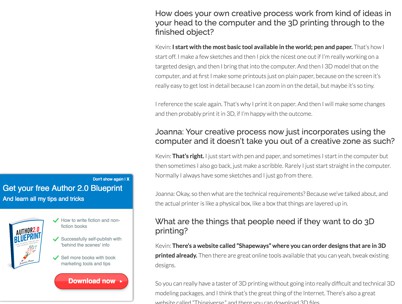
7. Comment Tickbox Optin
A comment tickbox optin is a selection box that can be ticked when a person leaves a comment on your blog article, signifying that they would like to sign up to your email list at the same time they leave comment reply to your post.
I don’t see this type of optin very frequently, however I did make use of it on my own blog for many years.
Since many blogs are removing comments completely, this optin offer is not always an option. However if you currently have a lot of people leave comments on your blog this is a technique worth testing.
Many people who leave a comment can turn into email subscribers at the same time thanks to this method.
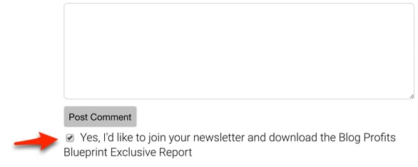
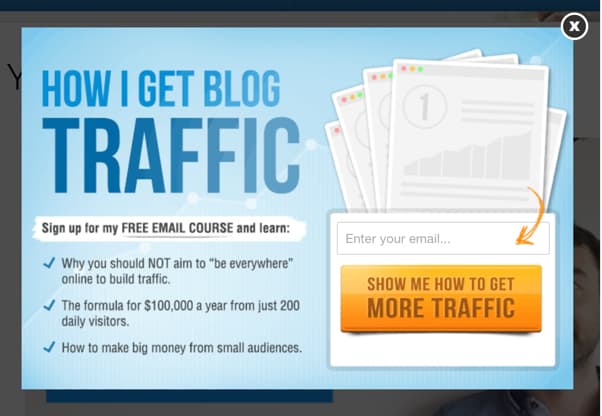
8. The Lightbox Or Popup Optin Box
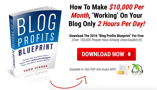
I remember the first time I tested a popup optin box on my blog. I was hesitant because I felt popups were annoying, so why annoy my audience.
The popup was simple. An optin box would pop up on my blog posts after a five second delay, offering my lead magnet/free resource.
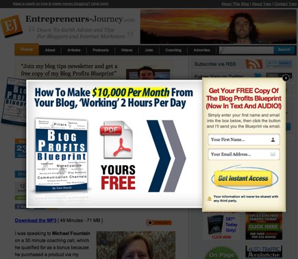
This is the first lightbox popup I used on my blog to promote my Blog Profits Blueprint free report.
Overnight my daily optin rate doubled just because of the popup. Yes I was annoying some people, but it’s hard to argue with a 100% increase in email subscriber growth — and it was sustained growth, it never dropped back down while I had the popup active.
In recent years the lightbox popup arrived, which is basically the same as a popup box, but the background gets dimmed (like light is shining on the popup box, hence the name). This serves to further focus attention on the optin box, but doesn’t make it less annoying!
Thanks to the release of new plugins that give you more control over your popups, I switched to what is known as an ‘exit-intent’ lightbox popup.
The exit-intent means the popup only appears when a visitor moves their mouse in a way that shows they intend to leave the page. It can help turn visitors who would otherwise leave into email subscribers, and performs just as well as a popup.
I like the exit intent because it’s not as intrusive. It won’t stop a person from reading an article they are engaged in. It will only show up if they go to leave.
Popups today are increasingly common, yet despite people becoming used to seeing them all over the web, they still provide a significant bump in your email growth rate.
I strongly recommend you test them, but make sure your offer is very appealing to your target audience, so it will be looked upon as valuable rather than annoying.
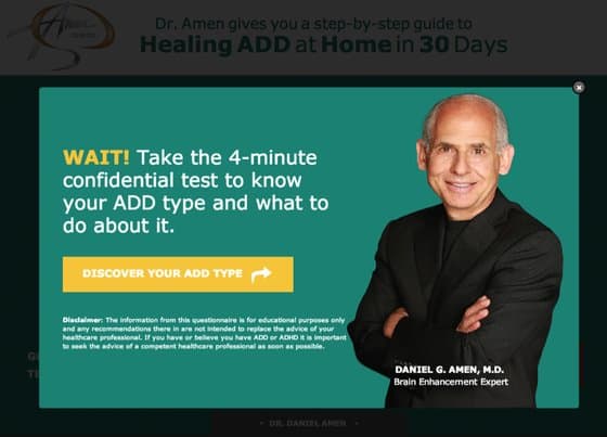
9. Welcome Gate Or Welcome Mat
A ‘Welcome Gate’ optin is similar to a lightbox popup. It triggers as soon as a new visitor lands on your blog page, and will cover the entire site in one big optin offer.
The Welcome Gate Optin we used for a webinar campaign on this blog.
The ‘Welcome Mat’ is very similar to the gate, but instead of covering over the top of your blog, it actually sits above your blog, like a welcome mat at a door of a house.
If a person closes the welcome gate, it fades away. If a person closes a welcome mat, the screen scrolls downwards to the main content of your blog.
These are subtle differences, but essentially the two ‘Welcome’ optin styles function very similar to Popups. In a way they are like giant popups that cover the entire screen.
Because of this they can be seen as potentially just as annoying to your reader since they are interrupted as they visit your blog, but they are also incredibly effective.
I recently tested a welcome gate on my blog and just like the popup, my email optin rate doubled over night.
This is a Welcome Matt optin, it appears ‘above’ the site content. If you click the arrow or the no thanks button it will scroll down to the blog.
What I don’t like about welcome style optin offers is that you place something in front of a visitor who is yet to engage with any of your content at all, so they haven’t had time to benefit from your work before you hit them with an optin box.
10. Landing Page
While not technically ON your blog, I couldn’t end this article without mentioning a landing page as a required email list growth tool for bloggers.
A landing page is a dedicated optin form sitting on a standalone page. It’s an important optin page to have because it usually converts the best because it’s 100% focused on one goal – an invitation to join your email list.
We split tested three different versions of the Blog Profits Blueprint landing page and this one converted the best.
Many of my coaching clients get confused when deciding when to use a landing page when you have all the optin boxes on your blog. Shouldn’t you just send people to your blog?
There are times when it makes more sense to send people directly to a landing page and not your blog.
For example, if you are interviewed as a guest on a podcast, you’ve already spent half an hour to an hour building a relationship with the audience, so sending them directly to a landing page makes more sense because they already have some trust with you, you don’t need blog articles to build that trust.
Another example is videos you release on YouTube. The video itself is the free content that builds trust, so at the end of the video you should direct people to a landing page to join your email list.
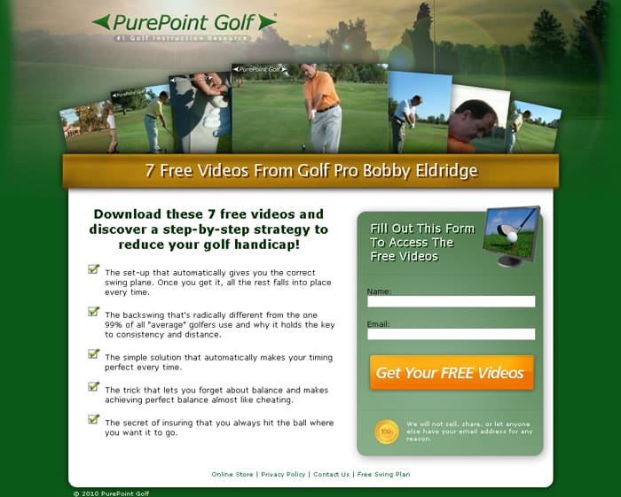
This is a landing page for a golf video series. The page does only one thing – focuses on converting the visitor on to the email list.
It’s important you have all the tools available to you to maximize email growth, hence having a landing page, plus a blog full of amazing content with multiple email optin boxes as discussed in this article.
Don’t Forget Mobile Phones!
All of the optin methods I mention above must function and present well no matter the size of the screen your visitor is using.
Given that as much as 60% of traffic to your blog is coming from mobile devices, all your email boxes, popups, welcome gates and landing page must be responsive (dynamically change in design to work no matter how large or small the screen).

Not all email optin tools and scripts format well for mobiles, so be sure to test them before rolling them out on your blog.
Going Beyond Basic Email Optin Forms
I realize it’s going to take you a while to just get some of the above optin boxes on to your blog.
However I feel it’s important, especially in today’s more crowded internet marketing landscape that I arm you with a few advanced ideas before we wrap up this article.
These concepts will help you not only increase your email list growth, but you will get a better quality subscriber as well, someone more likely to engage with your content and eventually buy from you.
Quality Vs Quantity
Sometimes bloggers get carried away with simply getting people on to their email list.
It’s important you understand that having an engaged subscriber is way more effective than 100 people on your list who never read the emails you send them.
Quality is more important than quantity. You can make a lot more money from a very small email list when that list is full of the ideal customer for your business.
Some of the techniques above like welcome mats and popups focus more on simply getting someone to subscribe, rather than making sure it’s the RIGHT person subscribing.
This is why I like optin options like in-content upgrades, and author bio box optins and header/footer optins. These tools invite a person to join your list AFTER engaging with your content. They’ve shown interest and prequalified themselves, so when they join your email list they really do want what you offer.
Segmented Targeting
Another advanced technique you can apply to get a better quality subscriber is segmentation.
One of the ways I do this on my blog is offer content specific email offers to related content categories on my blog.
This is a lightbox popup that appears on all articles on this blog in the traffic category.
For example, on blog posts where I write about productivity and personal development, I show optin offers for my free mindset email course.
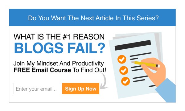
This is an email course in-content upgrade optin box we used in a split test on a series of articles about productivity and mindset.
You can segment your blog into various categories and then offer specific email giveaways that speak to those interests. That will increase your optin conversion rate and also help you get a better targeted subscriber on to your email list.
You do need more advanced software running your email optin boxes in order to segment like this, but it’s something available to everyone.
Split Testing
Split testing is a simple idea. You run two different versions of an optin box, perhaps changing the headline in version A compared to version B.
Then you let both versions run live on your blog and see which one gets more optins. Once you have enough data to determine a winner, you drop the one with the lower conversion rate and then set up a new test to see if you can beat the winner.
You can run split tests on every type of email optin technique I discussed above. Again you do need more advanced software tools, but most of the modern email optin software management plugins and scripts today offer some kind of split testing feature.
A 1% increase in your email optin conversion rate from a split test may not mean much, but imagine over time every one of your optin boxes are slowly getting better and better. This can lead to thousands of additional subscribers on your list each year.
Keep Things Fresh
Over time every type of email optin design becomes popular and thus people start to become blind to them.
When I first started online, the sidebar optin was king, then people started making big header optin boxes, then the popup optin arrived and blew everyone away with how effective it is.
Today the welcome mat is the current trending optin box, but it too will become a standard across many websites and thus performance will decrease.
If you want to increase how many email subscribers you attract, keep trying new designs and placements of optin boxes on your blog.
I wouldn’t recommend using all ten of the options above at once, but you could through the course of a year, test all ten by swapping some out for others. This will work to grab attention of your readers when they have become blind to any single format of optin design and placement.
Keep things fresh. Test new designs and blog site placements, split test headlines, try new lead magnets and giveaways, segment your offers and your email list will begin to grow quicker and quicker.
Over 250,000 Email Subscribers From Blog Traffic
My blog has attracted over 250,000 email subscribers since that day I first added an optin box to the design.
While that’s an impressive number, in truth what really matters to my business are the few thousand people from those email subscribers who became my customers and coaching clients.
Your job is to turn your blog into an email list growth machine, so you can build relationships and find your customer base.
I hope you found this article helpful and use the advice and techniques to grow your email list.
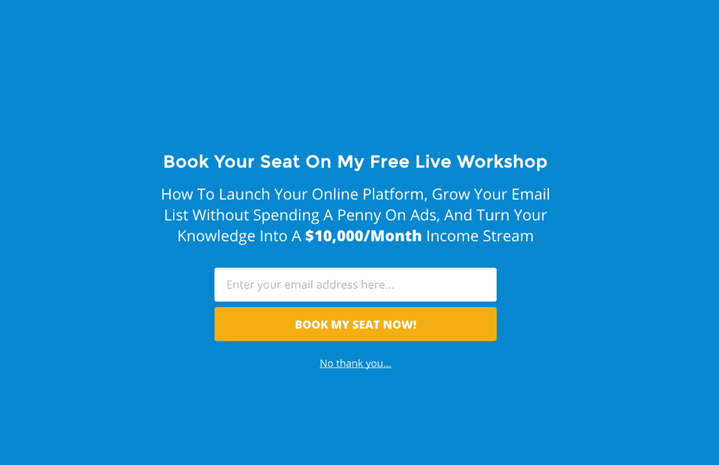
If you’re serious about growing your email list and using that email list to sell your products and services, you should take part in my free workshop:
Yaro
Hi Yaro,
WOW! This is a great Article. Many of these are exactly what I’ve been looking for. Can’t wait to start working with them. Thanks for the fantastic, comprehensive article.
You’re welcome Elison!
Thanks Yaro, for this highly informative article. What I really liked was the well-illustrated examples of various email optins one can use, as well employ techniques to grow their email subscription list for their blogs.
Glad you liked the article Beth – it turned into a monster long one, but I think if everyone considers all ten of these optin methods they will do very well.
Dear Yaro, I agree that the blog took a while to read, but was worth the time spent. Sure all these optin methods are really useful to implement.
Thanks for this article, would implement it on my blog asap.
Wow Yaro! This is an awesome article. I especially love the idea of using targeted pop-ups based on what the users are reading on my blog. Such a wonderful idea!
Thanks so much… off to share..
Hi Yaro,
Congratulations on achieving $2M in sales! Long time reader/follower.
It is funny, I was just thinking about on how to increase my subscription list currently from 1 to 1000 lol. Your article came just in time.
I will try all the techniques and see which one works for me.
Thanks again
Norm
Thank you Yaro,
This is a great help for me and my blog readers, I am already using some of this technics but without knowing much about it. I am running a blog in Sinhala(Sri Lankan)language about blogging and would you mind if I share this knowledge in my language with my readers?
Thank you in advance.
Sinhala Blogger
Hi Yaro, I have put a sidebar optin form on my blog to capture email IDs. I have noticed that you never use sidebar forms. Is there any specific reason for this ? Do you think sidebar optins should not be there ?
Best Regards
Rohit
I switched to a single column blog design years ago Rohit. I like the simplicity and focus placed just on the article content. I’m sure I could get a couple of more optins by adding a right sidebar optin, but it would create another distraction. What I really want are people to read and love my content, and then sign up eager for more. Yaro
I agree with Elison, as the well-illustrated examples of various email options one can use and employed techniques to grow their email subscription list for their blogs are very effective steps to build the email list. There are practically countless options available, but email remains to be the most effective forms of marketing for many good reasons. As a blogger, I find email marketing as the best option as it is the most cost-effective form of marketing. To increase the number of views on my blogs, I used EasySendy which turned out to be the best platform for me to reach my niche audience. With its best-in-class feature of time wrap delivery, I found scheduling the emails based on location secure. My viewers count reached a good count after using this platform. Yours was a great article. Thanks for updating the other advantages of using email marketing too.