9 Proven Strategies Your Small Business Can Use to Increase Engagement and Conversion Rates
![]()
What is a conversion form?
A conversion form, or lead generation form, is a set of text fields and labels that a company uses to gather information from its customers and prospective customers. Forms can be as complicated as a multipage survey with dozens of fields and options or as simple as a single email address field.

If you are an established entrepreneur and run an e-commerce business or depend on leads to generate revenue from your website, you already know that the forms on your site will make or break your business.
But if you’re starting a business and planning your go-to-market strategy, you may not yet understand how website forms can help or hurt your business.
A SalesForce study concluded that “companies that excel at lead nurturing generate 50 percent more sales-ready leads.”
If your lead generation forms are poorly designed, they become a roadblock and quickly turn customers away from your site. If you design your lead generation forms well, you can watch your conversion rates quickly skyrocket.
This isn’t something you should leave to chance.
Your inbound marketing and content marketing efforts will be wasted, and you’ll waste time and money if your landing pages aren’t ready to convert the people you’re sending to your website.
Let’s look at ways your small business or startup can optimize lead generation forms to improve conversions and increase sales significantly.
What is a conversion form?
An effective lead generation form gets what it needs from the user and nothing more.
If your lead generation form isn’t working well, it will impact all of your marketing campaigns.
For example, many marketers and business owners actively consider or experiment with chatbot marketing. Some chatbots are designed to send high-quality leads to your landing pages. But if your landing page lead generation forms are poorly designed, you’ll waste those valuable inbound leads.
Every business and every form is different, but industry averages can help you understand how your site compares to others. Larry Kim writes in the WordStream Blog:
Across industries, the average landing page conversion rate was 2.35%, yet the top 25% are converting at 5.31% or higher. Ideally, you want to break into the top 10% — these are the landing pages with conversion rates of 11.45% or higher.
Here are nine proven strategies to design a great lead conversion form:
- Use the above-the-fold space thoughtfully
- Make the value proposition clear
- Ask for only what you need
- Use a single column
- Eliminate distractions
- Offer a clear call-to-action
- Use inline form validation
- Use social proof
- Explain what happens next
Let’s look in detail at each of the nine strategies.
1. Use the above-the-fold space thoughtfully
Smart business owners know that placing a conversion form above the fold brings the most impressive results.
Anything placed “above the fold” is considered the prime real estate of your website. That’s where engagement with your brand is the highest and longest-lasting.
Engaged time usually peaks above the fold. That means you’ll want to put your landing page’s most important elements – like your conversion form – as high up on your page as possible. And be sure that your business name and company logo are featured prominently in that above-the-fold space.
It’s also helpful to place your form as close to your CTA (call-to-action) as possible. For example, KISSmetrics places its CTAs and conversion forms above-the-fold on their landing pages for the most impactful conversion rate optimization.

If you want to learn more about optimizing website conversions, read 13 Proven Ways To Optimize Small Business Website Conversions and How to Create a High Converting Landing Page.
Essential Branding Toolkit for Entrepreneurs
Build a stronger brand with our free guides. Get actionable insights to define your brand’s unique voice, understand your market, and stand out to customers. The guides are concise, actionable, practical, and tailored for the busy entrepreneur.
- The Ultimate Branding Checklist
- Crafting Your Unique Value Proposition
- Build Your Brand Pillars Worksheet
- Market Research Kit
2. Make the value proposition clear
If you’re going to make your customers fill out a form, make sure it’s obvious what they will get out of it.
Whether your customers need a product, a service, or information, it’s vitally important that you offer a value proposition that meets that need.
Your value proposition makes the benefit of completing the form.

Square uses a clear value proposition to inform potential customers exactly what they’re signing up for.
Don’t leave any room for uncertainty. Forms are a pain to complete; if the customer isn’t sure what they’ll get out of it, they may balk.
Some value propositions examples to get you started:
- Contact form – Contact us / We’re here to help!
- Order form – Buy now / Free shipping and returns
- Survey form – Your feedback matters / Help us improve our service
- Event registration – Register now for this event
- Contest form – Win a prize! / Enter our free giveaway!
- Donation form – Every dollar counts / Help us find a cure
3. Ask for only what you need
One rule many poorly designed forms break is they ask for too much information.
Consider your goals for the form and ask for the bare minimum from your customers.
For example, don’t ask for their name or phone number if you want customers to sign up for your email newsletter. Having your customer’s name and email address on your mailing list might be great, but they have little benefit.
Research shows that removing unnecessary form fields boosts completion.
The company performed a comparison of an 11-field Contact Us form with a 4-field Contact Us form. They found contact form conversions increased 120% when the number of fields was reduced from 11 to 4 (a 64% decrease). Furthermore, the fields removed had no impact on the quality of the conversions.
You don’t want to give your customers reasons to change their minds.
Get only what you need to complete the transaction and avoid that possibility.
4. Use a single column
There are many ways to organize and lay out your form, but if you’re optimizing for completion (and asking for more than a single item of information), a single column is your best bet.
Western customers read from left to right. This means you should keep your form labels (the text that describes what you’re asking for) and the form fields (where your customers type their responses) aligned left.
This makes it easy for customers to scan the form. It also helps increase completion rates and decreases the number of errors.
5. Eliminate distractions
If you aim to increase conversions, give your customers a clear path. Avoid distracting images or links that could distract attention from the form itself. Amazon uses this best practice to have a significant effect on its checkout pages.
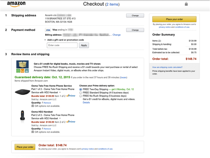
A typical Amazon page has dozens of links to related products. This makes sense, as Amazon wants to give customers as many options as possible.
But as soon as you enter the checkout process, all of the distracting links are stripped away, leaving just the checkout form itself.
Removing distractions isn’t as necessary for forms requiring one or two bits of information (like newsletter sign-up forms), as you don’t need the customer’s attention for long.
Consider a sparse, distraction-free design for longer, more complex forms to ensure customers don’t click away.
6. Offer a clear call-to-action
We have covered CTAs, or calls-to-action, before. As we wrote:
A “call to action” (or CTA) is the single reason and driving force behind your landing page. Every landing page must have one single goal. This could be to subscribe to your newsletter, download your free e-book, sign up for your service, or purchase your product.
But, you only get one. If you place more than one demand on your viewers they will feel conflicted and leave.
The call to action is the moment when the proverbial rubber hits the road. It’s the simple act of requesting a prospect to act. And it provides the motivation prospects need to convert.
Give your customers a clear indication of what value they are signing up for when they press that form submit button.
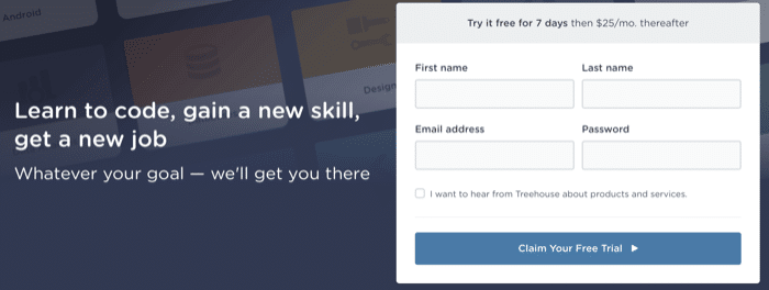
This includes offering an incentive in the call to action as well. Treehouse’s subscription form’s CTA reminds customers that trials are free.
If you communicate your offer’s value well and provide an interface that easily completes the call to action, you can bet that your conversion rates will soar.
7. Use inline form validation
A completed form may be useless if its information isn’t accurate. Customers may give up if they complete and submit the form only to find that they have to go back and fix a mistake they made.

Check information as it’s entered so customers immediately know if they’ve made a mistake. This not only reduces the amount of invalid information in your system – it also lowers customer frustration.
8. Use social proof
Reassure customers that what you’re offering is worth their time with testimonials and other social proof.
As we wrote in our look at 6 word-of-mouth marketing strategies:
Posting testimonials or reviews can be a great way of pulling word-of-mouth recommendations onto your site or social feed. Look on websites related to your business for reviews or testimonials. Bring them over to your site or social feed, and make sure to link back to the original review and/or identify the reviewer to help improve the post’s credibility.

In addition to showing thousands of crowdspring reviews from our customers, crowdspring also adds real testimonials to forms from people who have completed design projects with some of our talented creatives.
FriendBuy found that adding some testimonial text beside their signup form’s submit button boosted completion by 15%.
9. Explain what happens next
Many companies forget to pay attention to what happens after the customer has completed the form.
Take advantage of your “form sent” success page.
Tell customers what happens next, whether that’s “we’ll be in touch soon” or “we received your order!”

Another great use for this page is to give customers their next step as well. Many e-commerce order submission pages display “customers that bought this also bought” recommendations.
Customers may not jump at the chance to fill in a form, but there are many different ways to make the experience more painless.
Lead generation forms can significantly increase the quantity and quality of your incoming leads.
By following the abovementioned strategies, you can get better leads and improve your bottom line.
Code Embed: No embed code was found for CODE1200
Design Done Better
The easiest way to get affordable, high-quality custom logos, print design, web design and naming for your business.
Learn How to Grow Your Business With Beautiful Design