
Let’s talk about a collective marketing pain: Pretty much everyone’s mobile conversions suck.
This isn’t a secret. You know it. I know it. Your bottom line might even be reeling from it.
All types of businesses see significantly lower mobile conversion rates. Mobile traffic is, essentially, being wasted—and it gets worse. Every day, the percentage of online traffic coming from mobile increases.
Mobile searches surpassed desktop searches four years ago (in 2015), and mobile devices account for most digital media consumption. Put simply, businesses need a mobile conversion rate optimization solution, and they need it fast.
Fortunately, there are a number of practical solutions. CRO specialists have identified a handful of key, mobile-specific features that almost always improve mobile UX and, therefore, lead to more conversions.
Before we get into these practices, I want to address a key disconnect many marketers have when approaching mobile CRO. If you don’t understand this, you’ll totally botch the implementation of these mobile landing page features.
Table of contents
The all-important fact marketers are missing with mobile
Multiple case studies have shown that switching to responsive design can boost conversion rates by as much as 400%. These were legit case studies from highly successful eCommerce brands. The data was there. Responsive must be the answer, right?
And yet, CXL published another post demonstrating that responsive design is a terrible solution for mobile CRO. The post even quotes Joel Harvey from Conversion Sciences as saying, “Responsive design, as we know it today, is toxic to mobile conversion rates.”
How did we get from “responsive is the answer” to “responsive is toxic”? The issue here, which leads to our “all important fact,” is that optimization is not an A to B process. It’s more like A to Z.
If you go from A to D—if you switch from an archaic non-responsive design to a responsive design—you’ve made serious progress. But that doesn’t mean you are anywhere close to where you could be.
And that’s a reality that can, at times, be really hard for those who do a lot of split testing to remember. It’s sort of a “missing the forest for the trees” scenario.

A few years ago, responsive design was one of the most accessible tactics for taking a few steps up the ladder. Today, we have technology that lets us play at the other end of the ladder.
So here’s what I posit will let you stop optimizing from A to D and skip to P: Mobile users want immediate access to key data.
This is your starting place. You can look at a hundred mobile case studies, and you will see this truth hold up. Every. Single. Time.
When mobile users hit your site, they are there for something specific, and they want to find it as quickly as possible. If you look at any case study, you will find that any time a change makes that process quicker and better targeted towars the desired end goal, conversions increase.
Talia Wolf, founder of GetUplift.co, calls this “shortcutting”, and there are four mobile-specific features that do an amazing job of shortcutting the conversion process.
1. Click-to-call
This may seem a bit old school, but when it comes to smartphone conversions, it turns out that people still really like using the phone part of their smartphones. In other words, mobile users are still looking to make actual phone calls.
Research from Google highlights a number of key data points:
- 42% of searchers have used click-to-call to contact a business;
- 94% have needed to call a business directly;
- 72% of click-to-call conversations last longer than 30 seconds.
Interestingly, to a call-averse millennial such as myself, many mobile users are willing to make a phone call for the purpose of quickly identifying key data that could easily be displayed on the site.
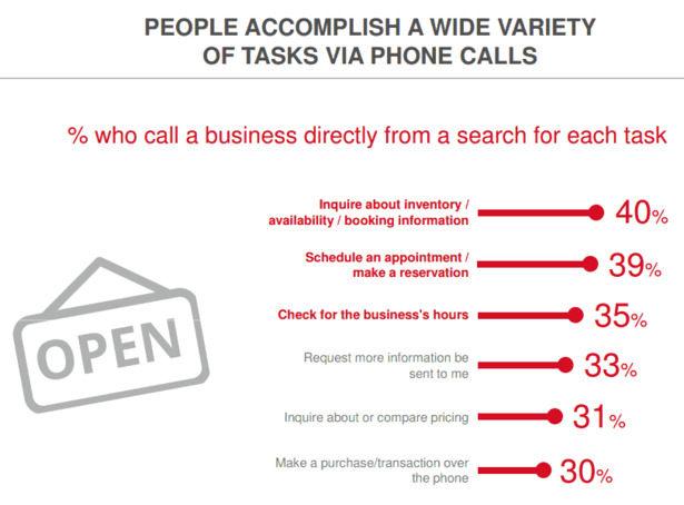
This highlights my earlier point—that mobile users are focused on immediately accessing key data. Whether that is inventory, booking info, business hours, pricing, whatever—these visitors would rather hit “Call Now” than spend more time trying to find data that isn’t immediately viewable.
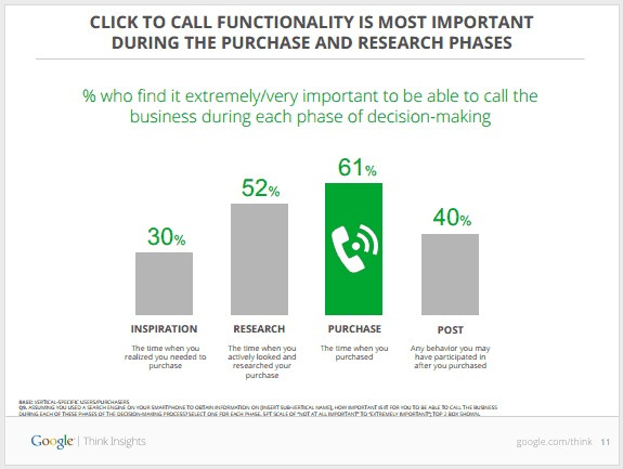
Furthermore, as Tommy Walker, former Editor of CXL, pointed out previously, the ability to quickly make a call is most important to mobile users during the purchase phase of the buying cycle. When a consumer is ready to buy with a phone in their hand, they often want to make a call.
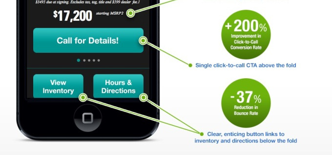
This is great news for call-based businesses like Esurance, which used click-to-call to increase call volume by 200% and decrease cost per acquisition by 30%.
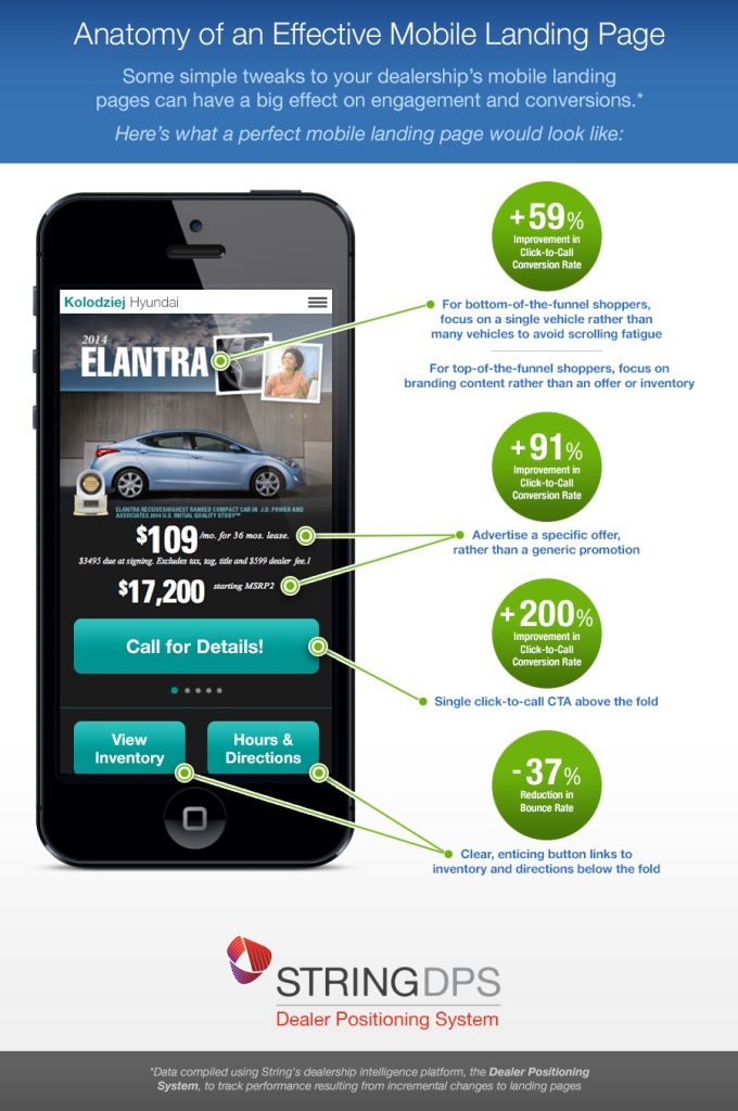
And in a case study you’ve probably seen before, String Automotive used a series of A/B tests to net several big wins for a landing page, most notably via the addition of a click-to-call button above the fold, which resulted in a 200% conversion rate improvement.
Click-to-call buttons are a powerful mobile conversion strategy and should be the first thing you test on your mobile landing pages.
But before we abandon the above case study, I want to point out another mobile feature that can enhance the conversion process…
2. Click-to-scroll
As a marketer or casual split tester, you might look at Sling Automotive’s graphic and see four different green numbers—four separate wins that need to be studied individually. (Those with a keen eye will note that they don’t post full numbers either, so it’s impossible to determine the validity of the results.)
Let’s give them benefit of the doubt this time. And while that’s valid, I want you to look at this page in its entirety and grasp what it means for your business.
Why would someone click through to a vehicle landing page like this?
- They’re looking for more info on the car.
- They’re comparing pricing or availability.
- They’re interested in viewing this car in person.
- They’re evaluating local cars with intent to buy.
What you will see in the above landing page is that all of these “whys” are highlighted on the page—and that’s it! There is no extra space wasted on possible alternatives. There is no extensive scrolling or additional images for users to browse.
String Automotive understands that if a user pulls out their smartphone and clicks through to your dealership website, they aren’t there to browse. They have an action in mind and are searching for a key piece of data.
This is where Click-to-Scroll comes into play.
These buttons could take you to separate pages with the relevant information, but as you’re probably already thinking, it makes far more sense for all this information to stay on the same landing page.
This is true in both an SEO sense and a practical sense. If you have 30 styles of cars to create landing pages for, building 90 pages would be inefficient.
At the same time, we know that users often fail to scroll and, most importantly, they want immediate access to key data. Instead of forcing them to scroll for that data (or more likely, bounce), adding a “click-to-scroll” button allows them to navigate directly to their desired point on the landing page.
For Sling Automotive, adding two of these buttons reduced the page’s bounce rate by 37%.
3. Sticky headers and footers
As visitors scroll through your landing pages or use click-to-scroll to engage with various portions of your page, make sure that the option to convert is always just a click away. As it turns out, sticky headers and footers are perfect for this.
A study by Smashing Magazine found that sticky navigation bars allowed users to find what they were looking for 22% faster. Since mobile users are looking for immediate results and quick access to key data, navigating 22% faster is a big deal.
Furthermore, the same study found that an incredible 100% of participants preferred sites with sticky navigation bars, despite often not knowing why.
Even more importantly, CRO specialists Joel Harvey and Brian Massey of Conversion Sciences found that adding sticky footers and headers consistently has increased conversions for numerous clients.
Almost everyone who tests sticky headers/footers seems to come away with positive results. While there are always exceptions to best practices, it seems that, like click-to-call, sticky navigation is a must-test for any online business.
4. Mobile pop-ups
When we think of pop-ups, we typically think of email capture, and this is just as true for mobile. It’s important, however, that we understand where visitors are in the buying cycle.
For visitors looking to make a purchase, including a pop-up that displays a click-to-call button can increase conversions significantly, as Joel Harvey talked about at CXL Live a few years ago.
But let’s not forget about lead capture. Mobile is often a good place to pursue email sign-ups as opposed to direct sales, particularly for businesses that don’t rely on incoming calls.
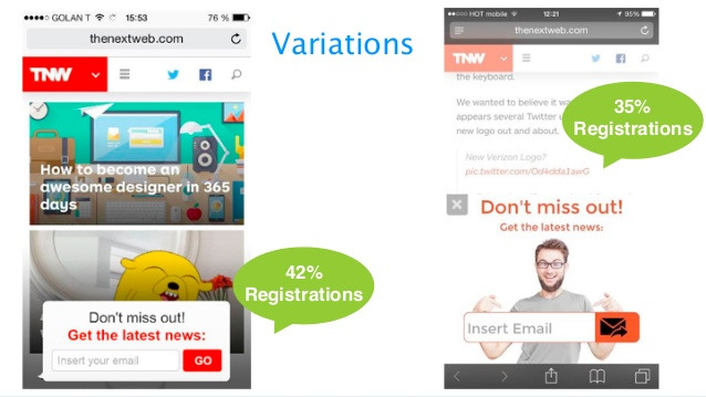
The Next Web increased conversions by 42% through the addition of a simple email capture pop-up at the bottom of their mobile blog feed.
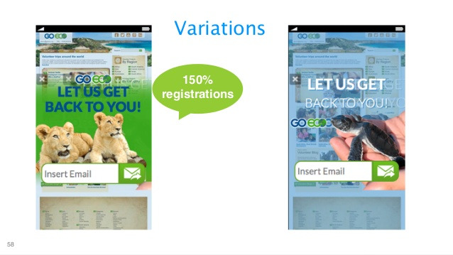
In another case study from Talia Wolf and the GetUplift.co team, GoEco increased registrations by 150% via mobile overlays.
Mobile phones simply aren’t ideal for everything, and they might be a terrible medium for engaging with your visitors. Esigns found that simply inviting users to transition from phone to desktop at their leisure resulted in the site acquiring 16,000 new email addresses per year.
Remember that mobile optimization is all about identifying why mobile users are on your site and then getting them to key data quickly. In Esign’s case, users were looking for banner solutions on the go, but that’s where their user journey was doomed to end—mobile isn’t the right medium to continue that transaction.
Mobile pop-ups give you the flexibility to add the most intuitive “next step” to any page, at any time.
How to add these features to your mobile landing pages
One of the first challenges we hit at the point of implementation is that desktop and mobile users have different needs. It probably wouldn’t make sense to hit your desktop users with a click-to-call popup, while that feature is vital to mobile users.
Further, the copy itself should be different across devices. Calls to action that make bank on smartphones might actually lower conversions on desktop.
What this means is that we need the ability to deliver different content to mobile users versus desktop users. In the past, that has meant investing in adaptive design, creating a completely separate m.domain.com site for mobile users, or attempting to channel users to a mobile app.
Once this capability was achieved, features like click-to-call or sticky headers could be custom coded into your mobile pages.
In an era of instant, low-cost landing page builders, this seems like a hell of a lot of work. Fortunately, there are adaptive landing page builders like UnDelay that do everything I’ve discussed in this article.
Conclusion
You can’t afford to treat mobile traffic like an extension of desktop traffic. Mobile users want to access key data quickly, and the better you can shortcut that process, the higher your mobile conversion rates will be.
Four things tend to work more often than not. They are:
- Click to call;
- Click to scroll;
- Sticky headers and footers;
- Mobile pop-ups.
Test these mobile-specific features for yourself. There are no magic bullets. It’s all about providing a good user experience and meeting (and exceeding) visitor expectations.
How you do that will vary, but these four mobile landing page optimizations are a good starting point—especially if you’re still at the “responsive phase” of mobile optimization.
Related Posts
-

If you're selling in a competitive market, you must live & die by the little things…
-
According to a study of 3,000 mobile searchers by Google & IPOS, nearly half indicated…
-
Google is a strong advocate for responsive design. Mashable named 2013 "The Year of Responsive Design,"…
-
Several years ago, Jeremy Smith wrote, "Traditional optimization is dead, and in its place is arising…


I don’t know if it’s just me… But of all the web marketing and conversion optimization blogs I follow, CXL has been really nailing it lately. I really love your stuff everyone who contributes here! Please keep up the good work and writing.
Regarding this topic in particular. You are spot-on about people preferring to use the “phone feature of their smartphones.” Recently, I split test two separate clients on a form up front style landing page. Both variations underperformed – the form got in the way of what people actually wanted and was too cumbersome for mobile.
They want to call you and ask the question, place the order/appointment, and get it done. Especially for my dentist – which shouldn’t surprise you.
My next test on these landing pages will be call button focused on mobile, incorporating your suggestions (I particularly liked the idea of a -slim- sticky header & footer).
Thanks Kevin (and I agree – props to Shanelle, Peep, and the CXL team/contributors).
And thanks for including that case study. It would definitely seem that, like email, actual phone calls aren’t going away any time soon.
Thanks Kevin – glad you’ve been enjoying our content! And I agree…usually if I’m searching a local business, I want some contact info – either a number or an address. If it’s easy to find, I’m happy.
Do let us know how those sticky header/footer tests go!
Funny thing is, somehow I ended up talking to my wife about sticky headers on mobile. As soon as I mentioned it she exclaimed “I HATE THOSE! UHG!”
Hah! She’s no marketing pro – just your average Internet user. It goes to show that no one thing is going to work for everyone. We do our best to appeal to as large of our target market as possible.
Over the years, I’ve heard similar hatred towards Google Ads, web forms, orange buttons, and pop-overs. All of which you can argue – statistically – improve conversions.
Like you guys, I’ve got plenty of case studies I could share. None of that is guaranteed to work for you in your situation – even if you were in the same vertical.
Here’s a great example: same client, same service, and 2 different ad channels. Direct to form on “Ad Channel 1” I get a 20% conversion rate. Ad Channel 2? Nope, 1.5% conversion rate on direct to form.
Comes down to knowing your customer. The human being on the other end of your campaign…
Anyways, I like the exchange of ideas. You never know what your prospective customers will take to.
Absolutetly. I am with Kevin.
Thanks :) Glad you’re enjoying the content here.
Loved this article, although Click To Call does nothing to unblock the bottleneck at the Contact Centre or improve customer wait times. Adding a managed intelligent and interactive Callback feature that avoids the customer having to wait in a queue and which can provide the next available operator with in context data to improve the customer experience would add significant value, particularly so at the point in the cycle where the customer is ready to buy. If this strikes a chord with online retailers they should check out SaaS provider Buzzeasy which spun out of telecoms specialist Geomant. @SalesXpert
Was looking at increasing mobile conversions and came across this, good article jacob, il be sharing it on my social accounts!