
Discoverability and findability are two important terms that optimizers should be familiar with.
Discoverability is when you find the perfect book, even though you were not necessarily looking for it. Findability is when you find the exact book you were looking for, even if all you knew about it was the author’s last name.
eCommerce product filtering, when done right, can solve both issues.
Table of contents
What is eCommerce product filtering?
eCommerce product filtering helps your visitors narrow in on the specific product they’re looking for and find products they might be interested in based on certain features (e.g. size, color, category).
Product filtering is what allows your visitors to enjoy and appreciate your big product catalog instead of cursing it.
Why does it matter, anyway?
Everyone knows internal search is an important factor when it comes to product discoverability. Product filtering and internal search go hand-in-hand, both working towards a better UX. David Moth of Econsultancy explains…

David Moth, Econsultancy:
“Only a small proportion of shoppers will arrive at an ecommerce site knowing the exact product they’re looking for, while most will prefer to browse and consider different options.
As such sites need to give shoppers tools to search their product range and strip out the items they’re not interested in.
An effective site search function is obviously a key element, but product filters are also necessary if you want to deliver a decent user experience.” (via Econsultancy)
If your product filtering is not optimized to be as useful as possible, there is only one outcome: your visitors will get frustrated and leave. If you want to make money, you need to make it as easy as possible for visitors to find products they want to buy.
What’s the current state?
All of this sounds incredibly simple, I know.
What might surprise you, though, is that recent research found that only 16% of major eCommerce sites (e.g. Nordstrom, Macy’s, Dell, Apple) provide users with a reasonably good filtering experience. So, in 2015, the best the top eCommerce sites in the world could do is “reasonably good”… 16% of the time.
Here are some other surprising data points…
- 42% of top eCommerce sites don’t have category-specific filter types for several of their main product categories.
- 20% of top eCommerce sites don’t have thematic filters despite selling products with obvious thematic attributes (season, style, etc.)
Some industries do product filtering better than others. Apparel, sports and hobbies, and electronics and office all lag behind the competition, falling under the “acceptable performance” mark.
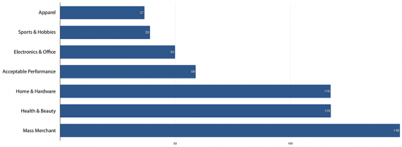
Given that fashion-related products was ranked the most popular eCommerce vertical in 2015, product filtering is clearly an issue eCommerce sites are facing.
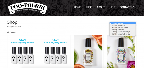
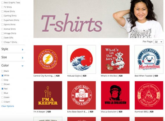
If you’re familiar with my articles, you know I like to mention Poo-Pourri as a shining example of what to do. Unfortunately, here’s the extent of their product filtering…
eCommerce Product Filtering Factors to Consider
Product filtering is highly contextual. The “perfect” combination will depend on your vertical, product catalog, visitors and a variety of other factors. However, there are some basic principles and guidelines that you can take into consideration.
Notice how almost none of the examples provided for individual factors take all of the factors into account. More proof that product filters just aren’t where they should be.
1. Indicate Product Quantity
Beside each filter, indicate how many products fall under it. For example…
Notice how they indicate the number of products that are red, purple, size 6, etc. Based on my research, this is actually quite common practice. Armando Roggio of D&B Supply thinks sites should be taking it a step further, though…

Armando Roggio, D&B Supply:
“It is also important that filter counts update each time that a new filter is applied. If the navigation showed 378 small t-shirts and 362 medium t-shirts before the shopper selected the red color filter, those options (small and medium) should adjust to the new total after the red filter is chosen.” (via Practical Ecommerce)
2. Hide Non-Existent Options
Consider returning zero products as a result of product filtering the equivalent of a 404 page.
For the visitor, it’s just plain frustrating. That visitor was excited see your selection of red and white striped summer dresses in size small. When you return zero products, she’s disappointed.
The result? Either she tries again or goes looking for someone who has a selection of red and white striped summer dresses in size small. Which do you think is more likely?
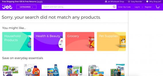
How can this be avoided? Once she’s selected striped summer dresses in size small, only show her the colors available. Don’t even give her the option of “red and white” or “red” and “white. It’ll save you both a lot of disappointment.
David explains why logic isn’t always enough…
David Moth, Econsultancy:
“It’s logical that if a customer is too narrow with their product demands then their search risks returning zero products, but unfortunately shoppers don’t necessarily think logically.
A search that yields no results is likely to frustrate the user and may cause them to shop elsewhere, so it‘s a better idea to only allow shoppers to filter on options that you know are available.” (via Econsultancy)
3. Allow Multiple Filter Selections
Often, it’s one or the other with product filters. So, using the dress example, you wouldn’t be able to pick both “red” and “white” at the same time. There’d be no side-by-side comparison. Instead, you’d have to first view the red dresses and then view the white dresses.
Allowing multiple selections in the same category will benefit those with the comparison shopping mindset.
There’s no real downside. Either the visitor takes advantage of the multiple selection or they don’t.
4. Make Applied Filters Obvious
Just as we display breadcrumbs to show visitors what content they’re currently viewing, we display applied filters to show visitors what products they’re currently viewing.
As David explains, this is important because they may want to remove a filter to widen their selection…
David Moth, Econsultancy:
“If a customer doesn’t get the product options they were hoping for then they’ll want to quickly modify the filter. Therefore it’s important to allow people to remove filters with one click.” (via Econsultancy)
Typically, this is done in one of two ways…
- In-line (e.g. a checkmark or a greyed box).
- Above the filtering options.
Neither is inherently better or worse. What matters is that the filters applied are clear and easy to remove with a click or two.
Rich Page, optimization consultant, adds that icons can be helpful for both attracting attention and helping those who are perhaps less informed with jargon, for example…

Rich Page, Optimization Consultant:
“Adding good visuals like related icons and color options for filters can also be very useful for better engaging and guiding your visitors while they browse. GlassesUSA.com and REI.com have great examples of filters for inspiration.”
Here’s what Rich is referring to on GlassesUSA.com…
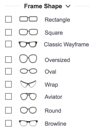
Someone who just started wearing glasses or who has always worn the same glasses might be confused by terms like “browline” and “wayframe”, so the icons are helpful.
5. Consider Factors Outside of UX
Whenever you think about UX, you have to think about SEO. Perhaps that’s not a sentence you’ve read before as the two practices seem fairly unrelated on the surface. The truth is they go hand-in-hand and often, when you’re making UX decisions, you’re making SEO decisions without realizing it.
Andy Crestodina of Orbit Media explains…

Andy Crestodina, Orbit Media:
“It’s so tempting. When products have different parameters (size, color, style, materials, etc.) it always seems like a good idea to give visitors filters to narrow down their results. It’s a handy way to let people drill into a category in a way that distills results with every click.
But there’s a downside. UX pros may not be thinking about what’s happening in the address bar during this experience. And if you’re not thinking about URLs, you’re not thinking about search.
Two risks:
• First, if you don’t have a category page with its own URL (website.com/shiny_gold_buttons) then you’ll never rank for the phrase “shiny gold buttons.” No page, no rank. Those are the rules!
• Second, if you have two pages that are both relevant for the phrase (website.com/buttons/gold/shiny and website.com/shiny_gold_buttons) then you risk confusing the search engine and competing with yourself.
The fix is to talk to the developers while you’re designing your filtering UX to see how they would build it. If there isn’t a URL for the filtered results, tell them to program something in so you’ll have one. Conversely, if you are two URLs, one for the filter and the other for a category page, have them add a canonical tag to the filter URL.
UX is crucial, but not as much fun if you don’t have any visitors. Really, the visitor’s experience often starts in Google, right? SEO is UX.“
So, to summarize: talk to your developers about how your product filtering is affecting your search engine ranking. Whether you’ve had your current filtering system for years or you’re implementing it for the first time, consider the side effects carefully.
Don’t let SEO stop you, but do let it inform your UX.
6. Improve Mobile Filters, Too
Product filters on mobile devices are usually not a fun experience. The filters are too small for fingers (i.e. constant zooming in and out), there are too many filters, there are too few filters, the list goes on and on.
Searching for products on mobile is undeniably more difficult than searching for products on desktop. Filters should improve that, not make it worse.
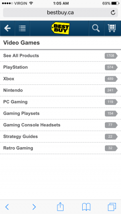
Best Buy does mobile product filtering well. Here’s what you get when you tap “browse”…
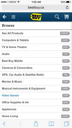
You’ll select “Video Games” and go from there…
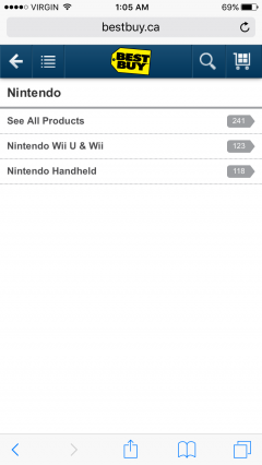
Filter after filter after filter. But with each step, you know you’re narrowing in on what you’re looking for. They all feel relevant and necessary to find the product you’re looking for…
Note that at every stage, you can opt out of the filtering process and just “See All Products”, so this process isn’t mandatory…
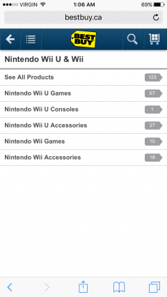
Finally, we end up with “Nintendo Wii U Games”. From there, we can sort by best match, price, etc. or even apply more filters if we want to narrow in on something even further…
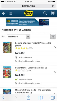
Here’s what those additional filters look like…
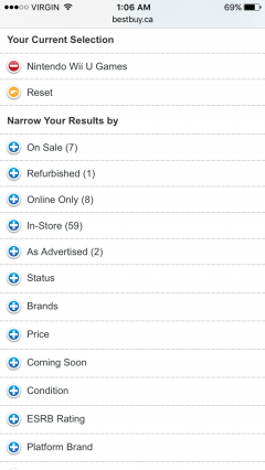
Just enough filters to land you in a narrow-enough product category full of relevant content with the option to filter even further down if you’re not happy yet. Despite all of the screens, it was a quick experience (1:05 a.m. to 1:06 a.m.) because the filter labels were easy to understand.
7. It’s Not About Having the Most Filters
It’s not about having the most filters, it’s about having the most useful filters. Frankly, anyone can have a ton of filters. It almost defeats the purpose; instead of product overload, you have filter overload.
A common example of an eCommerce site that believes more is more? Amazon…
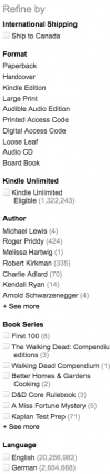
And it keeps going…
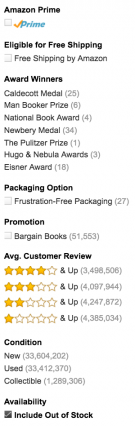
Actually, it even keeps going after that, but you get the idea.
If you do decide to go with a lot of filters, you can at least prioritize them so that they pop up at the most relevant moment. For example, some filters are collapsed by default if they are useful, but not as commonly used…
It simply makes the product filtering seem less overwhelming.
8. Beware of In-line Scrollable Areas
While this seems like it should be a thing of the past, in-line scrollable areas are alive and well thanks to product filtering. For example…
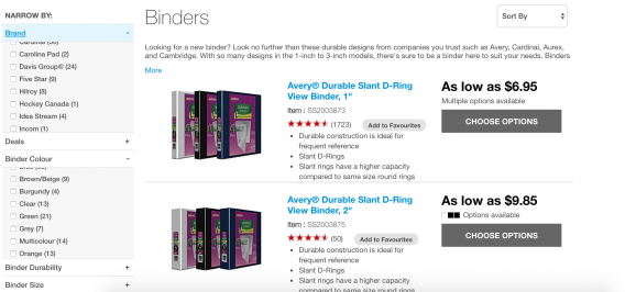
As you can see, both the “Brand” and “Binder Colour” filters are scrollable. When this happens, the UX usually suffers. Multiple points of scrolling? It brings back bad iframe memories from the early 2000s.
Instead, research shows that you should show a few values and then truncate…
Testing showed that 10+ filtering values require truncation — yet 32% of websites either have insufficient truncation design, causing users to overlook the truncated values (6%) or use what testing found to be even more troublesome, inline scrollable areas (24%).
9. Useful > Common
Useful is better than common. Still, many sites will choose product filters based on what’s common. For example, it would be difficult to find an apparel site that doesn’t use brand, size, color and price as their standard filters. Sure, those filters are helpful, but what about other filters that could be helpful?
There are product filters that would be useful to your specific audience or because of your specific product catalog. Don’t be afraid to use them, Rich explains…
Rich Page, Optimization Consultant:
“Think outside of the box with your category filters. Don’t just offer the essentials like price, brand and color, think of other filters that your visitors would find really helpful, like recommended use or occasion best suited for.”
But, of course, that doesn’t mean you can’t do some UX benchmarking to see how your usability stacks up against the competition’s…
Rich Page, Optimization Consultant:
“Ultimately you should look at what your competitors are offering for their category filters and make sure yours is the best for usability and number of helpful filters. This will help your visitors find what they are looking for faster and give them a better experience – and increase the chances of them purchasing and coming back more often in the future.”
What’s important is that you remember you’re comparing UX, not actual filters.
Since useful is better than common, it’s also important to personalize filters based on category, for example. Some product filters are more important for certain categories, some less. Some are not important at all. So, why show them?
Sites tend to use the same product filters across every category for the sake of simplicity, but UX would be improved with even just a touch of personalization.
Here’s an example of filter personalization done right…
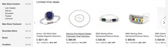
I’m looking at rings, so I’m shown stone-related filters. In other product categories, these filters are not shown. Relevancy is a big part of usefulness.
10. Mind the Delay
As with most things optimization, speed is an important factor.
The time it takes for your products to load after a new filter is applied is crucial. First of all, if it’s slow, you’re just discouraging visitors from using the filters. Plus, there is plenty of research on the price of slow load times.
Since we’ve already written on speed extensively, I’ll simply suggest you read this article.
Conclusion
With only 16% of top eCommerce sites having “reasonably good” product filtering, there’s a lot of room for improvement. Even an inch of improvement could do wonders for discoverability and findability.
Here’s where you should start…
- Indicate the number of products that fall under each filter. The numbers should update as new filters are applied.
- Automatically hide any filters that will return “Sorry, your search did not match any products” style responses.
- Allow visitors to select multiple filters at once.
- Be clear about which filters are currently applied and make it easy to remove them.
- Consider the side effects of product filtering decisions, like SEO.
- Use filters to improve mobile browsing, not make it worse. Keep it minimal and use large filter buttons.
- Strive to have the most useful filters, not the most filters. If you have a lot of filters, collapse the less popular ones by default.
- Beware of in-line scrollable areas. Instead, show a few values and then truncate.
- Don’t just use the same filters as your competitors. Personalize the filters based on your unique site and catalog.
- Return the content quickly as new filters are applied.
Related Posts
-

In today's review I'm reviewing 2 different ecommerce product pages. Watch this 5-minute review: Pages…
-
Get data-backed ecommerce guidelines you can implement right away to increase revenue. If you're wondering what…
-
Today we're doing an eCommerce funnel review for Vintage King Audio. Watch the 7-minute review: Here's…
-
Your ecommerce checkout flow is where the money is at. Think about it. Random visitors…


Interesting read.
I recently ran a test on an e-commerce retailer where we increased filter usage by +163% (from 7% to 19% – >99.9% significance) over 30 days. We saw no difference in conversion or revenue, but a significant drop in PDP views (based on there being fewer products to view).
I’ve also tested separately on other sites where we reduced filter usage by over 200%, yet saw no drop in conversion rates.
Based on the above I’m a little sceptical how much correlation there is between filter usage and overall sales. As ever, there’s no 1 size fits all in web design, CROs should look at data and understand where the key problems are and focus changes around there!
(My 50 cents at least)!
Very interesting results, Ashley! Any chance you’ve published the case study? I’d love to see the variations.
Thanks for sharing this example. Conversion research, of course, should always be conducted to identify pains and problem areas.
This article is just outstanding! You’ve taken good time and shown great detail to show why it is important to have a great search point as well as the category navigation done correctly on your website.
Thanks so much, Sienna. Glad you enjoyed it.
Shanelle, solid post and some great information here. As always, love the screenshots and expert snippets.
Something not covered was the underlying data (product attributes) needed to support all of these filters. Adding filters and filter groups is easy, but making sure your products are classified correctly can be daunting…especially if you have a large catalogue.
Ah, very good point, Scott. That could be an entire article of its own.
Thanks for reading!
Hi Shanelle,
This is a great post. Thanks a lot for sharing all these details. I love it.
Thanks Steve! I appreciate the kind words.