2018 Web Design Trends: Your Guide To Navigating 9 Hot Trends

Photo by William Iven on Unsplash.
People are increasingly shopping online. In fact, last year more than half of all purchases were made online.
This trend shows no signs of slowing, so if you don’t have a business website – or if your existing website looks dated – it’s time to invest in a design or a redesign.
As we wrote in Grow Your Small Business With These 7 Website Design Best Practices,
Today, it’s impossible to reach most customers without a website. This is especially true for new small businesses and startups trying to compete in an increasingly noisy world. but it’s also true for even established companies.
Don’t believe me? A recent study shows that 97% of consumers research their purchases online before they buy something.
Your website is a crucial component of your marketing and branding strategy. Customers visit your website because they have a particular purpose in mind – they need something from you – and your website should help to make them feel comfortable to purchase a product or service from you.
If you have a poorly designed website, the chances are good that you’re losing a chance to turn researchers into loyal customers. Make sure you’re not giving up thousands of dollars in revenue and get your website functioning the way you need it to.
A dated or poor looking website design can make even the best businesses appear non-professional and unreliable.
Check out the 2019 web design trends here.
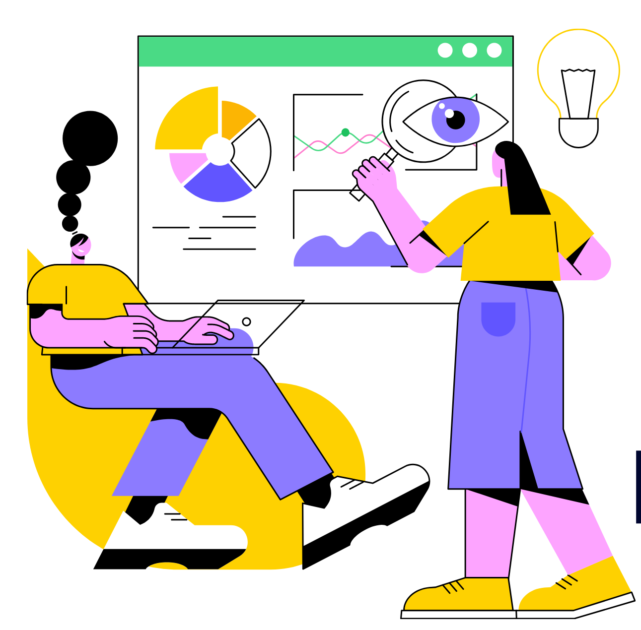
If you want your business to thrive, you have to stand out and one good way to do so is to take advantage of hot website design trends to give your website or landing page a sharp, contemporary feel.
We’ve collected nine of the top website design trends you can expect to see in 2018:
- 80s influenced design
- Clean layouts and bold typography
- Unusual color combinations
- Magazine-style layouts
- Brutalism
- Illustration
- Full-screen backgrounds
- Cinemagraphs
- Depth
Let’s look at each of these trends and assess whether it makes sense for your business.
1. 80s-influenced design
Annual trends aren’t necessarily new. “What goes around, comes around,” as the saying goes.
You don’t have to look further than the resurgence of 80s and 90s fashion for proof.
Brands are taking elements of 80s fashion and design and incorporating them into their websites. This adoption mirrors what’s happening in fashion and other design-related fields throughout the western world; what’s old is new again.
In many cases, this works to the advantage of brands: many elements of the 80s style (and Memphis Design) work well in drawing attention:
- Patterns and shapes,
- Vibrant colors,
- Flat, vectorized designs, and
- High contrast typography.
The risks of co-opting the 80s look for your website is the same risk for using any time-specific look: when the rest of the world tires of 80s design, your site may look dated and out-of-place.
However, if you know your specific audience responds to a good old-fashioned throwback, it may be worth investigating.

Cartoon Network Studios is a great example of the big and bold Memphis design look.

Little Flyers incorporates 80s-style iconography throughout their site.

Denver’s Desk Pass‘s color palette has a strong 80s influence.

Example of 80s-influenced patterns available for purchase from Creative Market.
We just emailed the info to you.
2. Clean layouts and bold typography
Bright colors, wild geometry, and lots of wavy and straight lines everywhere: like it or not, the growth of 80s-influenced design is upon us.
Unlike fashion from the 90s, however, (we’re calling you out, acid wash denim!) clean layouts that use typography in inventive ways can look amazing, and clarity will always be in style.
There are very few instances where choosing a clean, concise design is a wrong decision. Clean design moves site content to the forefront and helps focus your audience’s attention on what your site says. Such layouts help to showcase your business name and logo and focus your customers and prospects on the key message you’re trying to communicate.
Clean layouts can belie the hard work and planning that goes into making them possible. When playing this card, it’s important to remember the difference between simple and simplistic: simple means easy, straightforward, and uncomplicated, whereas simplistic can mean something is overly simplified, often to the point of being misleading.

Big type and cheese: a natural combination (via Tilamook)

Spotify uses large, spaciously laid out type in many of their designs to great effect. (via Spotify.me)

Bold type against a neutral background: an excellent mix. (via SMITH)

The use of full screen backgrounds and carefully positioned type works well on Stellar Works‘s website.
3. Unusual color combinations
Gone are the days when sites relied on subtle and faded color combinations.
Websites that went with bold, unusual color choices and combinations surged in 2017, and this trend looks to continue in 2018.
The motivations driving these decisions are often pragmatic, and it continues to be difficult for websites to differentiate themselves. Bright color palettes offer brands a way to stand out from their competitors while creating a unique and memorable visual experience.
Choosing a striking color scheme can be challenging. Fortunately, there are a lot of tools available to help designers and business owners generate color ideas quickly and easily. Sites like Coolors and Colormind mix up combinations for you and are useful to see a lot of options quickly.
If you’re going to try some unusual colors, keep in mind that color preferences are highly subjective. One person’s energetic combination can seem garish and overwhelming to someone else.
As always, keep your brand at the forefront of any decisions. Choose colors that make sense for your brand, and if you’re going to choose something wild and off-brand, do it for a good reason.

Dropbox‘s recent rebrand uses bold color combinations to create visual excitement.

Via True Digital

Cosmetics powerhouse Lush mixes bright, lively colors with striking illustrations on their website.

Uber created this colorful website that lets people learn basic sign language.

Check out this bold mix of purples and greens on this work-related site.
4. Open, magazine-like layouts
The boxy, grid-based designs seen everywhere two to three years ago were popular in part due to the limitations of web development technology.
Many sites also relied on predictable, clearly laid out designs to ensure that they were responsive to unpredictable screen sizes like tablets and mobile phones.
A lot has changed.
More recently, layouts have unmoored themselves from the grid and gone with looser, more magazine-style designs. We’re going to see even more of this in 2018 as brands start to experiment more openly with grid-less designs.

This site uses a grid-less layout that evokes David Carson’s magazine designs from the 90s. (via VP Brands)

Variety magazine appropriately uses a magazine-like layout for this power ranking microsite.

Big photos rule on Fresh Connections Caterings website.

This drive-in’s website is another example of David Carson‘s influence on page layout.

Big typography combines with a nice color palette in this site for a Chicago-based financial tech co-working space.
5. Brutalism
2017 saw the rise of websites that took all of the trends we’ve already mentioned — clean designs, unusual color combinations, and open layouts — tossed them together, and added an unexpected spin to create something new.
Designers group these websites into the same category as the Brutalism architecture wave of the 1950s-70s, similarly highlighting a raw, intentionally unfinished look.
Websites considered part of the Brutalism style are characterized by:
- layouts that overlap in sometimes haphazard ways,
- stark color palettes, and
- a bold use of typography.
Many of these sites cater to younger audiences, and the look might be too edgy for some brands.
That said, many of the elements from cutting edge sites make their way into mainstream businesses, and we expect this to happen more frequently in 2018.

Haphazardly placed images and text clash on Non-Linear‘s website.

This magazine site is an excellent example of a brutalist-inspired layout. It feels raw and unfinished.

Online publication The Outline uses an unusual mishmash of 80s design and raw layout to reinforce the idea that it’s not like any other content site you’ve seen before.

Adult Swim‘s mess of a design makes sense when you consider their target audience skews younger and seeks out edgier, more unusual content.

6. Illustration

by jeffquigley
We’ve previously looked at how brands incorporate illustration, and this trend is going to continue for the same reasons we outlined earlier:
One of the biggest strengths of using illustration is that it is based on ideas and not reality, as photographs tend to be. They can be crafted to communicate exactly what you want to convey and can often make complex ideas easier to understand. It’s also easier to create a very individual style and feel using illustration than it is with photography.
One challenge with incorporating illustration is it can be difficult to find skilled illustrators. Another is the work is often expensive.
Crowdspring can help with both problems. We have thousands of creatives who create high-quality illustrations (and other designs) at affordable prices. This allows companies and brands to add illustration and graphic design to their websites and landing pages quickly and easily.

Via Bloom

This website for the book World of Wonder appropriately uses illustrations from the book throughout.

Cell carrier US Mobile uses illustration to help soften its image and make it seem more approachable than the bigger companies.

This family tree site’s mascot is a very happy-looking bear. (via Family.Me)
7. Full-screen backgrounds
As the saying goes, a picture is worth a thousand words, and websites are saying a lot more with less using images and videos as a background element.
Websites have used full-screen backgrounds for a while, but many of these targeted audiences with access to newer technology and faster Internet connections. Now that the speed and responsiveness of mobile networks have caught up to home-based Internet, this design style is on the rise.
The broader availability of high-quality, cheap stock photos and video has also fueled this change. They’re much easier to find, and adding them to a page is straightforward.

Via Veil Hymn


This promotional site for a home battery system uses full-screen background images effectively. (via Orison Energy)
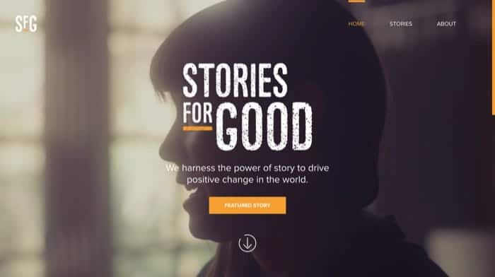
Big images go along with big stories on this site dedicated to stories “about important issues around the world.” (via Stories for Good)

A rather surprisingly well-designed website for this Russian maker of propane tanks. (via Gaz)
8. Cinemagraphs
When is a photo not entirely just a photo? Cinemagraphs, or “living photos,” are still photos that incorporate a tiny bit of motion, and they’re being used in website design more and more.
Created by Kevin Burg and Jamie Beck in 2011, cinemagraphs are powerful in part because they can surprise and delight the viewer.
What seems like a motionless photo at first can draw a customer’s attention when they notice the movement, and as everyone online knows, attention is the currency of the web.
The explosion of animated GIFs as both an art form and a way of communicating is another critical driver of cinemagraphs in design. This is another trend enabled by faster mobile networks and smartphone use.

Deep End Consulting mixes still photography with moving vehicles for a cool-looking effect.

Cinemagraph via Glendevon Motors

Via Gilt Taste

Via Jade and Andy
9. Depth
Adding depth to a website design can, quite literally, draw in your audience’s attention. There’s something deeply compelling about sites that try to break free of the web’s usual two-dimensions.
Thanks to, once again, faster devices and networks, pages that utilize isometric design (representing three-dimensional objects using two-dimensions) and parallax scrolling effects (where the background of a page scrolls at a slower rate than items “closer” to the viewer do) are becoming more common. This will continue to be true in 2018.
Audiences respond to the feeling of motion and scope that parallax scrolling and three-dimensional design adds to a website. It can make a straightforward website feel sophisticated and creates a sense of narrative that highlights the site’s product or service.

A beautifully layered site for this French tea company. (via Teapot Creation)

Well-executed parallax scrolling on the website for the video game Firewatch.

Parallax scrolling and some witty site copy and images make this men’s underwear site a lot of fun.


This may possibly be the best placeholder website for a public school ever. (via PS 6 NYC)

This is one great-looking site with lots of parallax scrolling. (via Hometown Trolley)
2018 Web Design Trends
The choice to incorporate a trend into your website design comes down to this: does it complement or extends your brand?
Specific trends like brutalism or unorthodox color combinations could alienate or put off your audience if misused, or they could be the hook you need.
As with anything, whether or not you should use something can be summarized with those two frustratingly apt words: “it depends.” A skilled web designer can take an objective look at your needs and figure out how to make use of these trends in a way that reinforces your brand’s identity.
Here at crowdspring, we have thousands of web designers who can take a trend and make it something original – and entirely in keeping with your company’s existing visual identity.
Design Done Better
The easiest way to get affordable, high-quality custom logos, print design, web design and naming for your business.
Learn How to Grow Your Business With Beautiful Design