Like many young SaaS startups, we had no shortage of marketing and sales data, but it wasn’t easy to comprehend. The information was there, but it was scattered all over the place.
Some bits and pieces could be found in Google Analytics, while other data was stored in BigQuery and ProfitWell. This arrangement made it challenging to give a quick answer to basic questions on user conversions or to comment on traffic rates and MRR. It wasn’t until we began creating custom dashboards to visualize our data that everything started to click.
In this article, I’ll share how to bring together data from different sources and visualize it at custom marketing and sales funnels that help you make better decisions.
Table of contents
Defining your funnel
There are several approaches to creating a marketing funnel. The traditional one, also called a linear funnel, constitutes a sequence of stages that users usually go through while familiarizing themselves with an offering.
Due to the high complexity of the customer decision-making process, many marketing specialists consider this type of funnel insufficient and speak more in support of “tornadoes” or “3D” funnels that combine multiple alternative actions, contributing to a better understanding of the user journey.
We used Philip Kotler’s Marketing Funnel as our foundation.
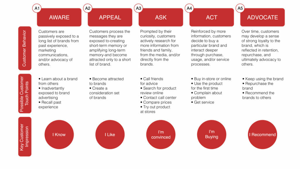
This model consists of five A’s: Awareness, Appeal, Ask, Act, and Advocate.
- Awareness. The stage in which your customers become aware of your product or service.
- Appeal. The stage in which potential customers are further exposed to your marketing and branding.
- Ask. The stage where your customers are actively researching for more information; during this stage social proof, and testimonials play an important role.
- Act. The stage in which a customer makes a purchase.
- Advocate. The stage in which your customers develop brand loyalty. They either make recurring purchases or keep using your product/service. They also leave positive reviews and recommend you to their social circle.
Building your custom marketing and sales funnel
At Coupler.io, one of our recent goals was to identify and eliminate possible “bucket leakages” throughout the process of product adoption. We wanted to see if the target audience is interested in our offering enough to:
- Try it.
- Use it.
- Pay for it.
Initially, we wanted to measure Awareness, Appeal, and Ask stages separately.
But there are so many ways a person can become aware about a product—they may see a paid advertisement; Google a question and land on a blog post; or come across somebody’s mention in social media. In addition, some of the potential users can begin at the Ask or Appeal funnel stage, skipping the rest.
Seeing how much time it would take us to track all this information and assign every user to the correct first stage, we decided to concentrate on the number of visitors we bring to our website.
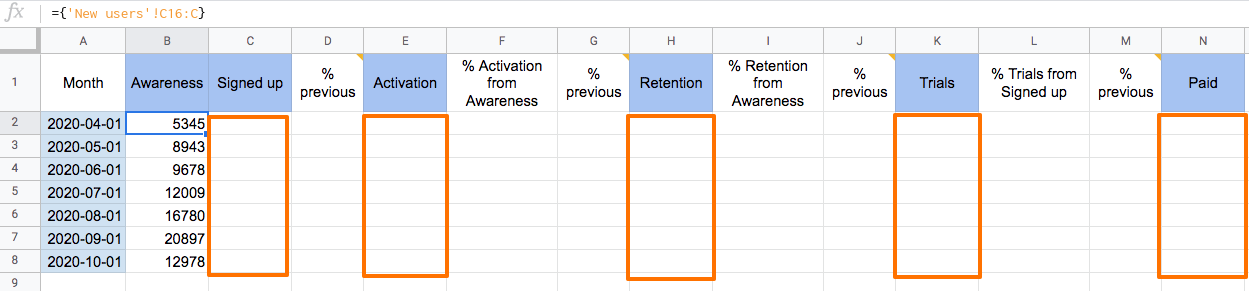
Instead of measuring Awareness, Appeal, and Ask separately, we combined all marketing acquisition efforts under the Awareness stage, leaving Act to account for conversions in the form of sign-ups.
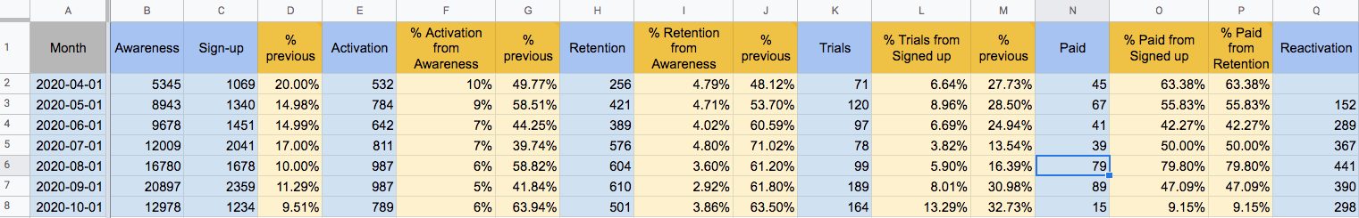
However, we split the Advocate stage into Activation, Retention, Trials, and Paid phases that contain information about product usage and sales. While evaluating our tool, like other SaaS products, some users tend to leave and then return, so our pipeline includes a Reactivation stage aimed at tracking the number of the reactivated accounts.
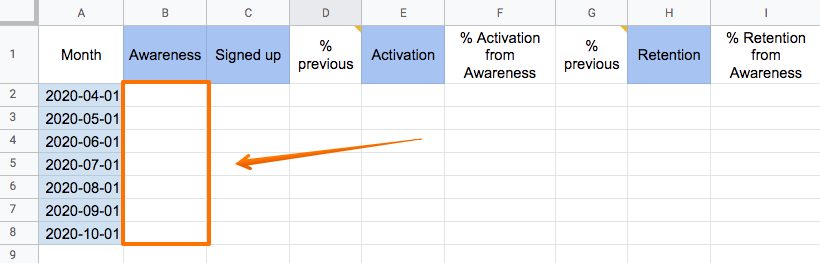
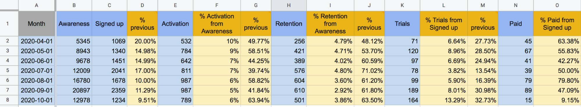
Here’s an example of what it looks like below:
Investing the time to define what our funnel would look like beforehand saved us—and will save you—time and future headaches during the visualization process.
Here’s how we set things up at Coupler.io:
The Awareness stage
Our Awareness stage includes new users who visit the website, blog, and marketplace listing within a given month, removing duplicate visitors.
Focusing on this segment allows us to see how well the product and its marketing, support, and other activities convert new visitors. That is why we don’t count a unique user in the funnel twice. If they return and re-activate at a future time, they become part of the Reactivation phase.
We source this statistical data from Google Analytics and import it to a dashboard on a daily basis.
The Sign-up stage
The name of this stage speaks for itself. It represents the number of users who sign up for an account or start a trial. We keep a close eye on how many sign-ups we receive on a regular basis and adjust if sign-ups are abnormally low.
The Activation stage
In our case, users, who try our product, are considered “activated.” We’ve chosen a few specific actions that relate to activation.
In our case, a potential customer should start using the product and perform at least 24 data imports within a 1–3 day period. We record this and other usage analytics data as anonymized Events in a Google BigQuery database.
The Retention stage
Retention shows how many people continue using our product regularly and remain as users. To measure the volume at this phase, we set criteria that correspond to frequent usage.
A potential member of this stage should have several scheduled integration workflows (i.e. set up an automatic schedule for data refresh), and keep them active for more than seven days.
The Trial stage
After signing up for a free trial, a user can either move to a paid plan or decrease usage and stay on a free plan, which affects churn.
By counting users with trial statuses in a specific period, we not only calculate the conversion from Trial to Paid but also predict the MRR by the end of the month.
The Paid stage
This stage refers to the quantity of paid subscriptions received in the chosen period.
The Reactivation stage
The Reactivation phase consists of users who created an account but stopped using the product during a previous period, then return or reactivate by performing any of the actions in line with Activation, Retention, Trial, or Paid stages.
Other metrics to monitor
In addition to the funnel stages described above, we also monitor some additional metrics.

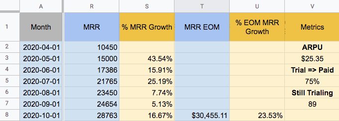
The Churn Rate allows us to estimate the satisfaction level of our paid users. (Here’s a link to a ProfitWell blog post sharing four different formulas to calculate churn.) If your churn rate is increasing, you can revisit your retention strategy, perform customer interviews, or even revisit your pricing structure.
As a SaaS product, it’s crucial for us to monitor the monthly revenue streams (MRR). We also review the Expected MRR, which we use to forecast MRR by the end of the month, as well as the expected MRR growth.
Now that we’ve covered the ingredients you need for your marketing or sales funnel, here’s how to build it using your current data sources.
How to visualize your marketing and sales funnel
For this funnel, we’re going to include the Awareness, Sign-up, Activation, Retention, Trials, Paid, and Reactivation stages, accompanied by the MRR, expected MRR, canceled subscriptions, and churn rate.
The data sources for each stage are as follows:
- The Awareness stage will be populated with data from Google Analytics.
- Sign-up, Activation, Retention, Trials, Paid, and Reactivation data from BigQuery.
- MRR, the number of canceled subscriptions, churn rate, and ARPU (Average Monthly Revenue Per User) from ProfitWell.
Importing New Users data from Google Analytics to Google Sheets
To complete the Awareness column of your funnel, first import this data from Google Analytics.
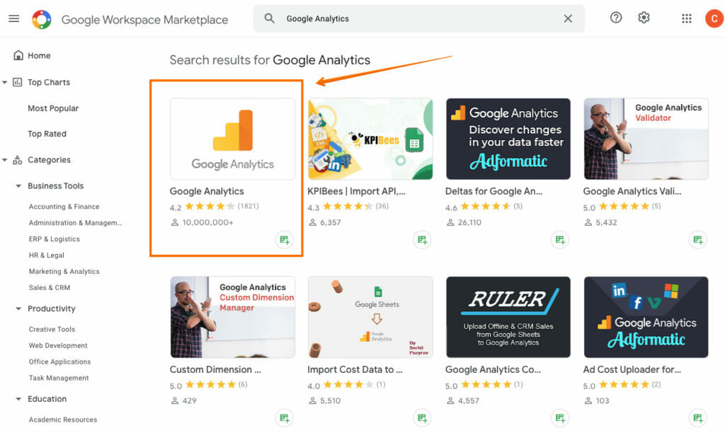
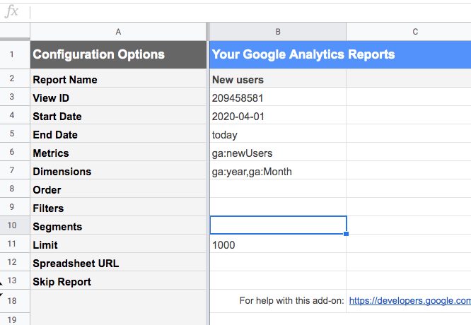
- To retrieve new user data from Google Analytics, go to the Google Workspace Marketplace and install the Google Analytics add-on.
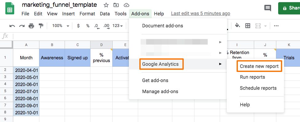
- Next, open a Google Sheet, go to the Add-ons menu, and select Google Analytics > Create new report.
- Set up the parameters for a new report. Specify the Google Analytics account, View, and Property, as well as add metrics and dimensions relevant for your case.
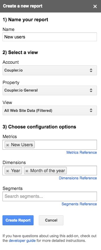
- The add-on will create a separate sheet called “Report configuration,” which contains the default parameters and those you’ve specified in the previous step.
- Next, you can adjust some of the default parameters. For example, let’s replace the default value “30daysAgo” for the Start Date with a custom date (2020-04-01).
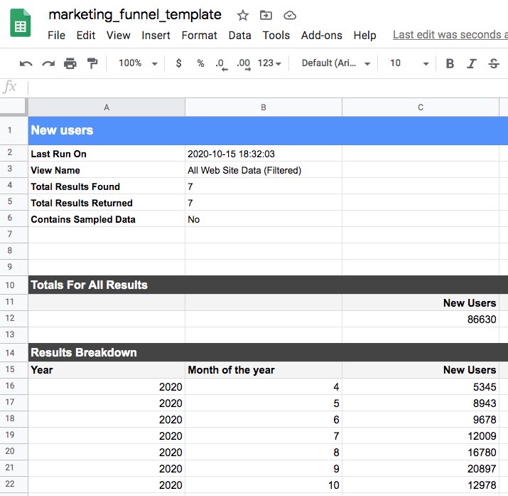
- Next, go to the Add-ons menu, select Google Analytics, and click “Run reports.”
- Below is a screenshot of a report I pulled from Google Analytics.
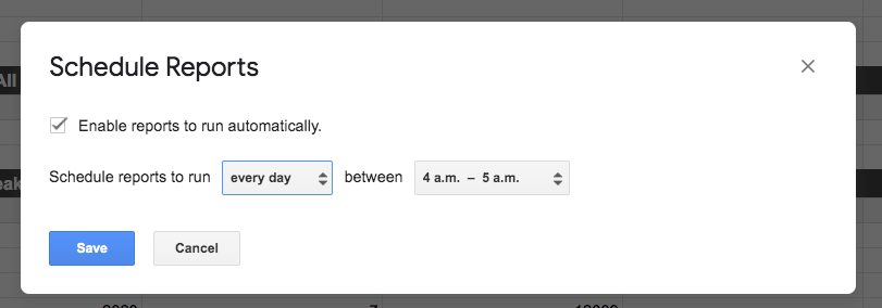
- Schedule automatic data refreshes for your report by going to Add-ons, selecting Google Analytics, then selecting “Schedule Reports.” You can set up the frequency to refresh every hour, every day, or every month.
- Last, populate the Awareness column with the data from Google Analytics.

Importing user activity data from BigQuery to Google Sheets
Now that we have the awareness stage covered, the next step is to add data for the Sign-up, Activation, Retention, Trials, Paid, and Reactivation sections, using BigQuery.
(To do this, we’ll use Coupler.io, but you can also use the BigQuery native connector.)
According to the official documentation, this functionality is supported for Enterprise Plus or G Suite Enterprise for Education accounts only. Alternatively, you may check out the Google Workspace Marketplace for other solutions.
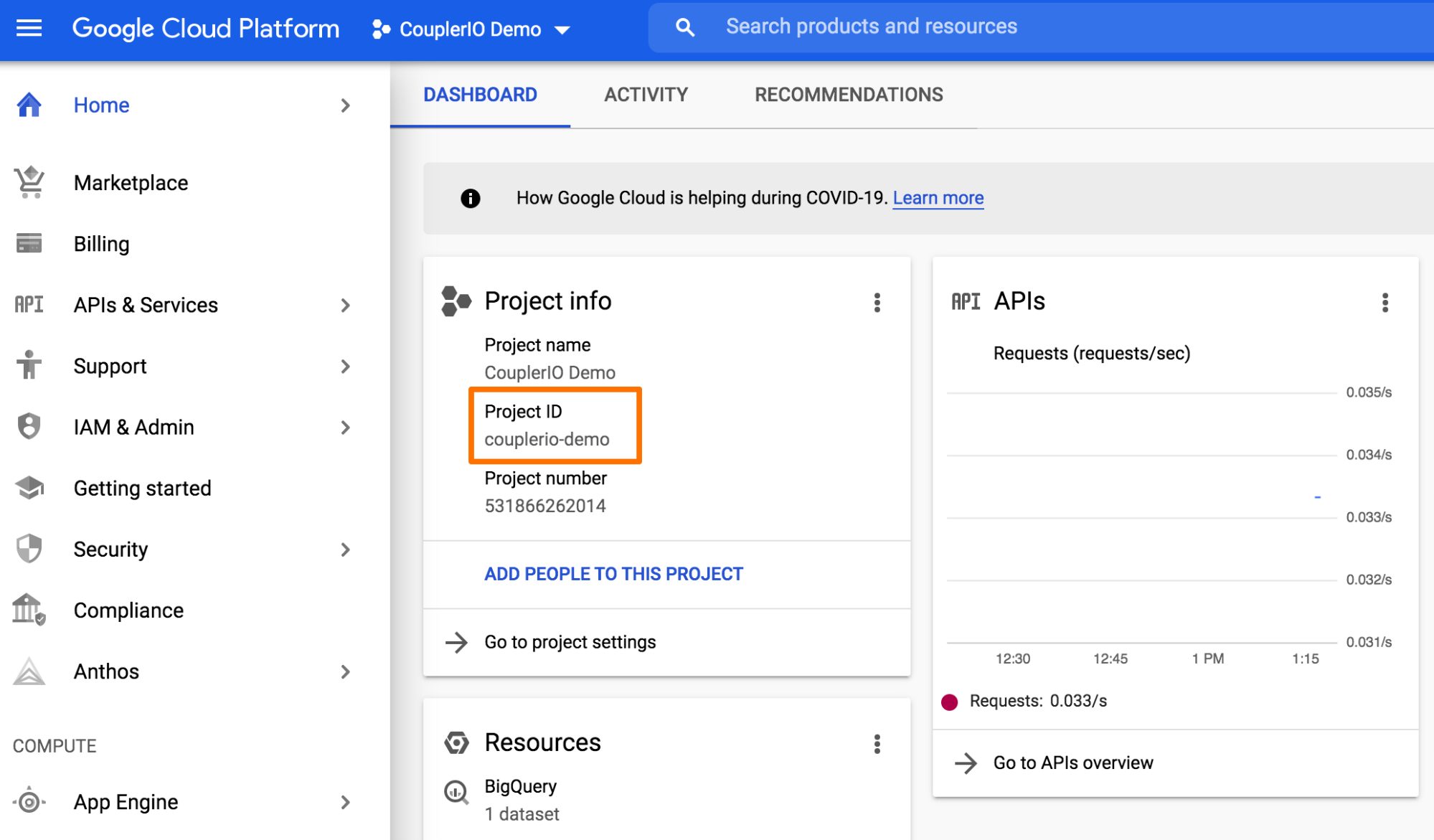
After you’ve installed Coupler.io or have another solution, Enter the Google Project ID. To find your Google Project ID:
- Go to the Google Cloud Platform console.
- Pick your project on the left-hand side of the page.
- The Google Project ID is available in the “Project info” part of the dashboard.
Next, enter the SQL query to review the data and return the requested information to Google Sheets. (Check this information to learn more about the Query syntax in Standard SQL.)
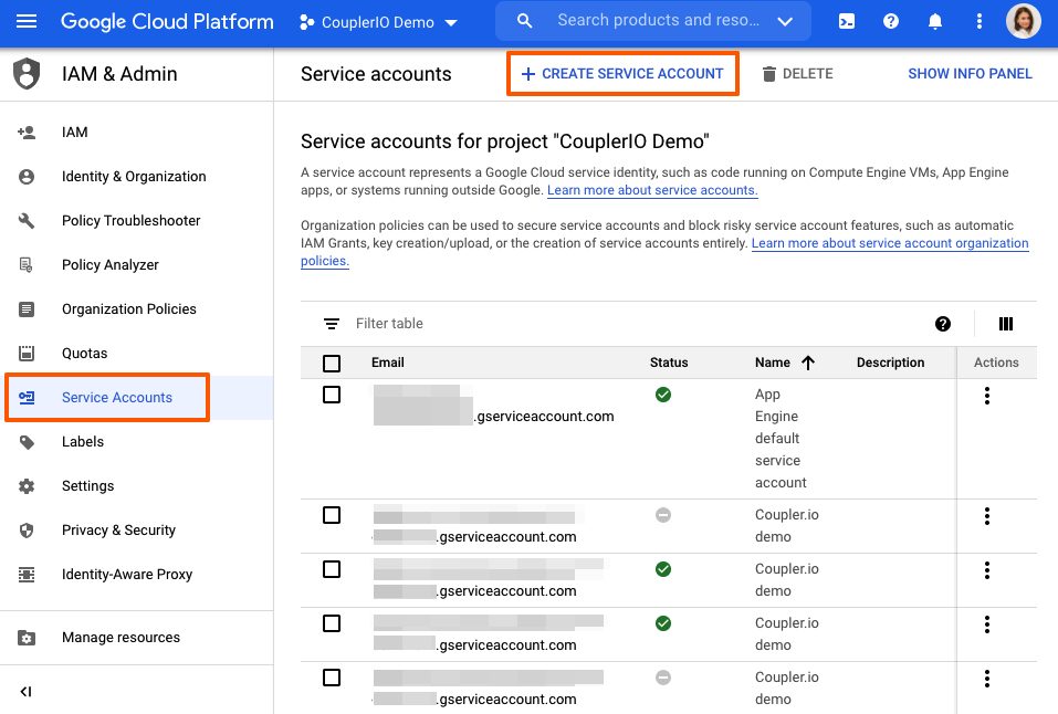
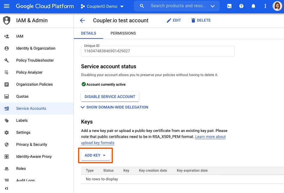
Then, create a service account and generate a JSON Key file. On the left side of the activity dashboard, click on “IAM & Admin.” Click on the “Service Accounts” and “+ Create service account.”
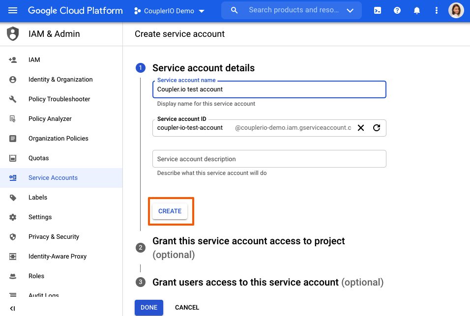
Type in the Service Account name. Click “Create.”
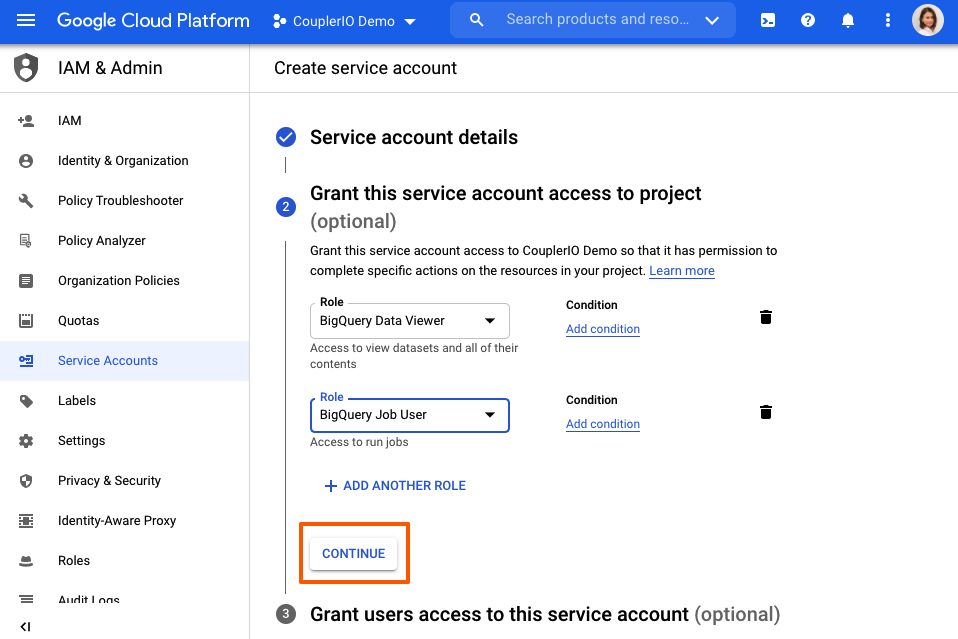
Add two roles, “BigQuery Data Viewer” and “BigQuery Job User,” then press “Continue” and “Done.”
In the list of service accounts, find the one you’ve just created and open it. Scroll down. Under the “Keys” section, press “Add key,” and “Create new key.”
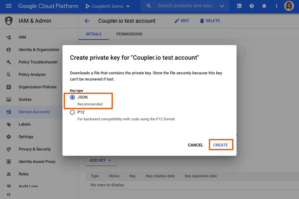
For Key type, choose “JSON.” Click “Create.”
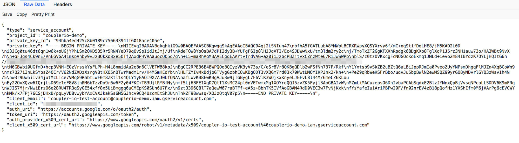
Your JSON file will automatically be saved to your computer. Open your JSON file, open the “Raw data” tab, copy the contents, and paste them into Coupler.io integration setup (or whichever tool you’re using).
Schedule automatic data refreshes; run a manual import to upload the initial data for the first time. (For additional help, you can read the complete instructions on how to import data from Google BigQuery to Google Sheets.)
Importing financial data from ProfitWell to Google Sheets
For the last step, we’ll deal with your financial data.
ProfitWell has a very good API, so it’s easy to obtain data from it. This time, we also set up a JSON importer by Coupler.io and retrieved the necessary data, such as MRR data that’s used to calculate the MRR EOM (Expected MRR by the End of the Month), as well as the number of canceled subscriptions and churn rate.
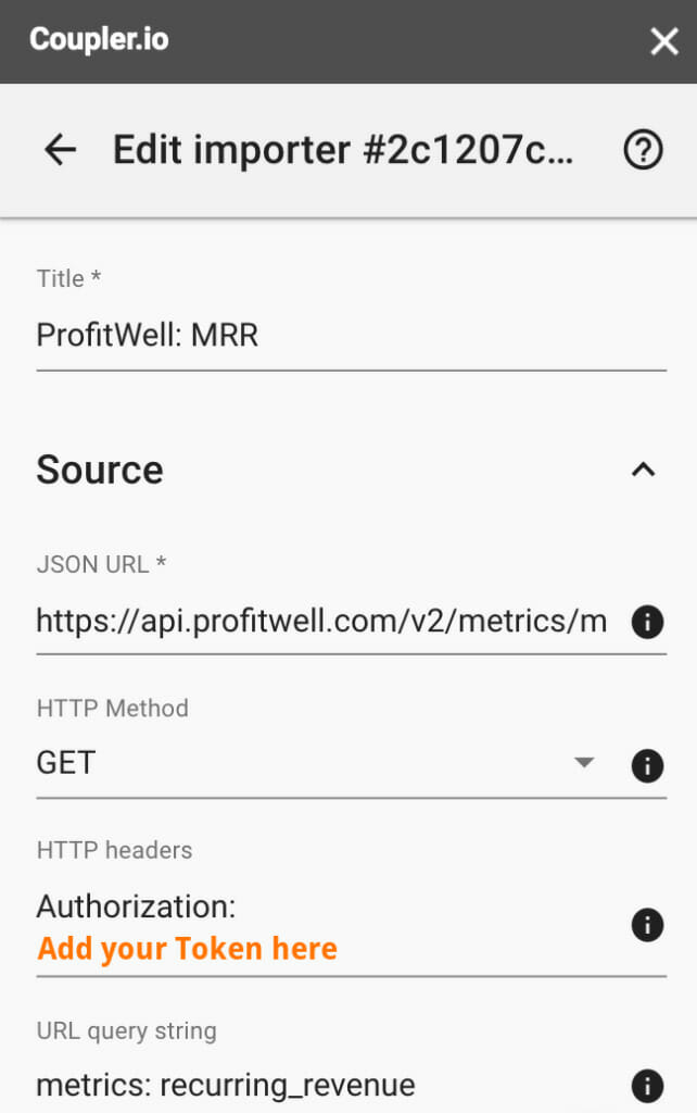
- To pull MRR, create a new JSON Client importer.
- For a JSON query string, use this one.
- Then, go through the authentication; set a request header with the value of your token.
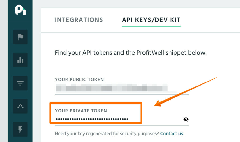
- Go to the API Keys/Dev Kit tab and copy your private token.
- Set the URL query string to “metrics: recurring_revenue.”
- Configure your data to update automatically, save, and run the importer.
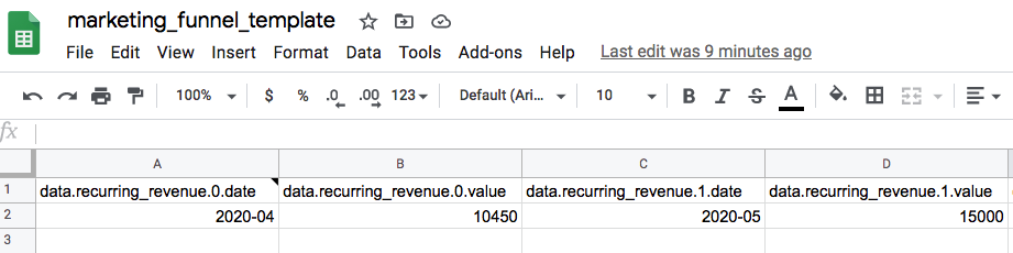
This is how your ready integration will look. Following this logic, you can perform similar actions to pull the information about canceled subscriptions, churn rate, and APRU.
By default, you’ll see the period (month and year) and the MRR value in this period.
We’ll then use this data to calculate MRR Growth, MRR EOM, and EOM MRR Growth.

So MRR EOM equals:
(Still Trialing) * ARPU * (Trial to Paid) + MRR for current period.
Depending on where you are in your business, not every section will be the same as mine. Once you’ve done this process one or twice, you can easily customize each of the stages to your liking.
Conclusion
The world of data is big. You can easily get lost. As a business owner or marketing specialist, being able to understand any stage of your marketing or sales funnel can help you make better decisions and deliver an up-to-date view of the health of your business.
Though building out your funnels may be intimidating at first, it’s a valuable skill. Start by building out your first report and improve as you go.
Related Posts
-

Over the last years, Google Data Studio has evolved from an appealing but clunky application…
-
Do you need to be a big company and need large volumes of traffic to be data…
-
Set up the measurement tool. Clean and process the data. Turn it into information. Analyze…
-

Not long ago, it was common for marketers and web analysts to spend the bulk…


Great post, one thing that I’m missing here though is being able to identify an individual user throughout the journey, so in other words segmentation based on traits like original source or delays within the funnel, or the number of touchpoints between A and B or whether they have passed through a certain touchpoint or not (email, blog post, page etc.)